Getting started with charts
Learn how to use your data to create charts and graphs.
This guide covers a set of new chart components, which are distinct from the legacy Chart component. The new chart components are available on Retool Cloud and on Self-hosted Retool version 3.111 and later.
Chart components allow you to visualize data as graphs and charts. There are various types of charts and graphs available, and each type offers customization options.
Retool also provides a Plotly JSON Chart that you can customize to fit your needs. All charts are built using Plotly.js version 2.34.
Chart types
Retool provides the following chart types:
- Bar Chart
- Bubble Chart
- Funnel Chart
- Heat Map
- Line Chart
- Mixed Chart
- Pie Chart
- Plotly JSON Chart
- Sankey Chart
- Scatter Chart
- Sparkline
- Stacked Bar Chart
- Sunburst Chart
- Treemap
- Waterfall Chart
Specify content options
In the Content section of the Inspector, add your data source. Series-based charts enable you to add one or more series, each with a different data source. Series-based charts include Bar Chart, Bubble Chart, Funnel Chart, Line Chart, Scatter Chart, Sparkline, and Waterfall Chart.
Choose your data
You can use queries, transformers, or JavaScript to build charts.
You can choose to manually add your data, or select a query or transformer in the Data source field, which automatically populates the chart with data.
Once you select the data source, you can choose what fields to display. Some charts have X data and Y data, and others have Labels and Values.
Group and aggregate data
Retool supports two transformation types:
- Group by: Group the data by a specific dimension.
- Aggregation: Summarize the y-values for a specific x-value.
These transformations are available for series-based charts only.
Group by
You can aggregate serial data for a dynamic number of groups. For example, you can create charts that visualize data over time and group that data, such as grouping revenue by product or headcount by team. Use the Group by property to choose a field from your data source to group and display this kind of data.
To see an example of this, create a JavaScript transformer using the code below, which represents a list of employee expenses. Make sure to save and run it before continuing.
const data = [
  { "Name": "David Wilson", "Category": "Travel", "Amount": 450.00, "Date": "2024-09-02" },
  { "Name": "Sarah Johnson", "Category": "Technology", "Amount": 475.00, "Date": "2024-09-05" },
  { "Name": "James Moore", "Category": "Meals", "Amount": 56.00, "Date": "2024-09-06" },
  { "Name": "Emily Davis", "Category": "Travel", "Amount": 300.00, "Date": "2024-09-11" },
  { "Name": "James Moore", "Category": "Travel", "Amount": 275.00, "Date": "2024-09-22" },
  { "Name": "Daniel Lee", "Category": "Meals", "Amount": 60.00, "Date": "2024-09-22" },
  { "Name": "Laura Taylor", "Category": "Technology", "Amount": 250.00, "Date": "2024-09-24" },
  { "Name": "James Moore", "Category": "Meals", "Amount": 45.00, "Date": "2024-09-30" },
  { "Name": "Laura Taylor", "Category": "Meals", "Amount": 85.00, "Date": "2024-09-31" }
];

return data;
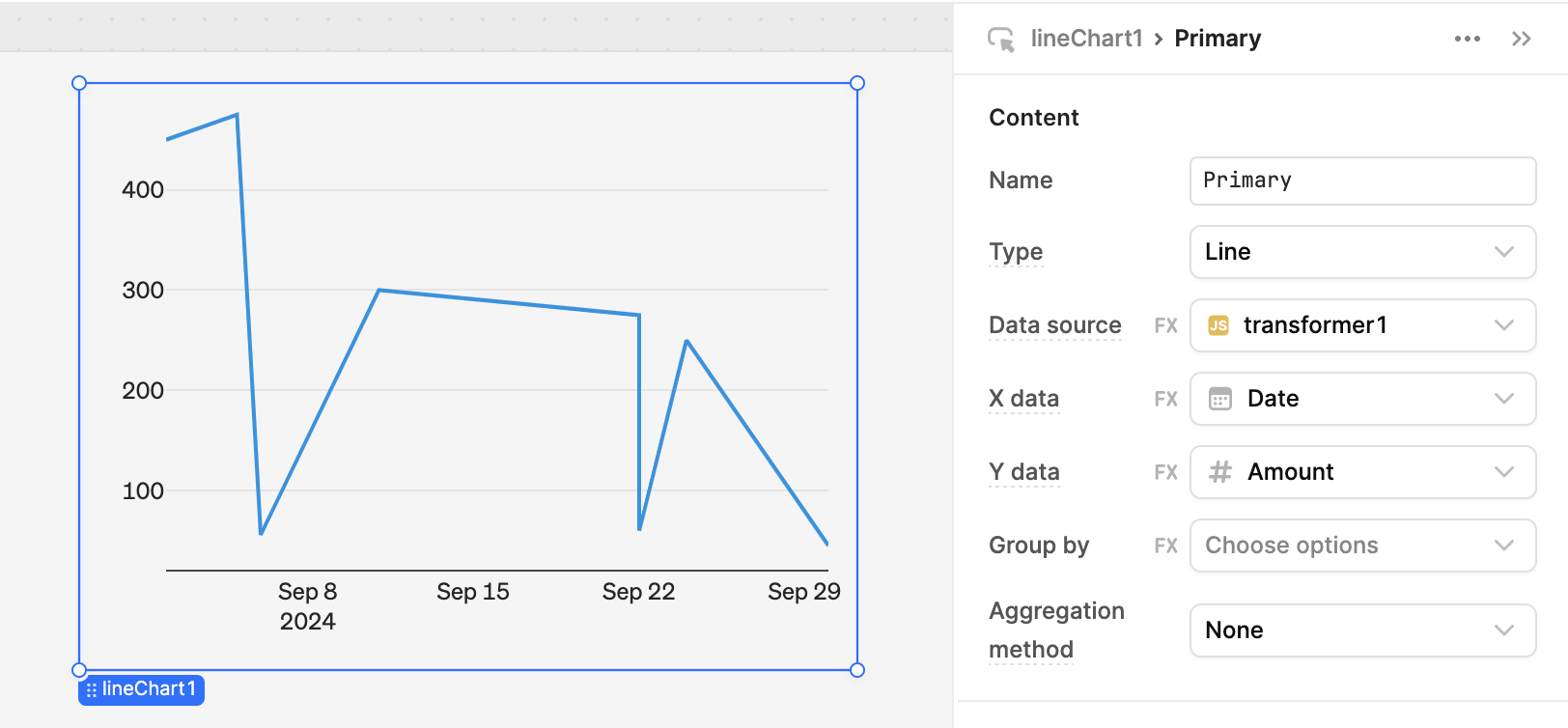
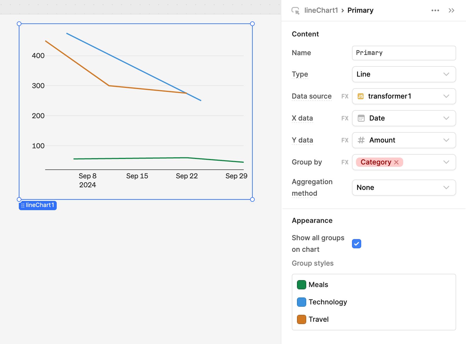
Add a Line Chart component to the canvas. Select the primary series, and set the Data source to the transformer you created. Set the X data to Date and the Y data to Amount. Set Group by to Category. The chart now shows three lines, one for each of the categories. If you add more data points to the transformer, the chart updates automatically.
Aggregation
In addition, you can use the following methods to aggregate data when you have multiple Y values for a single X data point.
| Method | Description |
|---|---|
| Sum | Returns the summation of all numeric values. |
| Average | Returns the average of all numeric values. |
| Count | Returns the quantity of items for each group. |
| Count distinct | Returns the quantity of distinct items for each group. |
| Min | Returns the minimum numeric value for each group. |
| Max | Returns the maximum numeric value for each group. |
| Median | Returns the median of all numeric values. |
| Mode | Returns the mode of all numeric values. |
| Standard deviation | Returns the standard deviation of all numeric values. |
| First value | Returns the first numeric value for each group. |
| Last value | Returns the last numeric value for each group. |
You can edit the data value for a Plotly JSON Chart directly to use the filter and sort transformation methods.
Include add-ons
The Add-ons setting enables you to add additional information to your chart component.
Common add-ons include:
- Title: Add a title that appears at the top of the chart.
- Toolbar: Add a configurable list of controls that allow a user to interact with the chart by selecting components, zooming in or out, and other functions.
- Legend: Add a legend to the chart and configure where the legend appears.
- Data labels: For Pie Chart, Treemap, and Sunburst Chart, add labels to display on categories and subcategories.
- Tooltip: For Pie Chart, Treemap, and Sunburst Chart, add labels that appear when you hover over categories and subcategories.
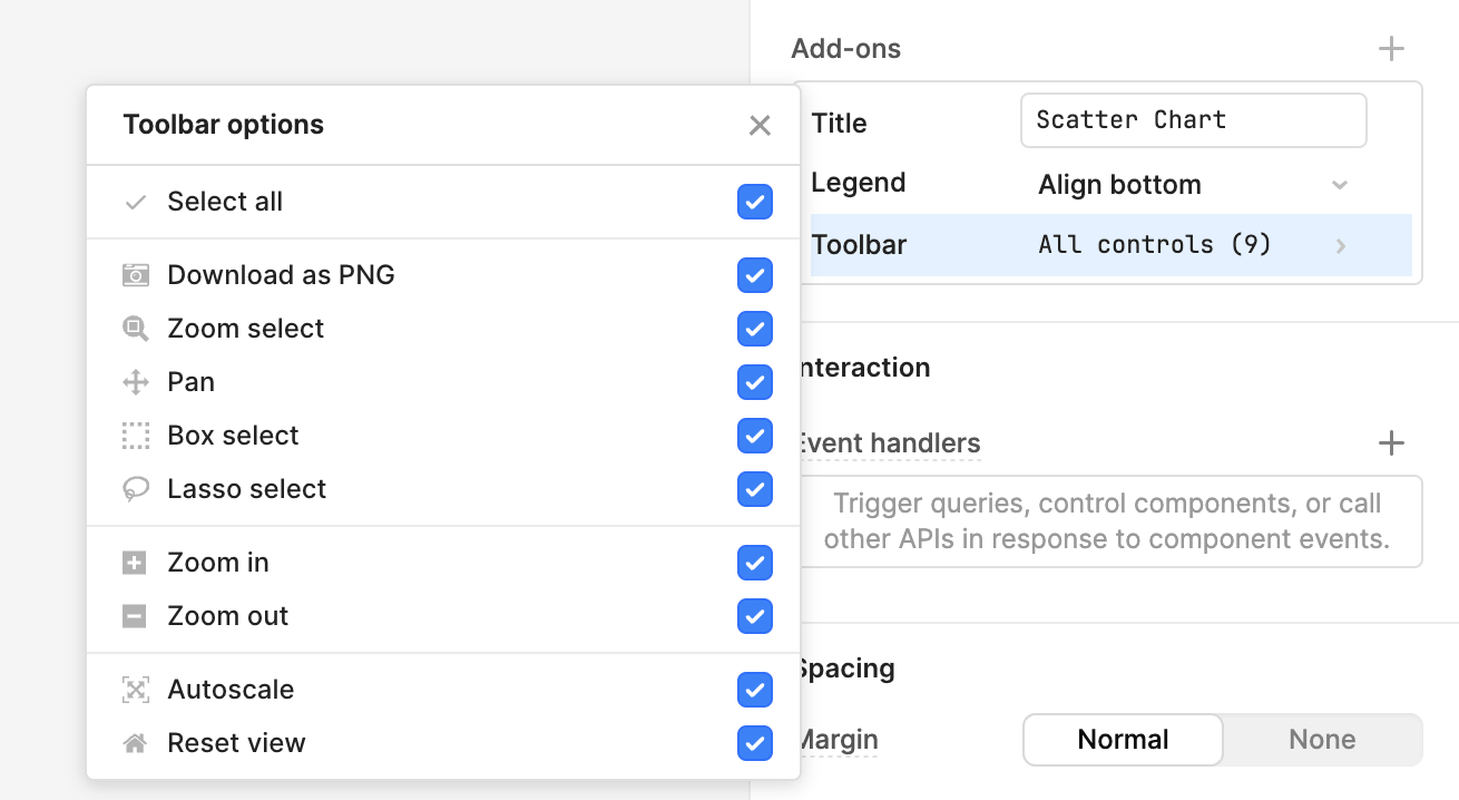
Each component has a slightly different set of add-ons.
Axis tick formats
Use the Axis controls setting to customize tick labels. Click on the axis you want to edit, and Retool provides various appearance settings to customize the ticks. For full control over the tick labels, click the button and input a valid d3-format specifier.
Refer to d3-time-format for a list of date-time formatters and d3-format for a list of numerical formatters. Here are a few examples of commonly used formats.
| Specifier | Example | Description |
|---|---|---|
%I:%M%p | 12:00 PM | Uses %I for 12-hour clock hour, %M for minute and %p for AM or PM. |
Q%q %Y | Q2 2020 | Uses %q for quarter of the year and %Y for the year with century. |
% | Input: 0.05 Output: 5% | % multiplies by 100, and then decimal notation with a percent sign. |
Add multiple y-axes
Series-based charts support multiple y-axes. This is useful when working with both absolute numbers and percentages, you might want to show additional y-axes on your chart. For example, you could chart the total number of visits to a website, and the percentage of those visits split between new and existing users. The left y-axis would map to a count, and the right one would map to a percentage.
The Mixed Chart component automatically includes two y-axes, with some sample data to demonstrate the abilities of the chart.
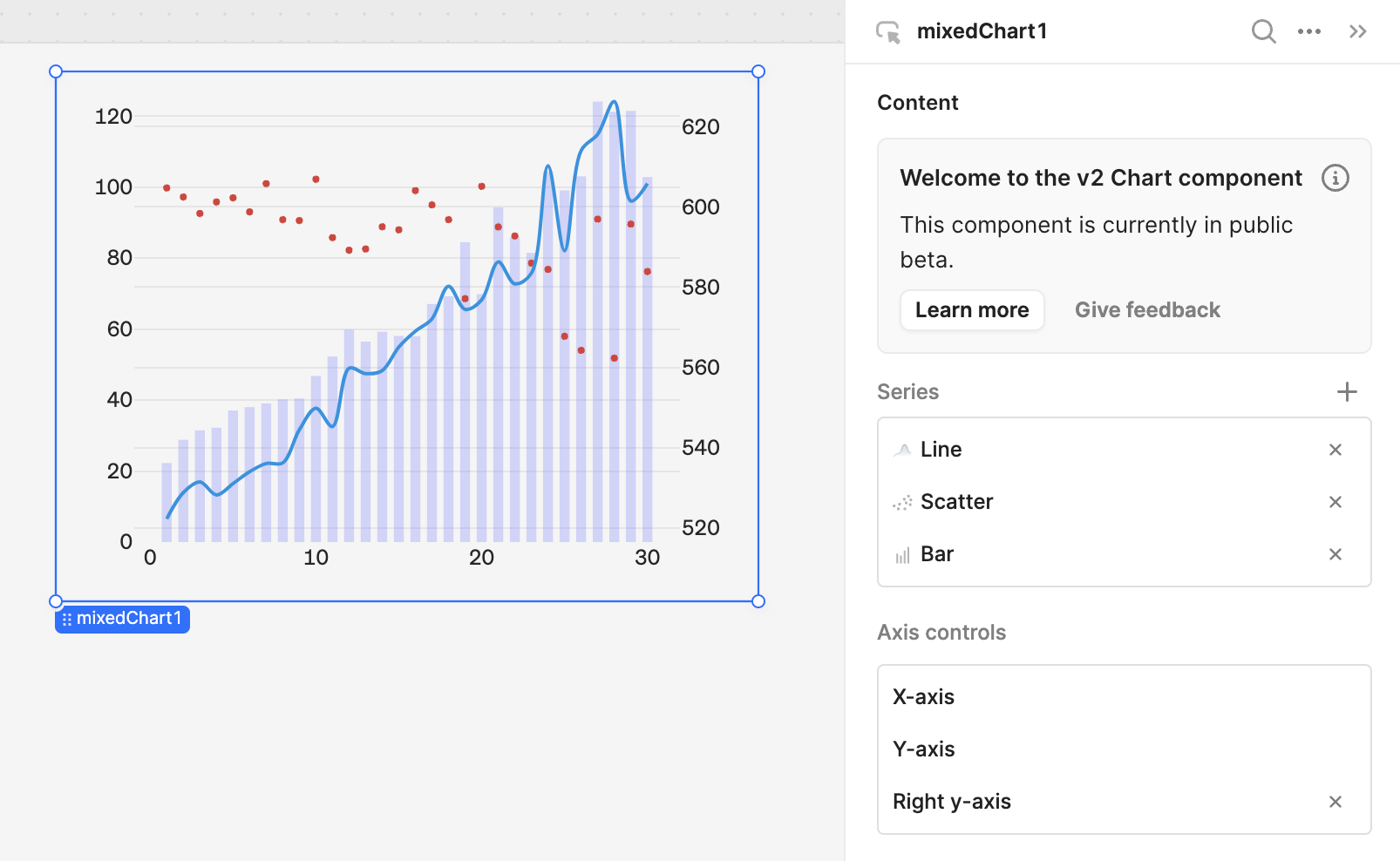
Alternatively, you can add an additional y-axis to other kinds of series-based charts using the Axis controls section of the inspector. Click + to add a right y-axis to a chart, and select the new axis to edit axis-specific settings.
Configure user interaction
When you select points on a chart, Retool exposes the underlying data in the .selectedPoints array property on the chart. This means you can filter, transform, or update your app by referencing the chartName.selectedPoints array property in any component, query, or JavaScript function.
For example, to use the x values of selected points on a Scatter Chart to filter a query, you can write {{ scatterChart1.selectedPoints.map(d => d.x) }}. Here is an example in a BigQuery SQL query:
SELECT id, event, timestamp, value, trigger
FROM big_query.event_table
WHERE timestamp IN UNNEST( {{chart.selectedPoints.map(d => d.x) }})
Retool also exposes event handlers on charts for the following events:
- Select
- Clear
- Legend click
- Legend double click
- Hover
- Unhover
Customize appearance
You can customize the presentation of your component in the Spacing and Appearance sections of the Inspector.
All components have a Hidden setting, which you can dynamically control with a truthy value that evaluates to true or false. You can also control the hidden property for a component using the .setHidden() method from event handlers and JavaScript queries.
You can also create custom style rules using the Styles setting. Each component has different styles that you can configure, but common ones include colors, fonts, and text styles. Use app-level or organization-level themes to set these styles across all components.
Advanced use cases
A few more advanced use cases require additional configuration or knowledge of Plotly.
Plotly JSON Chart
If you have an advanced use case that isn't covered by one of the chart presets, you can use the Plotly JSON Chart component to build charts with raw Plotly JSON structured data. Retool exposes chart information (chart type, aggregation methods, axes names, etc.) as JSON passed to the data and layout properties.
Retool provides a repository of data visualization examples on GitHub that you can reference and duplicate.
The Data setting in Retool populates the Plotly data property. Use this to define a list of traces (datasets) to chart. The schema of each trace is dependent on the type.
In the Appearance section, the Layout setting in Retool populates the Plotly layout property. Use this property to control positioning and to set the title, axes, colors, and legend.
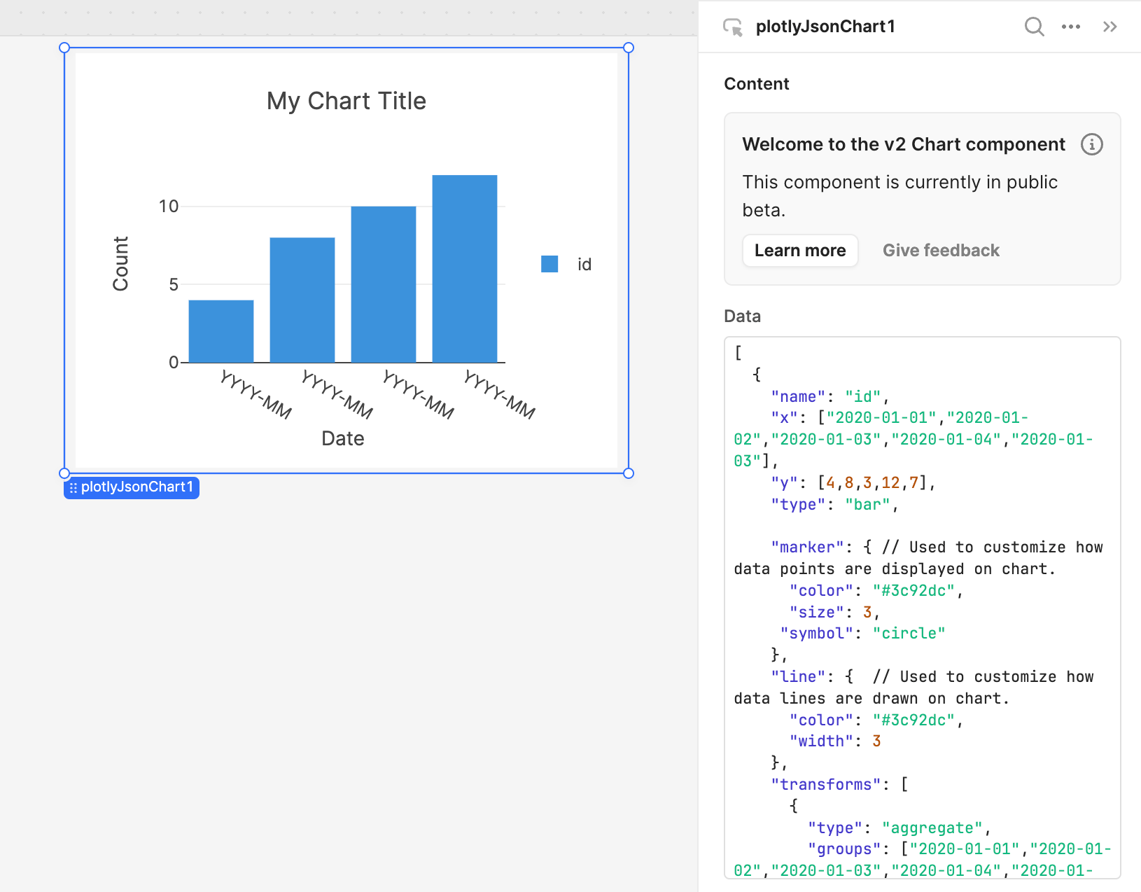
Visit the Plotly API reference to read more about the data structure that the Plotly library operates on.
The following examples show the Data and Layout values for a bar chart.
Common Data options:
[
  {
    "name": "id",
    "x": ["2020-01-01","2020-01-02","2020-01-03","2020-01-04","2020-01-03"],
    "y": [4,8,3,12,7],
    "type": "bar",

    "marker": { // Used to customize how data points are displayed on chart.
      "color": "#3c92dc",
      "size": 3,
     "symbol": "circle"
    },
    "line": {  // Used to customize how data lines are drawn on chart.
      "color": "#3c92dc",
      "width": 3
    },
    "transforms": [
      {
        "type": "aggregate",
        "groups": ["2020-01-01","2020-01-02","2020-01-03","2020-01-04","2020-01-03"],
        "aggregations": [
          {
            "target": "y",
            "func": "sum",
            "enabled": true
          }
        ]
      }
    ]
  }
]
Common Layout options:
{
  "title": "My Chart Title",
  "font": {
    "family": "Inter" // Default font for all chart labels.
  },
  "xaxis": {
    "title": "Date", // Text label for x-axis.
    "type": "-", // X-axis type.
    "tickformat": "YYYY-MM", // d3-format specifier. If empty or "", Plotly will attempt to guess format.
    "automargin": true,
    "fixedrange": true
  },
  "yaxis": {
    "title": "Count",
    "tickformat": "", // d3-format specifier. If empty or "" Plotly will attempt to guess format.
    "automargin": true,
    "fixedrange": true
  },
  "showlegend": true,
  "legend": {
    "xanchor": "left",
    "x": 1.05,
    "y": 0.5
  },
  "hovermode": "x unified",
  "margin": {
    "l": 75,
    "r": 25,
    "t": 80,
    "b": 75
  }
}
Paste these values into the Plotly JSON Chart component to test it out.