Visualize data with the Chart component
Learn how to use your data to create charts and graphs.
This is a legacy component. Retool recommends using the new chart components.
The Chart component allows you to visualize data as graphs and charts. It's built using Plotly.js, so you can also customize charts to fit your needs.
Demo
Check out the demo to see the Chart component in action.
Choose your data
You can use queries and transformers, or JavaScript to build charts. You can reference an array or an object in the Data source field for a chart and Retool automatically detects the data type and transforms it for graphing. If your data source is an array and you enable Use JavaScript, Retool's built-in formatArrayAsObject function wraps the data source reference.
After you select a data source, Retool parses the data and populates the chart. By default, the first non-numeric column populates the X-axis but you can change this and other properties like Chart type, Group by, etc.
Supported data structures
The Chart component requires data in a tabular format. This can either be an array of objects, where every object field is a column, or as an object where each key represents a column and the value is an array of values for that column.
[
  { "date": "2022-03-01", "animal": "dog", "count": 4 },
  { "date": "2022-03-01", "animal": "cat", "count": 6 },
  { "date": "2022-04-01", "animal": "frog", "count": 10 },
  { "date": "2022-04-01", "animal": "cat", "count": 3 },
  { "date": "2022-04-01", "animal": "dog", "count": 2 }
]
{
  "date": [
    "2022-03-01",
    "2022-03-01",
    "2022-04-01",
    "2022-04-01",
    "2022-04-01"
  ],
  "animal": ["dog", "cat", "frog", "cat", "dog"],
  "count": [4, 6, 10, 3, 2]
}
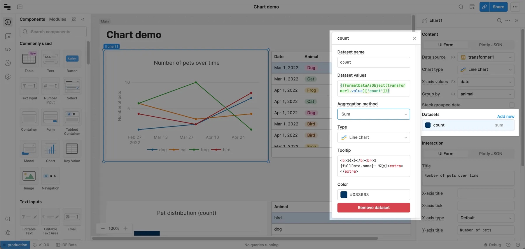
Group data
One common use case is to chart time series data for a dynamic number of groups. For example, grouping revenue by product or headcount by team. Use the Group by property to choose a field from your data source to group and display this kind of data.
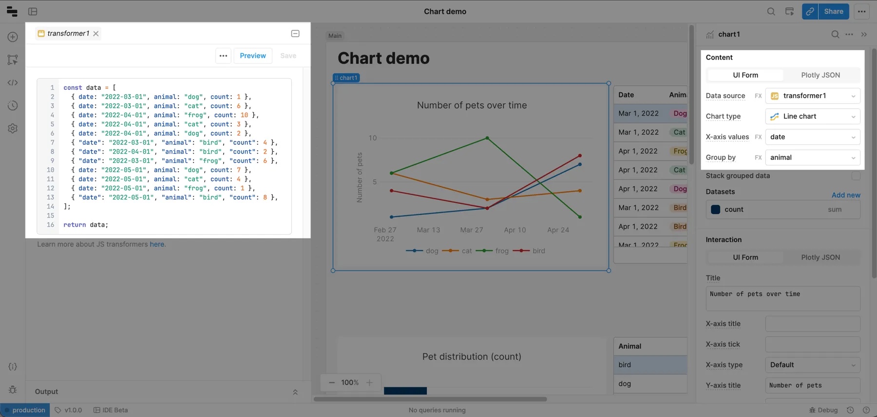
To see an example of this, create a transformers using the code below. Make sure to save and run it before continuing.
const data = [
  { date: "2022-03-01", animal: "dog", count: 1 },
  { date: "2022-03-01", animal: "cat", count: 6 },
  { date: "2022-04-01", animal: "frog", count: 10 },
  { date: "2022-04-01", animal: "cat", count: 3 },
  { date: "2022-04-01", animal: "dog", count: 2 },
  { "date": "2022-03-01", "animal": "bird", "count": 4 },
  { "date": "2022-04-01", "animal": "bird", "count": 2 },
  { "date": "2022-03-01", "animal": "frog", "count": 6 },
  { date: "2022-05-01", animal: "dog", count: 7 },
  { date: "2022-05-01", animal: "cat", count: 4 },
  { date: "2022-05-01", animal: "frog", count: 1 },
  { "date": "2022-05-01", "animal": "bird", "count": 8 },
];

return data;
Add a Chart component to the Canvas and set its Data source to the transformer you created. Change the chart type to Line chart and set Group by to animal. The chart now shows the number of animals over time. If you add more data points to the transformer, the chart updates automatically.
Transformation types
Retool supports two transformation types:
-
Group by: Group the data by a specific column.
-
Aggregation: Summarize the values for a group.
You can use the following methods to aggregate data.
| Method | Description |
|---|---|
| count | Returns the quantity of items for each group. |
| sum | Returns the summation of all numeric values. |
| avg | Returns the average of all numeric values. |
| median | Returns the median of all numeric values. |
| mode | Returns the mode of all numeric values. |
| rms | Returns the rms of all numeric values. |
| stddev | Returns the standard deviation of all numeric values. |
| min | Returns the minimum numeric value for each group. |
| max | Returns the maximum numeric value for each group. |
| first | Returns the first numeric value for each group. |
| last | Returns the last numeric value for each group. |
You can also edit the Plotly JSON for a Chart component directly to use the filter and sort transformation methods.
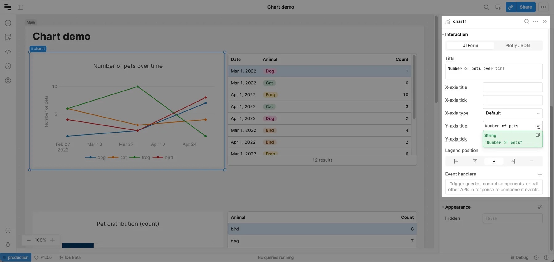
Customize the layout
Edit the chart's layout using the Interaction section in the right panel. Select UI Form to edit these settings directly or Plotly JSON to configure the layout using Plotly layout JSON values.
Axis tick formats
Use the X-axis tick format and Y-axis tick format fields to customize tick labels using a valid d3-format specifier. For a full list of numerical values, use d3-format specifier. See d3-time-format for a list of date-time formatters and d3-format for a list of numerical formatters. Here are a few examples of commonly used formats.
| Specifier | Example | Description |
|---|---|---|
%I:%M%p | 12:00 PM | Uses %I for 12-hour clock hour, %M for minute and %p for AM or PM. |
Q%q %Y | Q2 2020 | Uses %q for quarter of the year and %Y for the year with century. |
% | Input: 0.05 Output: 5% | % multiplies by 100, and then decimal notation with a percent sign. |
Add interactivity
When you select points on a chart, Retool exposes the underlying data in the .selectedPoints array property on the chart. This means you can filter, transform, or update your app by referencing the chart.selectedPoints array property in any component, query, or JavaScript function.
For example, to use the x values of selected points to filter a query, you can write {{ chart.selectedPoints.map(d => d.x) }}. Here is an example in a BigQuery SQL query:
SELECT id, event, timestamp, value, trigger
FROM big_query.event_table
WHERE timestamp IN UNNEST( {{chart.selectedPoints.map(d => d.x) }})
Advanced use cases
Retool exposes chart information (chart type, aggregation methods, axes names, etc.) as JSON passed to the data and layout attributes. If you have an advanced use case, you can enable Plotly JSON to edit JSON directly.
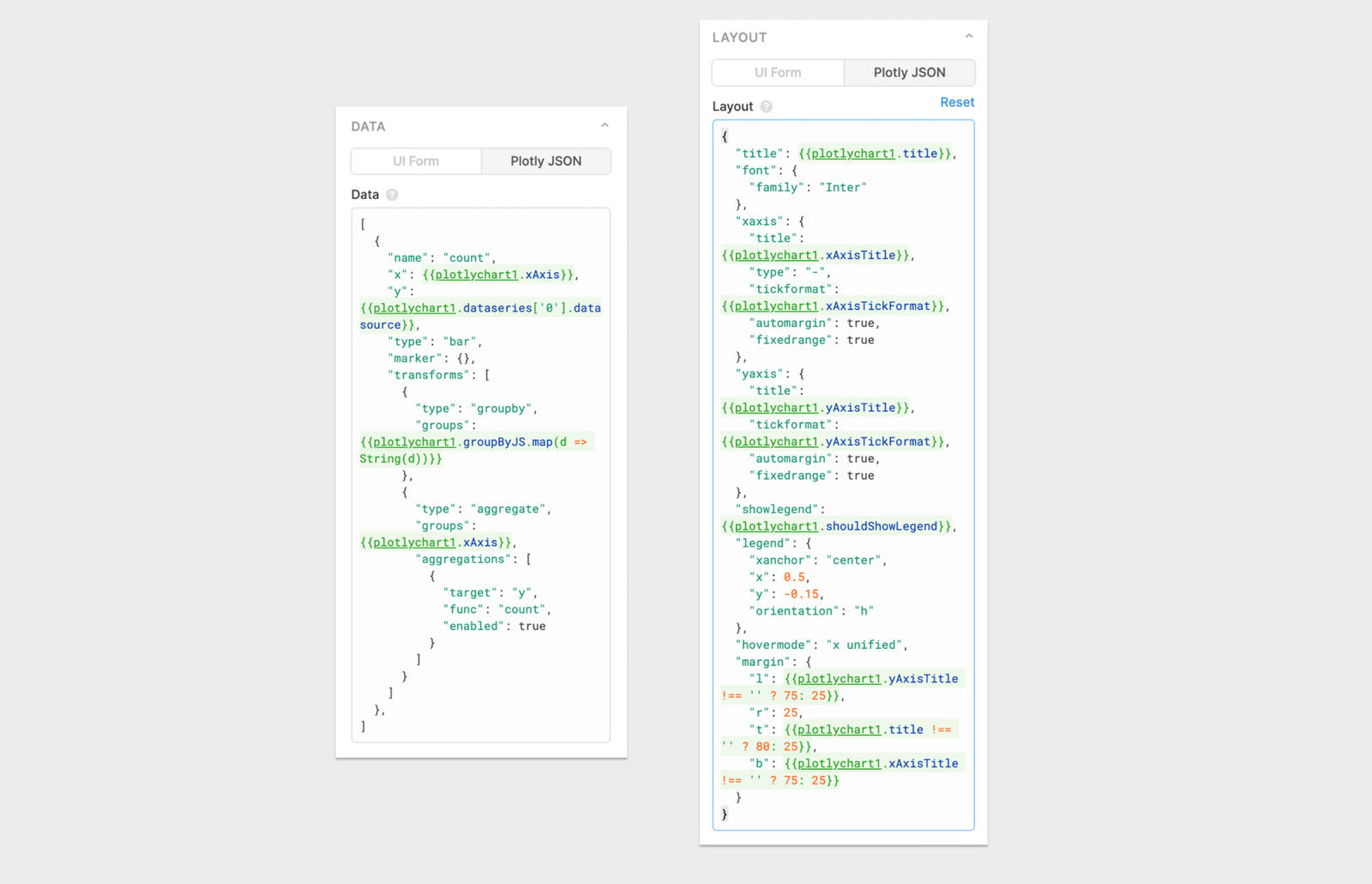
The Data field in Retool populates the Plotly data attribute. Use this attribute to define a list of traces (datasets) to chart. The schema of each trace is dependent on the type.
The Layout field in Retool populates the Plotly layout attribute. Use this attribute to control positioning and to set the title, axes, colors, and legend.
Visit the Plotly docs to read more about the data structure that the Plotly library operates on.
Common data options:
[
  {
    "name": "id",
    "x": ["2020-01-01","2020-01-02","2020-01-03","2020-01-04","2020-01-03"],
    "y": [4,8,3,12,7],
    "type": "bar",

    "marker": { // Used to customize how data points are displayed on chart.
      "color": "#3c92dc",
      "size": 3,
     "symbol": "circle"
    },
    "line": {  // Used to customize how data lines are drawn on chart.
      "color": "#3c92dc",
      "width": 3
    },
    "transforms": [
      {
        "type": "aggregate",
        "groups": ["2020-01-01","2020-01-02","2020-01-03","2020-01-04","2020-01-03"],
        "aggregations": [
          {
            "target": "y",
            "func": "sum",
            "enabled": true
          }
        ]
      }
    ]
  }, ...}
]
Common layout options:
{
  "title": "My Chart Title",
  "font": {
    "family": "Inter" // Default font for all chart labels.
  },
  "xaxis": {
    "title": "Date", // Text label for x-axis.
    "type": "-", // X-axis type.
    "tickformat": "YYYY-MM", // d3-format specifier. If empty or "", Plotly will attempt to guess format.
    "automargin": true,
    "fixedrange": true
  },
  "yaxis": {
    "title": "Count",
    "tickformat": "", // d3-format specifier. If empty or "" Plotly will attempt to guess format.
    "automargin": true,
    "fixedrange": true
  },
  "showlegend": true,
  "legend": {
    "xanchor": "left",
    "x": 1.05,
    "y": 0.5
  },
  "hovermode": "x unified",
  "margin": {
    "l": 75,
    "r": 25,
    "t": 80,
    "b": 75
  }
}
Add multiple y-axes
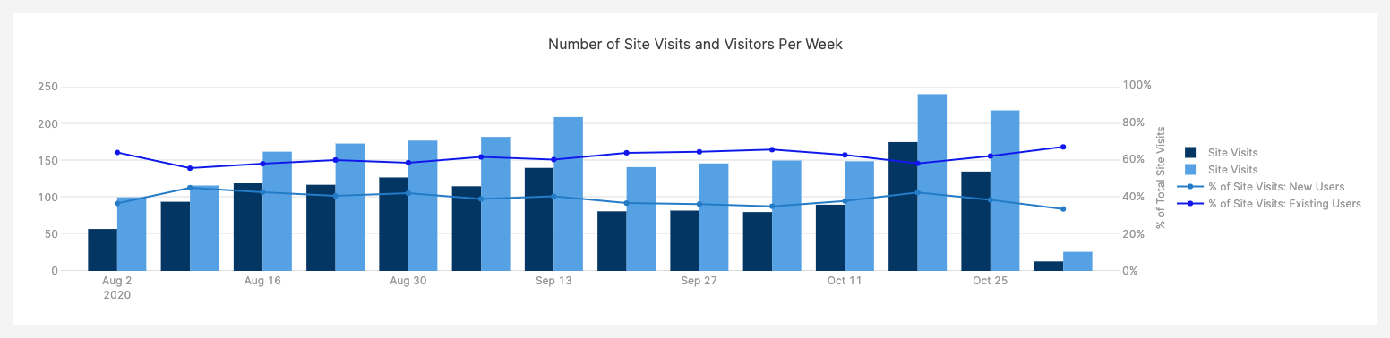
If you're working on a chart that shows absolute numbers and percentages, you might want to show additional y-axes on your chart. For example, you could chart the total number of visits to a website, and the percentage of those visits split between new and existing users. The left y-axis would map to a count, and the right one would map to a percentage. You can do this by editing the Plotly JSON directly with the following steps.
1. Add another y-axis to the Plotly Layout JSON
Select the chart and click Plotly JSON in the right panel. In the existing JSON, there's an entry for an existing y-axis with a "yaxis" key. Add a second entry named "yaxis2", and configure it to show up on the right side of the graph using side: right and overlaying: y.
  "yaxis2": {
    "title": {
      "text": "an axis title",
      "standoff": 12,
      "font": {
        "size": 12
      }
    },
    "overlaying": "y",
    "side": "right",
    "type": "linear",
    "automargin": true,
    "fixedrange": true,
    "zerolinecolor": "#DEDEDE"
  }
You can also add some optional fields to format the axis as a percentage and restrict the range to [0,1].
"tickformat": "%",
"range": [0,1],
2. Assign datasets to the axes
For each dataset that you want to assign to the additional y-axis, add this property:
"yaxis": "y2"
Additional resources
Check out these external resources for more information on building charts and using Plotly.
- Data Visualization examples on GitHub
- Plotly.js documentation