Group components with containers
Learn how to group components into multi-view interfaces.
You're viewing documentation for classic apps, which use Retool's original app editor. The new app builder is the recommended way to build apps and where Retool focuses new development.
You can group related components together in a card using the container components. Containers also support multiple views that allow you to separate content into distinct views that users can switch between.
Containers function like any other component. Once added, you can group components within them by dragging them onto the Container.
You can use the following components as containers:
- Collapsible Container
- Container
- Link Card
- Stack
- Steps and Stepped Container
- Tabs and Tabbed Container
- Collapsible Container
- Container
- Link Card
- Stack
- Stepped Container
- Tabbed Container
Features
Key features of containers include:
- The ability to group related components together.
- Multiple views and the ability to switch between them.
- Event handlers and other opportunities for interaction.
- Customizeable style options.
Specify content options
The Content section of the Inspector contains settings that control the content in the container, such as:
- Views (if more than one view exists).
- Default view.
- Add-ons.
Customize the container layout
Containers contain three sections in which you can place components:
- Header: The top area that initially contains a Text component for use as a title.
- Body: The main area for you to place components. If you enable multiple views, switching views changes the content shown in the body.
- Footer: The bottom area that is useful for optional footnotes and supplementary content.
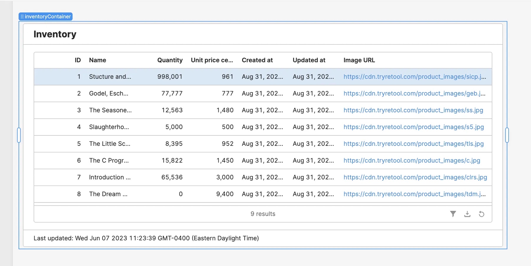
You can show or hide headers and footers using Add-ons in the container's Inspector.
Configure multiple views
Containers support multiple views for grouping content. Only one view is visible at a time and users switch between them by changing the current view of the Container component. Switching views applies only to the body of a Container—the header and footer areas are shared across all views.
Select or drag a Container on the canvas and click + Enable multiple views in the Content section of the Inspector. Once enabled, you manage views and select which view is visible using the option list editor.
To add components to the selected view, select Add component. Each component is associated with the view in which it's contained. As you switch between views, only components associated with the current view appear.
Link to Steps or Tabs
You can link a Steps or Tabs component to a Container with multiple views, creating a Stepped or Tabbed Container. Toggle the Link to a Container setting and select a Container to link with. To unlink, toggle the option off.
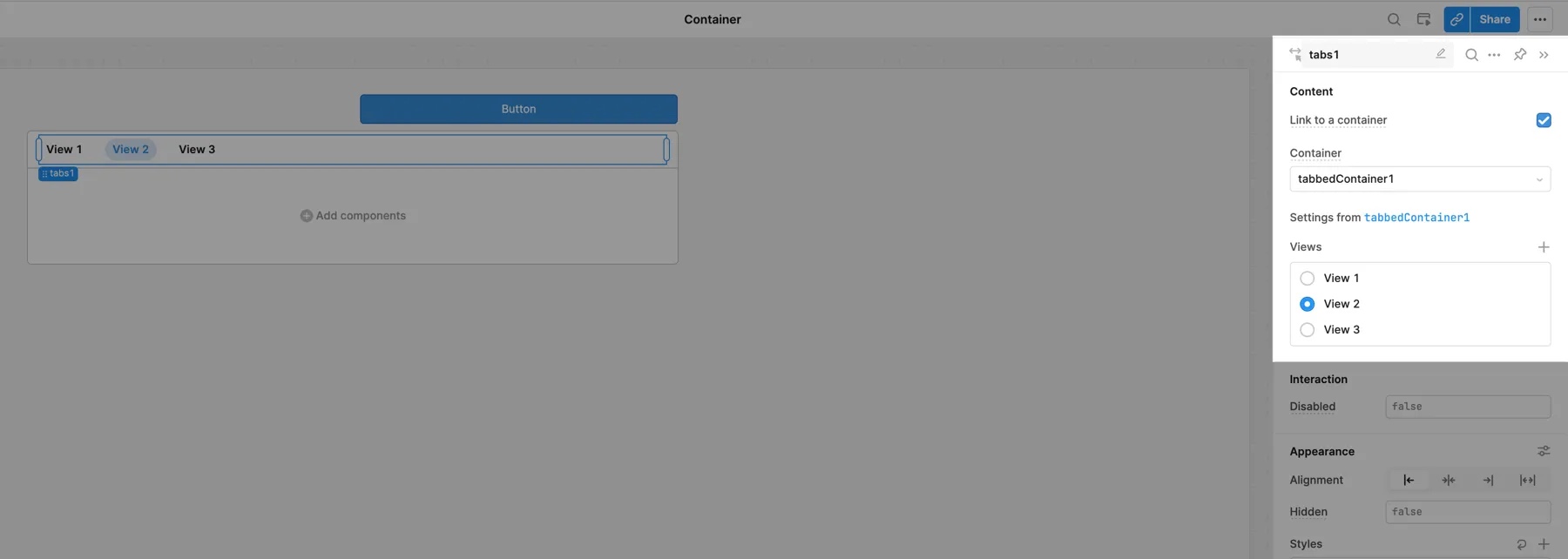
In general, Retool recommends using the preconfigured Stepped or Tabbed Containers.
Stepped Containers
The Stepped Container component combines the Steps component with a Container, allowing you to create a step-by-step flow through the Container's views. This is useful if you have a multi-step process that users must complete.
You can drag Stepped Containers directly to the canvas. The Container automatically includes a Steps component that maps to views. As you make changes to views, the steps update automatically.
You can use conditional logic to prevent users from progressing to the next step, such as an incomplete selection or missing input, or mark steps as complete.
Tabbed Container
The Tabbed Container combines the Tabs component with a Container, allowing you to create tabbed navigation for the Container's views.
You can drag Tabbed Containers directly to the canvas. The Container automatically includes a Tabs component that maps to views. As you make changes to views, navigation options update automatically.
Configure user interaction
The Interaction section of the Inspector contains settings that control user interaction, such as:
- Transition, which customizes the animations upon view change.
- Hoist loading state, which shows a loading state when inner components are loading.
- Event handlers, which listen for and handle interactions with your components.
Disable interaction
You can disable interaction with a Container by setting Disabled to a truthy value. Disabling a Container also prevents user interaction with any nested components it contains.
Switch between views
In addition to using Stepped or Tabbed Containers, you can select a Container's current view using event handlers, JavaScript, or a linked Steps or Tabs component.
Event handler
Use the Control component action and select either the Set current view key or Set current view index method.
Set views with JavaScript
You can write JavaScript (e.g., JavaScript queries or Run script event handlers) to select a view. Use setCurrentView() with the key for the view or setCurrentViewIndex() with the index of the view:
container1.setCurrentView("View 1");
container1.setCurrentViewIndex(0);
Customize appearance
You can customize the presentation of your component in the Spacing and Appearance sections of the Inspector.
All components have a Hidden setting, which you can dynamically control with a truthy value that evaluates to true or false. You can also control the hidden property for a component using the .setHidden() method from event handlers and JavaScript queries.
You can also create custom style rules using the Styles setting. Each component has different styles that you can configure, but common ones include colors, fonts, and text styles. Use app-level or organization-level themes to set these styles across all components.
Width and height
You have manual control over the width of a Container. You can configure its Height to either Auto or Fixed:
- Auto: The height grows automatically based on the content.
- Fixed: The height is a fixed size that you manually control. Scroll bars appear if the content exceeds the height.
Group components with flexible box layouts
The Stack component is a container with Flexbox-like controls. Rather than use with the 12-column grid layout, Stack arranges nested components horizontally or vertically, and provides additional controls over the layout.
The Direction setting specifies the direction that components follow within the container. Select → to arrange components horizontally or ↓ to arrange components vertically.
Stack components have additional settings for Layout and Spacing, including:
- Distribute
- Align
- Gap
- Allow wrap