Classic app IDE
Learn about Retool's IDE for classic app development.
The classic app IDE is the interface you use to build classic apps. It is available only to builders.
The IDE is made up of these primary areas:
- Canvas: Arrange components to build your app's interface.
- Navbar: Configure, preview, share and manage your app.
- Left panel: Explore components, queries, transformers, and constants.
- Right panel: Create and edit components.
- Status bar: Select the resource environment, releases, runtime, and debug apps.
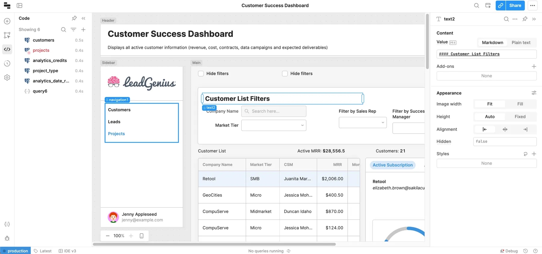
Canvas
The canvas is where you build the interface for your classic app. You drag and drop components from the left panel.
The canvas contains frames in which you can place components.
Canvas max width
To adjust the maximum width of the canvas, open the Inspector and update the Max width setting. This setting accepts pixel and percentage values, or you can set it to none so it uses 100% of the viewport. The default max width is 1200px. On desktops, regardless of the value, an 800px minimum is enforced.
Grid layout
Canvas frames use a 12-column grid layout. As you arrange or resize components, the grid becomes visible and component edges snap into position. Each frame automatically grows as you add or resize components by adding more rows to the grid.
All frames use the same fixed-height rows to ensure consistent vertical arrangement. The Main and Header frames dynamically adjust column width based on the size of the viewport, with a maximum width of 1560px. The Sidebar uses a single-column grid only so you cannot place components horizontally next to each other.
Grouping components
Retool also provides flexible components to group other components together, such as Container and Form. These components extend the 12-column grid layout so you can drag components directly into a container. This creates a group of nested components. All components can be nested in this way.
Navbar
The navbar is where you customize the IDE environment and configure high-level app settings. From here you can:
- Access the Retool navigation menu to browse apps and access other areas of Retool.
- Toggle the visibility of panels to provide more space when working in the canvas.
- Change zoom size to increase or decrease the canvas size.
- Set the name and description of your app.
- Write app documentation for users.
- Search and execute actions from the Command Palette.
- Access the app actions menu to configure the settings.
- Preview and share apps with users.
App actions
The Apps menu contains various actions and settings. Some available options include:
- Import or export an app as JSON.
- Duplicate an app or clone it as a module.
- Manage releases and history.
- Configure app settings such as themes and custom branding.
- Manage scripts and styles.
- Configure URL query parameters.
- Set custom keyboard shortcuts.
Left panel
The left panel contains several tabs for working with components, writing code, managing releases, and changing app settings.
Add UI tab
The Add UI tab allows you to search for and add components to your app. You can also add modules.
Pages tab
The Pages tab allows you to view and manages the pages in your app. You can drag and drop pages to reorder them.
Component tree tab
The Component tree tab contains a hierarchical tree from which you can select, rename, switch, or delete components. You can view and select components regardless of visibility including those within multiview containers, such as Tabbed Container component views. Selecting a component makes it visible and, where necessary, switches a container's view to make it active.
Code tab
The Code tab contains all of your classic app's resource queries, JavaScript, transformers, and variables. Selecting an item in the list opens a code editor where you can make changes. When a query is selected, there are three additional tabs displayed in the code editor.
Code search
The Code Search tab includes various options for searching through code in your classic apps. You can search within JavaScript, queries, event handlers, properties, custom CSS, URL parameters, etc. You can also configure case matching or use regular expressions to refine your searches.
General
The General tab is where you write and configure general settings for a query. Queries can typically run automatically when inputs change or run only when manually triggered.
You can write SQL queries using either SQL mode for reading data or GUI mode to write data using an interactive query builder. You can also configure query event handlers that trigger when a query runs or fails to run successfully.
To protect your data, queries that perform write or delete operations (e.g., POST API requests or GUI mode SQL queries) are set to manually triggered by default.
Response
The Response tab allows you to configure actions and conditions once a query is run. You can configure notifications or customize failure conditions.
Advanced
The Advanced tab expands on the previous tab's settings. You can configure confirmation requests, timeouts, and disable queries under certain conditions. If you configure a query to run automatically on input change, you can specify which inputs to watch. This triggers the query only when a relevant input changes.
All components appear on the desktop layout by default. The mobile layout is enabled when you configure at least one component to show on mobile. Classic apps automatically switch to the mobile layout when the viewport width is less than 600px wide.
State tab
The State tab contains details on components, queries, transformers, and global objects in your classic app. You can see more details from the sidebar by selecting individual objects. For example, component state contains its current value and all its properties.
The bottom of the window also shows the queries that a component depends on, and vice versa, which can be useful for identifying dependencies in your classic app.
Releases and history tab
The Releases and history tab allows you to view and create releases. You can also view your classic app's history, and revert to previous versions.
App settings tab
The App Settings tab allows you to change general settings like the mobile layout and user menu branding. There are additional sections for:
- Custom components
- Custom CSS
- Preloaded JavaScript
- Libraries
- App theme
- Notifications
- Localization
Assist tab
The Assist tab allows you to use AI to generate classic apps, make changes to existing apps, and ask questions about Retool.
For more information, visit the Assist guide.
Inspector
The Inspector, located in the right panel, contains app and component settings. This is the panel you most interact with when building classic apps. When a component is selected, this is where you set values, update component names, create event handlers, etc.
Settings are organized into different sections, such as Content, Interaction, and Appearance. As some components have many configurable properties, some optional and less frequently used settings are grouped into subsections to reduce clutter. For instance, the Add-ons section contains settings for prefix and suffix text.
App Inspector
The App Inspector appears when you don't have a specific component selected. It contains settings related to the classic app as a whole, such as URL, shortcut, and max width settings. Open the App Inspector with one of the following actions:
- Click on the dark grey border around the canvas.
- Click on blank parts of the Component Tree or Pages panel.
- Clicking on the key when a component on the canvas is selected.
Status bar
The status bar contains options to:
- Switch environments to change the data in use.
- View releases.
- Access Debug Tools to troubleshoot issues.
- Get help and submit breakage reports.