Design and usability

Learn how to customize the style of your apps and enhance their usability.

You can control the appearance of your apps with custom style options you configure per-app or shared across your organization as custom themes. Retool also provides numerous usability features to further enhance your user's app experience.

Customize style options

📘

Components inherit style options from either a parent component (if nested) or the current app theme. You can override style options directly as needed.

You can customize the style of each component, or the Header and Main frames in the canvas. Select the component or frame to customize, then use the Style section in the Inspect tab of the right panel. There are different style options, such as color or border radius, depending on the type of component or the frame.

Color is one of the most effective ways to communicate status or severity to your users. You can set custom color options using the color picker or entering a valid CSS color value. You can also select a color from one of the current theme's default colors.

As with other settings, you can write JavaScript to conditionally set style options. For example, you can customize the background color of a Number Input component based on whether its value is less than or greater than 100 using {{ numberInput2.value < 100 ? 'red' : 'blue' }}.

Themes

🚧

Themes are only available on the Business and Enterprise plans.

You can create and manage custom themes from the Themes section in your organization settings. Click on your User menu on the upper-right and select Settings.

Access settings for your organization

Create themes

Click Create new and enter a name. You can then select an existing Retool theme from which to start. Our themes are optimized for high-contrast use.

Create a new theme

The theme editor displays a live preview of your style options and how they apply to your apps. Style options are broken down into different sections:

  • Brand colors: The primary and additional colors for your app.
  • Surface colors: The colors for the Header and Main frames in the Canvas, and components that contain other components or data (e.g., Container and Table components).
  • Status colors: The colors for certain interactive components, such as Alert and Button.
  • Automatic colors: The colors used by components that support deterministic color assignments (e.g., the Tags component).
  • Border radius: The default border radius for components.

Theme editor and preview

Manage themes

You can set a default theme that applies to all apps by default, duplicate an existing theme, or delete a theme at any time. Click the ••• button to bring up theme options.

Editors can always override the theme in each app from the ••• App actions menu. Any apps using a deleted theme revert to your organization's default theme. If you delete the default theme, apps revert to Retool's default style instead.

Apply custom branding

🚧

Custom branding is only available on the Enterprise plan.

You can use custom branding to customize headers, sign up and login pages, and email invites for users. Use the Branding section of your organization settings to upload a logo and set the header background color.

Once set, custom branding is visible to anyone using your organization's apps in user mode.

Override CSS

🚧

We strongly recommend using Retool's built-in style and theme options whenever possible. Class names and DOM structure may change as new features are added that could break custom style overrides.

You can provide custom CSS to override Retool's default style rules on a per-app basis. Click the ••• App actions menu and select Scripts and styles.

You can also provide custom CSS that applies to all apps from the Advanced section in your organization settings. Navigate to your organization's settings, then click on your User menu on the upper-right and select Settings.

Retool component class names are unique and use the format _retool-[component name]. For example, the class name of the textInput1 component would be _retool-textInput1.

Usability features

Retool includes a number of additional features to enhance the usability of your apps. These options include additional context or personalization, text and data formatting, notifications, and query confirmations.

Adjust the look and feel of inputs

📘

Refer to the Component Library for a complete reference of all components and the settings they support.

Most input components, such as Text Input, support a number of settings that help you provide your users with greater context.

  • Placeholder: A placeholder appears within the input when it doesn't have a value.
  • Label: A label appears next to the component. You can also include a caption to provide further context.
  • Adornments: You can enhance inputs with prefix and suffix text or icons, tooltips to display further context when the mouse hovers over the input, and helper text that appears when an input is in focus.

Input adornments

Available settings appear in the Inspect tab in sections like Label and Adornments.

Display formatted data types

Certain components, such as Table, allows you to format the contents based on the data it contains—such as currencies or email addresses. For example, you can format a column of dates to use a Column type of Date. This allows you to customize the date formatting or even adjust the date shown to match the user's local time zone.

Configure column type

Personalize apps to the current user

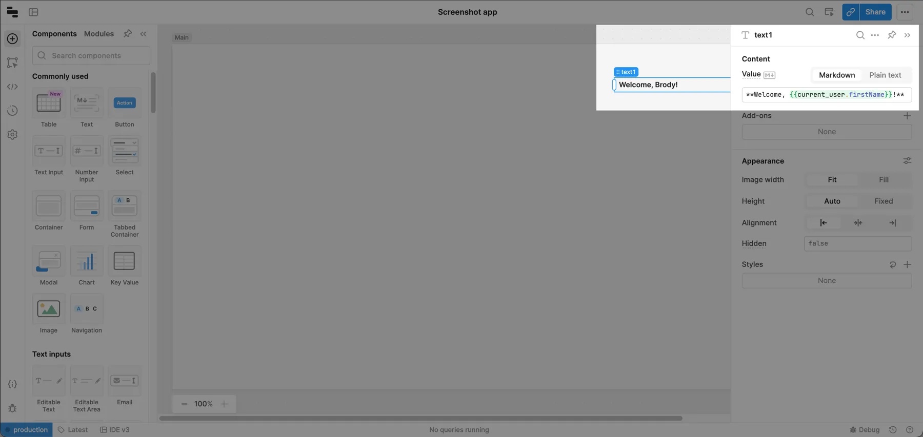
Retool apps have access to global variables, such as current_user, which allows you to personalize the app. For example, you can include a welcome message that displays the user's name with Welcome {{current_user.firstName}}!.

Markdown text with built-in user variables

Write formatted text with Markdown and HTML

You can use Markdown or HTML across a number of surfaces to include rich text or images. Retool renders Markdown and HTML where available. Refer to the Markdown and HTML reference for more information and to preview how this works.

Trigger notifications

You can set up notifications using event handlers that are triggered in response to any supported event. Add a new event handler using the Interaction settings in the Inspect tab, then select Show notification as the action.

Configure notification

In addition to the title and description, you can specify the Type of notification by selecting from the list or dynamically with JavaScript. This represents the severity of the message and changes the color used. You can also control the duration for which notifications are shown before being dismissed.

You can also trigger notifications with JavaScript using utils.showNotification() .
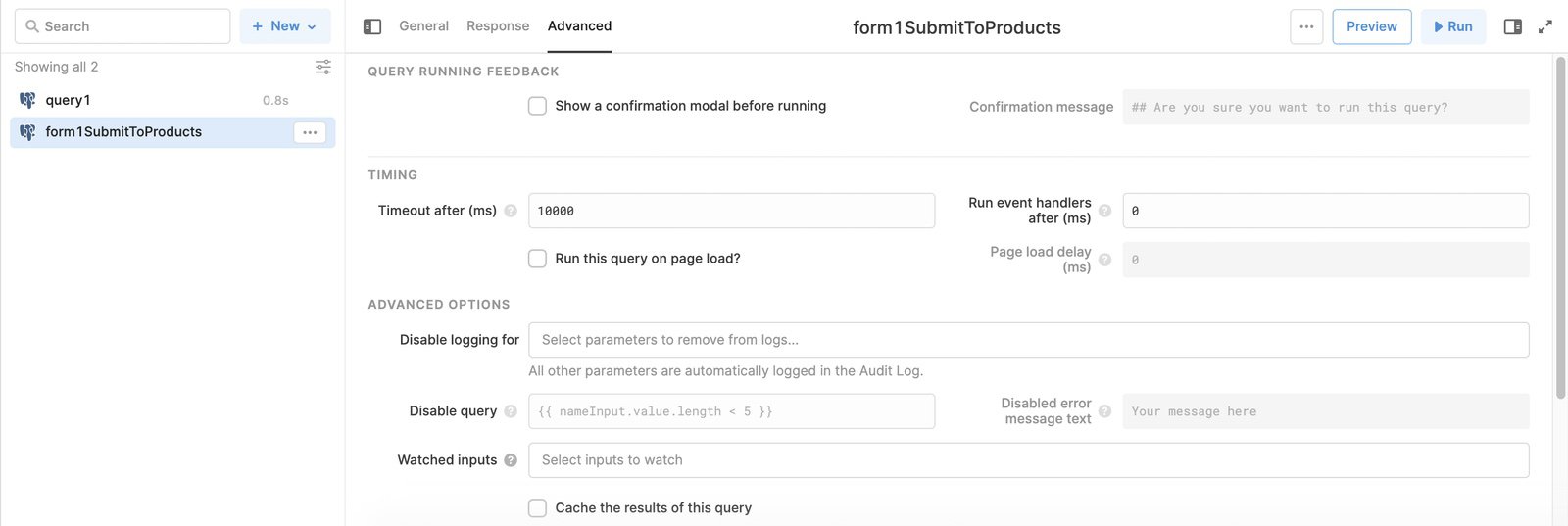
Ask for confirmation before running a query

Queries that write or delete data can display a confirmation message before they run. You can enable this in the Advanced tab of a selected query.

Query confirmation