Retool apps quickstart
Learn about the fundamental concepts of Retool apps.
This guide serves as an introduction to Retool apps. It covers many of the concepts and terminology you will come across as you build apps using the web-based IDE. After reading this page, you should have a good understanding of the fundamentals for building Retool apps.
Retool officially supports the latest stable releases of the following desktop web browsers:
Editing apps in alternative browsers, on mobile devices, or using beta and nightly builds is not officially supported.
Assemble the interface
A Retool app's user interface is comprised of components, pages, and frames. These interface elements function as objects with internal state.
- Components are interface elements, such as a text input field or a table, with which users interact.
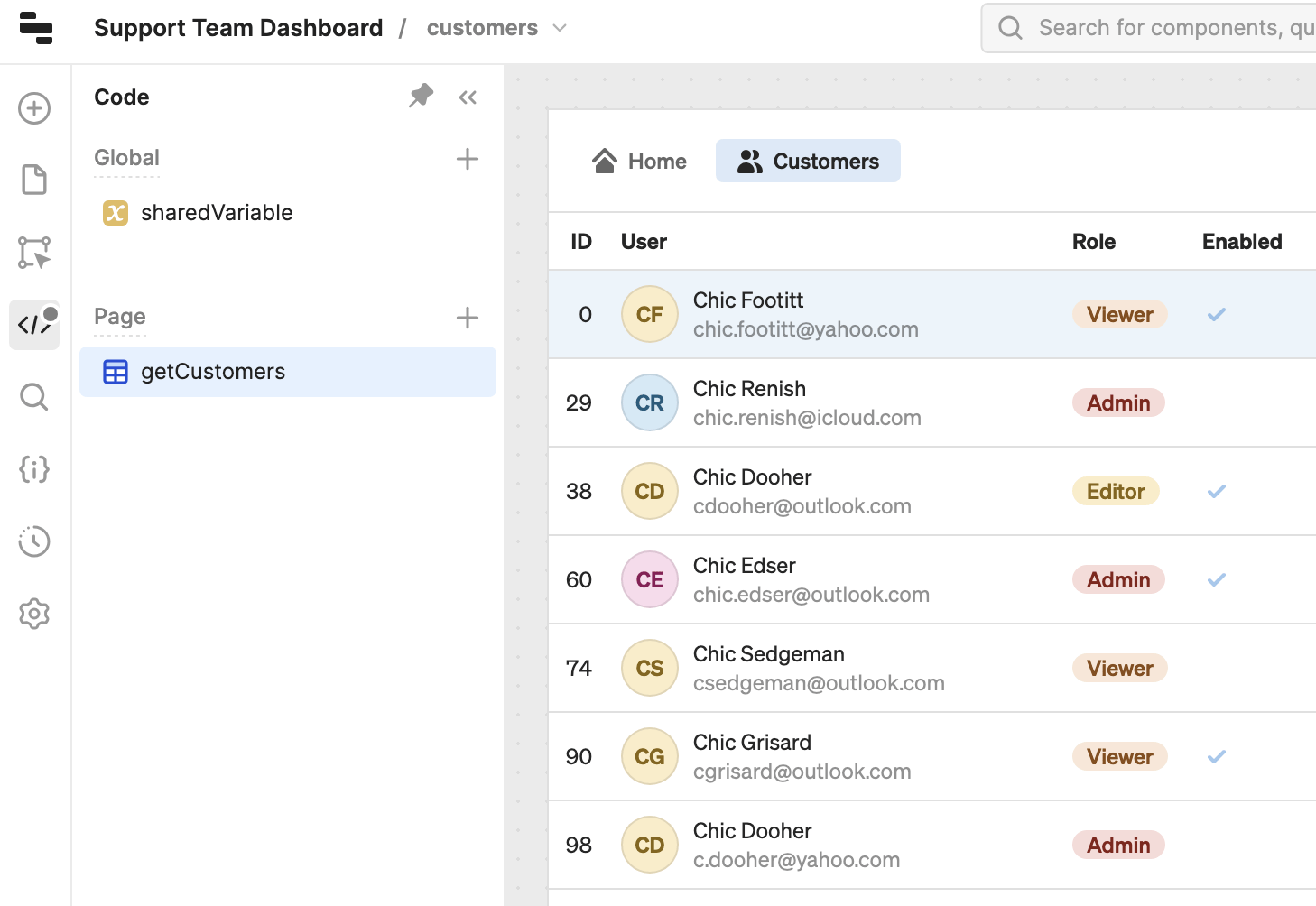
- Pages are separate sections that contain their own code, frames, and components. Users navigate between pages which are often used for distinct use cases. For example, a customer support app might have separate pages to retrieve order information, check inventory, and process refunds.
- Frames are distinct areas of the canvas in which you add components. They provide you with flexible layout options for arranging your app's user interface. You can add frames to pages or use them globally.
Retool exposes properties, methods, and events with which you can interact. As you interact with components, their properties change. For example:
- Entering text into a Text Input component changes its
valueproperty value. - Closing a Drawer frame sets its
hiddenproperty value totrue.
You also write code that interacts with data, transforms values, or controls behavior using JavaScript methods. For example:
- Use
setValue('Jenny Appleseed')to set thevalueproperty value of a Text Input component to Jenny Appleseed. - Use
setHidden(true)to set thehiddenproperty value of a Drawer frame totrue.
Components
You use Retool's drag-and-drop component library in the IDE to assemble and configure an app's UI. You position components anywhere on the canvas of a selected page, and can adjust their position and size.
Pages
Retool only evaluates a page's objects when the page is currently in view. This allows for apps to serve multiple functions without impacting performance.
The Pages tab contains a list of pages within the app. The default page is the one that first loads when launching the app. You can explore and manage all pages, change the default page, and view more details.
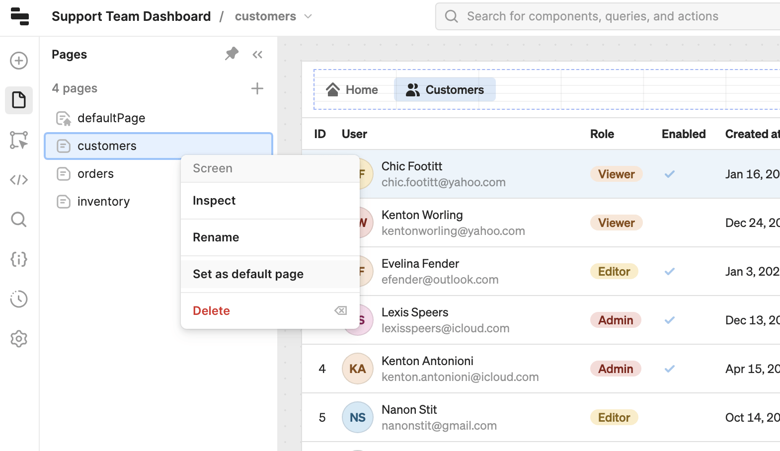
Explore pages.
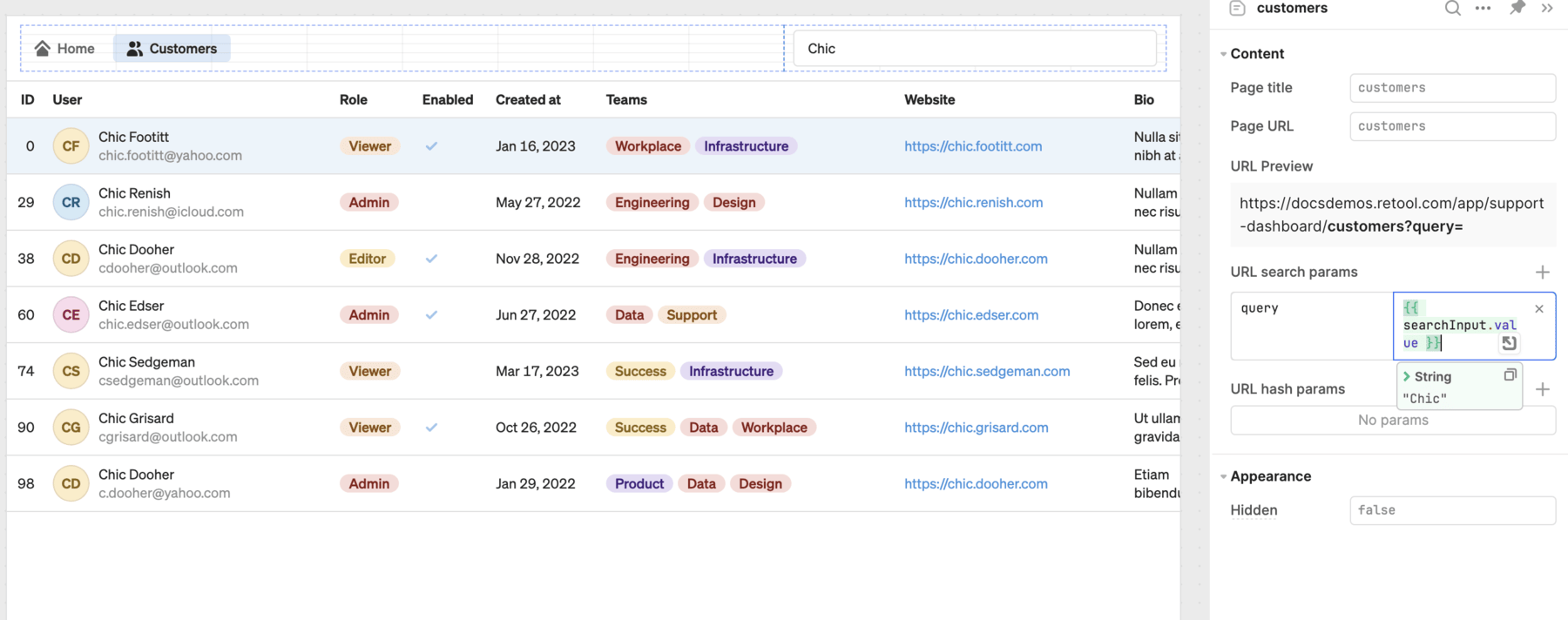
Each page has a title and URL that you configure from the Inspector. The page URL is appended to the app URL and allows for deep-linking to specific pages. For example, a page with the URL of customers would be available at https://example.retool.com/app/support-dashboard/customers. Accessing the app using this URL would then bypass the default page.
Configure page settings.
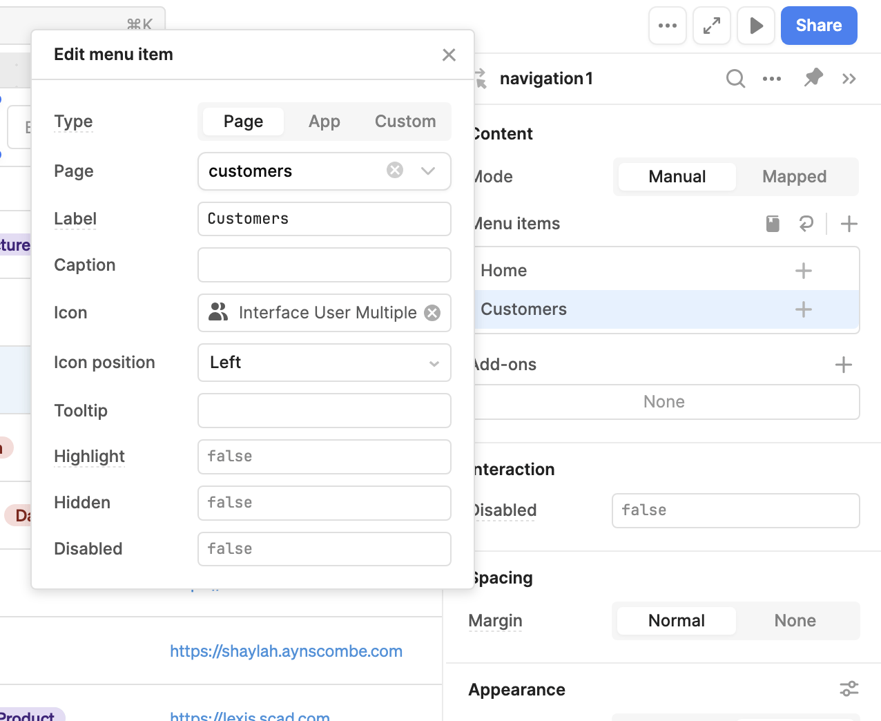
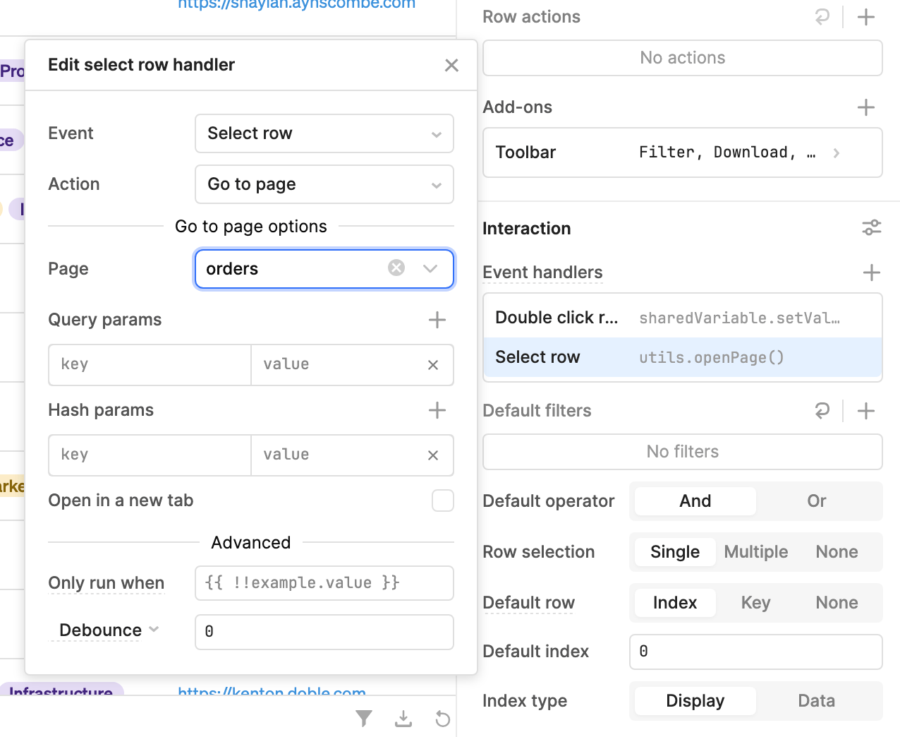
The Navigation component, when added to an app with multiple pages, dynamically generates navigation items for each page. If you want to switch pages using another method, you can configure any event handler with the Go to page action, such as a button click.
The Header or Sidebar frames contain a Navigation component by default that's configured for page navigation when enabled in an app with multiple pages.
Frames
The following demo shows an app that utilizes all types of frames:
Frame types
The following sections outline the different frame types.
Header frame
The Header frame allows you to build a header for your app. Once enabled, it initially contains a Navigation component to create a horizontal navigation menu.
This frame is globally-scoped and persists across all pages.
Sidebar frame
The Sidebar frame is primarily for building navigation into your apps. On first use, it initially contains the following components:
- An Image component with a default logo.
- A Navigation component.
- An Avatar component.
You can drag any components into the Sidebar frame the same way as the Header and Main frames. As the Sidebar frame is designed to appear vertically, it has specific size and layout constraints:
- Fixed 240px width.
- Positioned to the left of the Main frame.
- Rendered below the Header frame (if visible).
The Sidebar frame is also optimized for mobile. It is hidden by default when viewed on a mobile device and is accessible using a menu button that is automatically included. When pressed, the Sidebar frame slides into view.
This frame is globally-scoped and persists across all pages.
Drawer frame
The Drawer frame adds a slide-out container to the right side of your app. It's commonly used to display forms, or detailed data for a particular item, user, or product.
You can open the Drawer frame using event handlers on components such as Button, Table, or List View.
Split Pane frame
The Split Pane frame adds a resizable canvas adjacent to the main frame. It can be used to display a detail view relative to the main frame or split the app for multitasking.
You can open the Split Pane frame using event handlers on components like Button, Table, List View, and so on.
Modal frame
The Modal frame adds a popup window to your app. You could use this frame to display information to users before they access your app, or to complete authentication using the Auth Login component.
You can open the Modal frame using event handlers on components like Button, Table, or List View.
Global and page scopes
Apps use global and per-page scopes for components, frames, and code.
- Globally scoped objects can be referenced across multiple pages. Retool continually evaluates globally scoped objects regardless of the page currently in view.
- Page-scoped objects can only be referenced within the same page. Retool only evaluates page-scoped objects when the page is currently being viewed.
Globally scoped objects
You can create Global code (e.g., resource queries or variables), which all pages can reference. Each page can interact with globally scoped code to trigger queries, set variable values, etc. For example, if you were building a customer support app then you could use a single globally scoped query to retrieve customer information rather than duplicate the same query across multiple pages.
You can drag code to either the Global or Page section in the Code pane to change its scope. You can also move code across pages using the Move to page contextual menu action.
The Header and Sidebar frames are also globally scoped and persist across all pages. Any components within these frames inherit this behavior and are globally scoped. All other frames (e.g., Modal and Drawer) are page-scoped and only available within the app in which they reside.
All pages and their contents can reference globally scoped objects. Globally scoped objects, however, can only reference other globally scoped objects. For instance, a globally scoped query cannot reference a properties for a component in a page.
Page-scoped objects
All code and components within a page are page-scoped, and cannot be referenced by other pages. If a page contains code or event handlers that would run on page load, these run whenever you switch to the page.
Connect interface elements together
Many page, component, and frame properties are editable. You configure them in the IDE with either static values (string, number, boolean, array, and object) or reference other property values using {{ }} , similar to the use of template literals.
You reference property values using dot notation. In the following example, The Default value setting in the IDE references {{table1.selectedRow.name}}. As a result, {{textInput1.value}} always corresponds to the name from the selected table row.
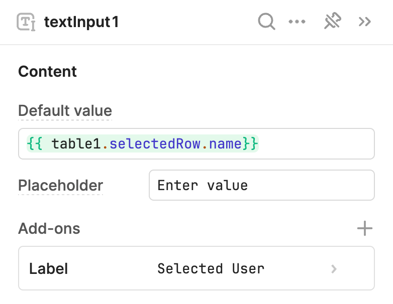
The Text Input component references {{table1.selectedRow.name}} to display the selected user.
Use JavaScript expressions for values
Retool performs string interpolation and evaluates {{ }} embedded expressions as JavaScript. As a result, you can write JavaScript code—that evaluates and returns a value synchronously—almost anywhere. This enables you to dynamically set property values using transformations or conditional logic to build complex apps.
Explore some common JavaScript expressions using the examples below.
- Truthy statement
- Ternary operator
- Data transformation
The Alert component's Hidden (hidden) property in the IDE uses a truthy statement that evaluates as true if the user is a member of the Sales team. Using ! at the start of the expression inverts the returned value from true to false. As a result, the alert only appears when a Sales team member is selected.
{{ !table1.selectedRow.teams.includes("Sales") }}
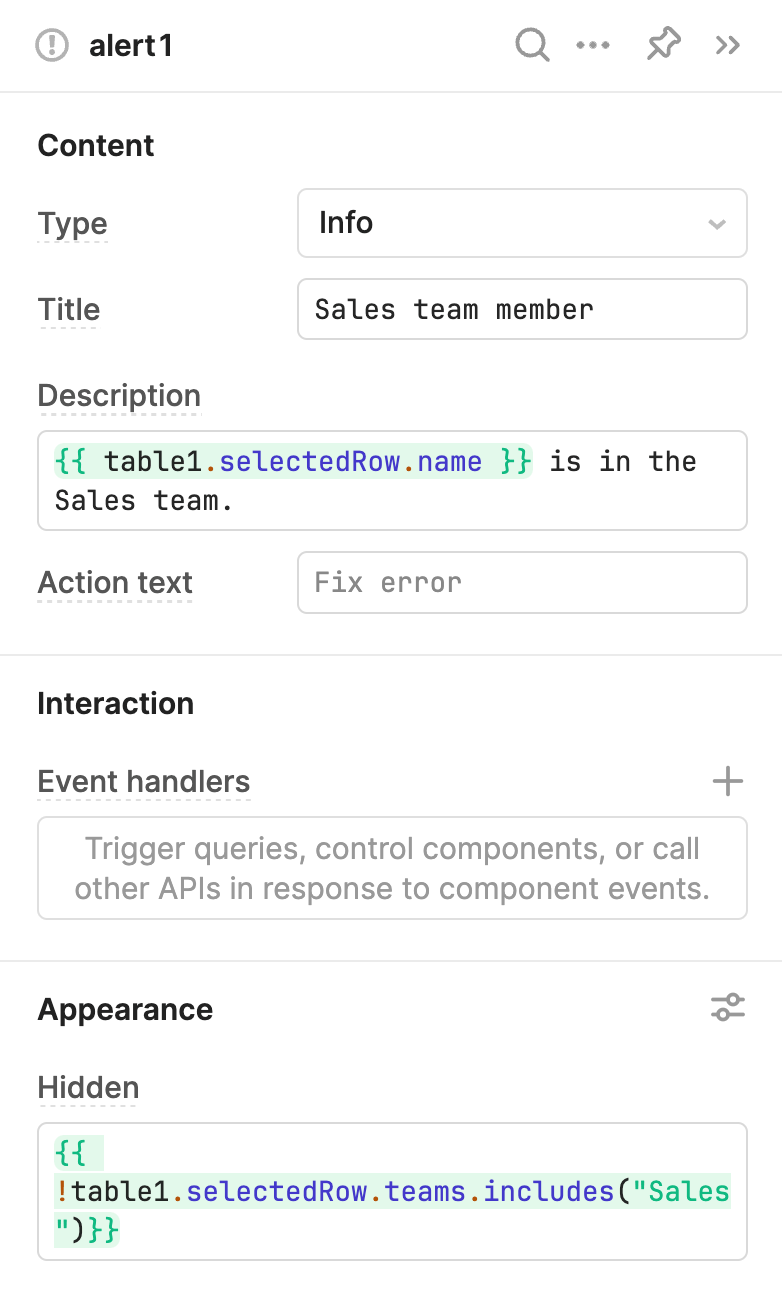
The alert is hidden when the statement evaluates as true.
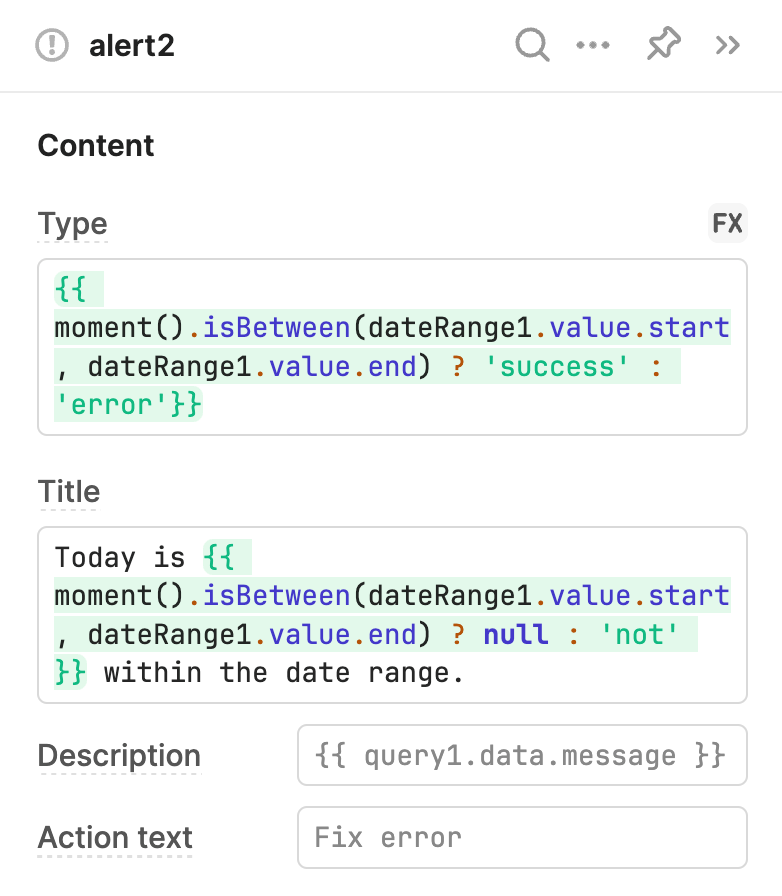
The Alert component's Type (type) and Title (title) properties in the IDE use conditional logic to determine what value to use. If the date range doesn't include today's date, the alert changes.
// Type
{{ +  moment().isBetween(dateRange1.value.start, dateRange1.value.end) ? 'success' : 'error'  + }}

// Title
Today is {{ +  moment.isBetween(dateRange1.value.start, dateRange1.value.end) ? null : 'not'  + }} within the date range.
The Table component's Data source (data) property in the IDE uses slice() to retrieve an index range from the listUsers query. The start and end values are determined by the Range Slider component. Adjusting the range automatically runs the query and updates the table.
{{ + listUsers.data.slice(rangeSlider1.value.start,rangeSlider1.value.end) + }}
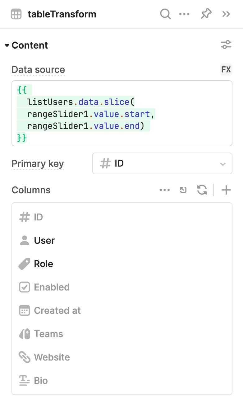
The expression used in Data source uses slice() to only include a specified range of items from an array.
Connect your data using resources
A resource is a saved set of user-configured properties that determines how Retool connects to a data source, such as a PostgreSQL database or REST API. You create a resource for each data source you want to use with Retool, then write queries to interact with them.
Each resource has configuration options that Retool uses when interacting with a data source. This simplifies how you query data sources while ensuring access is secure.
When a resource query is run, Retool proxies the request to the data source, server-side, using the resource's configuration settings. This means only Retool directly connects to a data source, not your users.
When a resource query runs, Retool proxies the request to the data source, server-side, using the resource's configuration settings. This method ensures only Retool directly connects to a data source, not your users.
Retool abstracts away all of the complexities when connecting to a data source from your users. They only need to select the resource to use when writing a query. The type of data source is also displayed but your users only need to specify the resource. In addition, you can connect different data sources of the same type. For example, you can add multiple Amazon S3 buckets as different resources to distinguish their usage.
With this approach, users don't interact directly with your data sources. Retool avoids any client-side connections to the data source that could expose credentials and ensures all interactions use the same conditions. Resources also make query caching possible, which allows Retool to serve cached data and reduce the number of requests to a data source—potentially reducing costs.
Read and write data using queries
A query is a piece of code you write to interact with a resource and perform CRUD operations. As with components, queries maintain an internal state and expose properties. Queries can also perform asynchronous actions and run simultaneously with other queries.
Queries are not part of an app's user interface. You reference the query's data property to read and display data in components for which users can interact. Queries can also reference component input values and write them back to the data source.
- Read data
- Write data
The Table component's Data source (data) property in the IDE is set to query1. Running the query retrieves the specified data in the query statement, which is then displayed in the table.
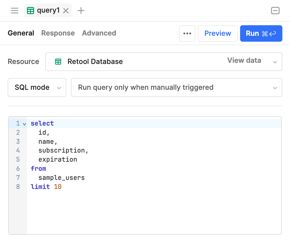
A resource query to retrieve data from a table.
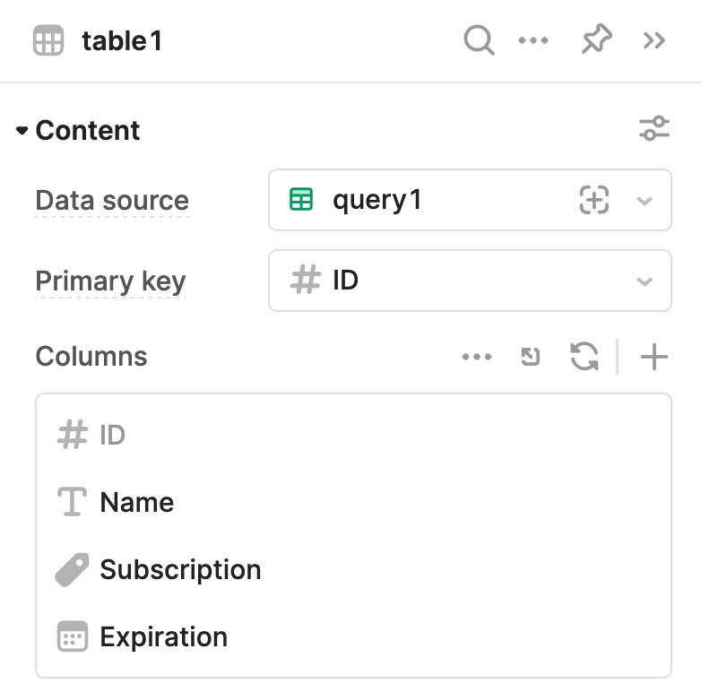
The Table component's Data source is set to reference the resource query.
query2 is set to update or create a record into the sample_users table. It uses a specified id to determine which record to update. Running the query updates or creates a record using the input values available in {{form1.data}}.
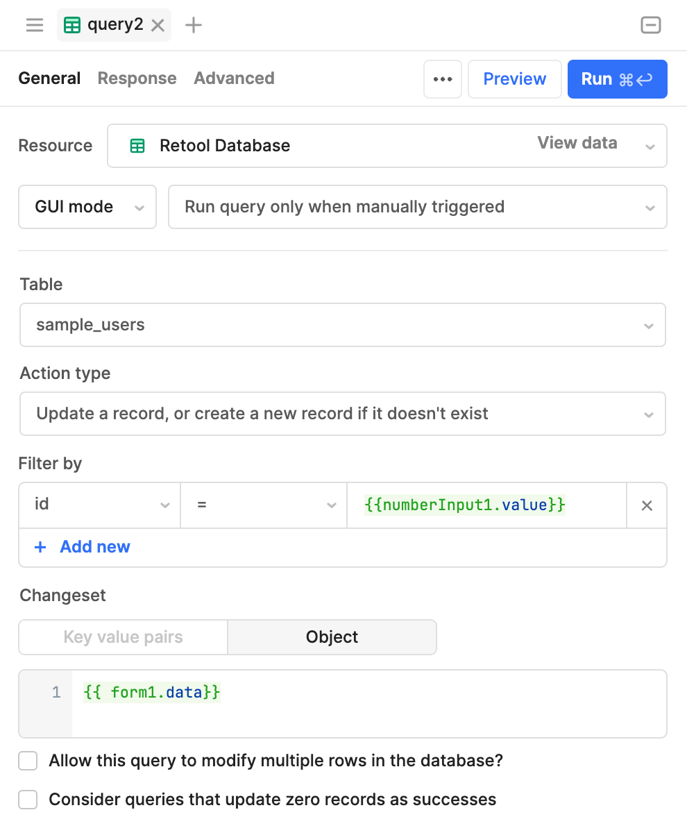
A GUI mode query to update or create a record.
Connect the interface and code together
Retool maintains a dependency graph for each app. This represents all property values and where they're referenced. Whenever a property changes, all downstream references using embedded expressions automatically update. This is similar to how spreadsheet formulas work when referencing cell values; if a referenced value changes then the formula instantly updates its result.
The Component tree and Code panels contain the Graph pane. This visualizes the dependency graph for a selected component or query. You can use the graph to view the relationship between the selected component or query and its immediate dependents.
Hover the cursor over the connecting points to display a tooltip with a list of dependencies and dependents.
You can chain embedded expressions together by referencing values that also use embedded expressions. Any input value changes automatically propagate through the entire app. This makes it possible to build powerful applications with very few lines of code.
The dependency graph enables Retool to prevent you from creating circular dependencies, where two or more properties rely on each other to function. If you attempt to reference values that rely on one another, the IDE displays a warning.

A circular dependency warning.
The following example demonstrates how the dependency graph connects components and queries together within an app. The resource query references {{textInput1.value}} and runs automatically whenever this value changes. The table references {{query1.data}} and displays updated results in real-time.
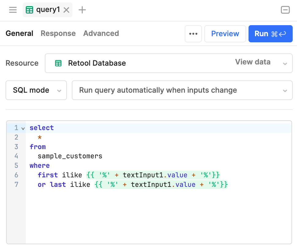
The resource query references {{textInput1.value}} and runs whenever it changes.
Control and run queries with event handlers
You configure event handlers to perform actions whenever a specific event occurs, such as a button click or query error. There are numerous actions available, such as setting component values and triggering queries.
The following example uses an event handler to display a notification whenever a Saturday or Sunday is selected in the date input field.
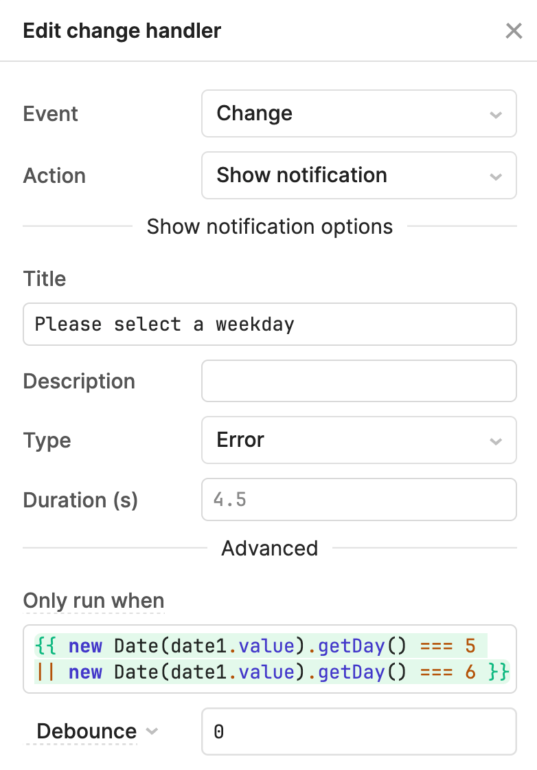
The event handler shows an error notification when a date is selected, but only runs if the specified day is a weekend.
Transform data using JavaScript transformers
While you can use JavaScript within {{ }} embedded expressions, you may need to manipulate data and implement complex logic to produce values, such as filtering or joining data sets.
A JavaScript transformer is a reusable block of JavaScript. You reference property values using embedded expressions and the results of the transformation are output on the transformer's value property using a return statement.
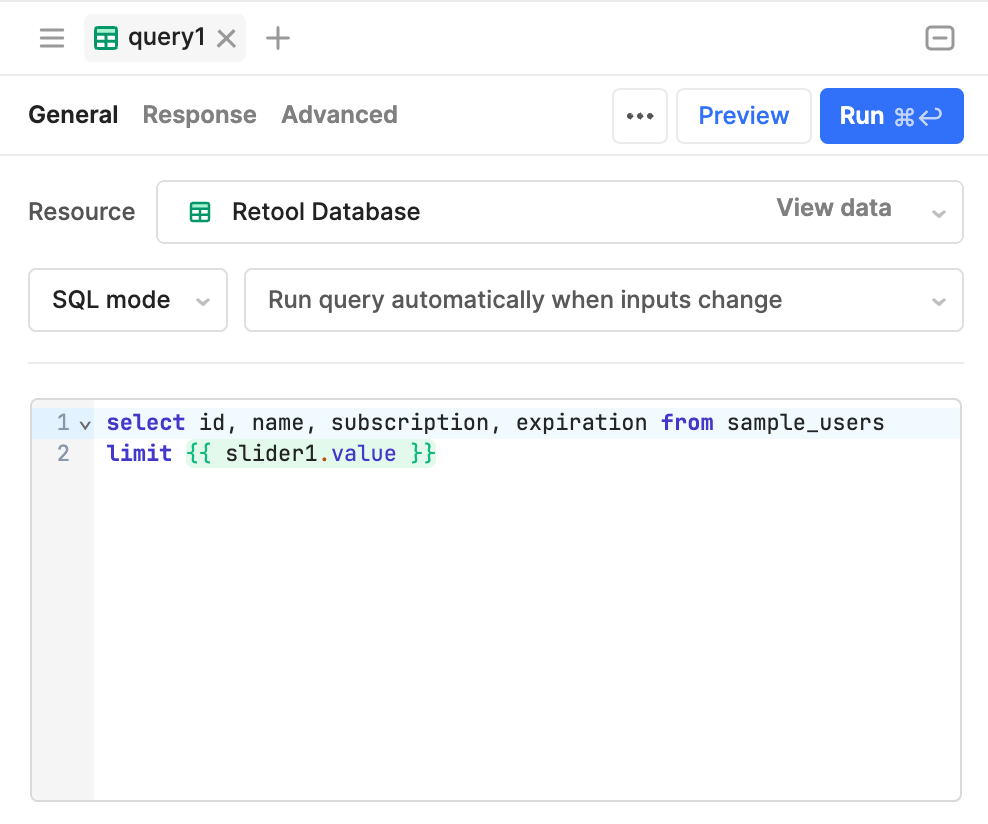
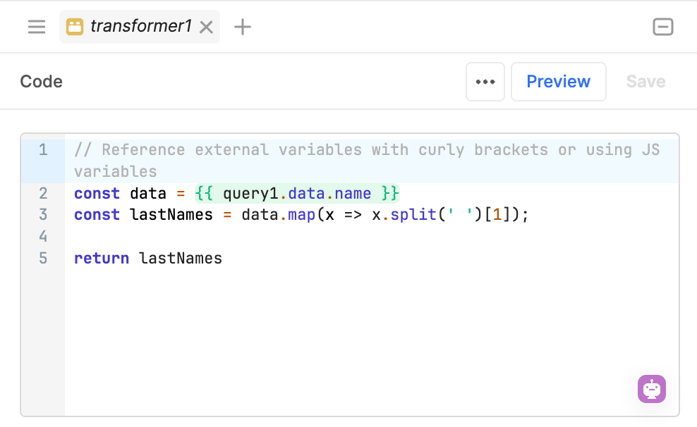
The following example uses a JavaScript transformer to split a list of names into first and last names. The Listbox component references {{transformer1.value}}, which provides an array of last names.
The resource query runs whenever the limit is changed.
The transformer references {{query1.data.name}}, splits the full name, and returns the last name. It updates whenever the query data changes.
Transformers are maintained by the dependency graph and continually output a transformed value. If you make changes to any values in the dependency chain, the transformer automatically updates.
If you only need to transform query data, you can include transformation code directly in the query. The transformed data is then made available in the query's data property.
Script apps with JavaScript
You can write JavaScript code to control app behavior, set property values, and more. Components and queries are globally scoped and include built-in methods to control their state. These methods can accept supported parameters, such as string or index values. In either case, you only need to use standard JavaScript notation, not {{ }} embedded expressions.
JavaScript queries can output data using a return statement.
The following example adjusts the selected date by a specified number of days, then sets this as the value for the calendar.
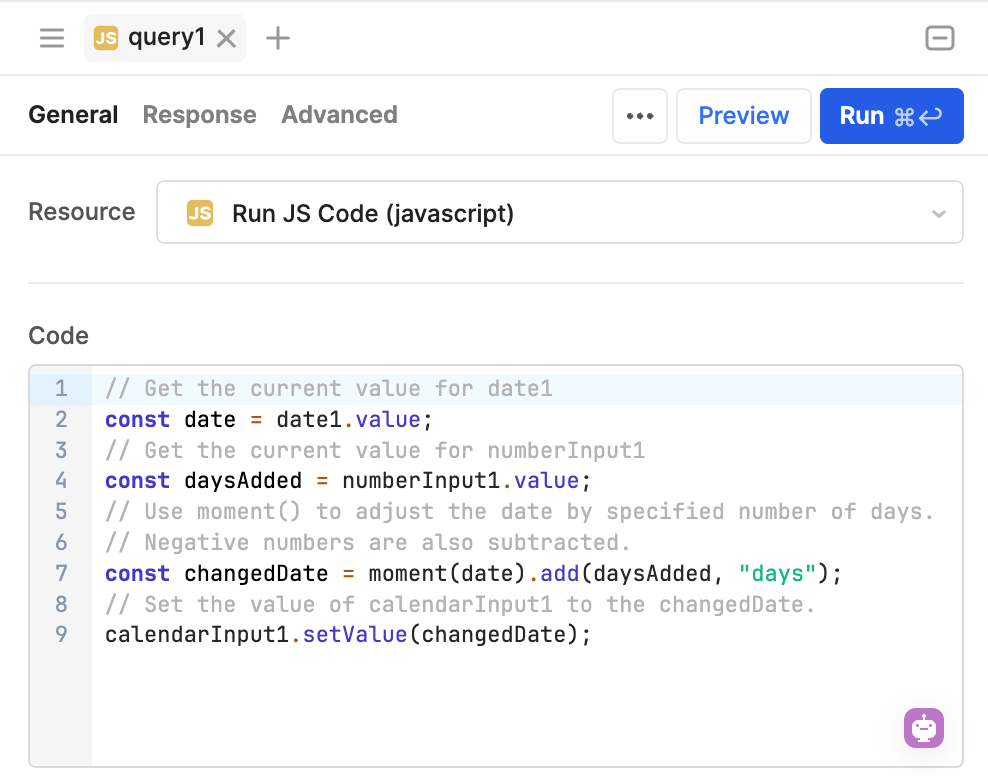
The JavaScript code adjusts the selected date by the specified number of days, then uses setValue() to set the value of calendarInput.
Embed content and build custom components
Retool's component library contains over 100 UI components, from input fields to image grids. For complex use cases that require UI components not currently provided, you can embed custom content or build a custom component. These components also have state and you can use {{ }} embedded expressions.
- HTML: A container for custom HTML and CSS code.
- IFrame: An embedded web page that supports permissions to allow or deny downloads, form submissions, microphone and camera access, and popups.
- Custom Component Libraries: A library of custom-built, embedded components using React and TypeScript. Build once and then deploy into any app.
The following example demonstrates the HTML component.
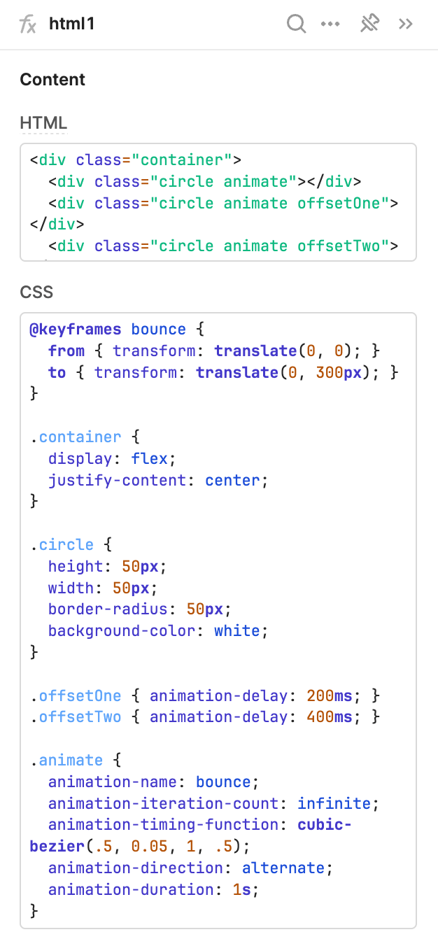
HTML component example.
Wrap up
Using these fundamental concepts, you can build complex web apps that:
- Contain polished user interfaces that can adapt to your needs.
- Dynamically reference values anywhere using dependency chains.
- Connect with almost any API and database to interact with your data.
- Perform actions using conditional logic in response to user events or script apps to control behavior.
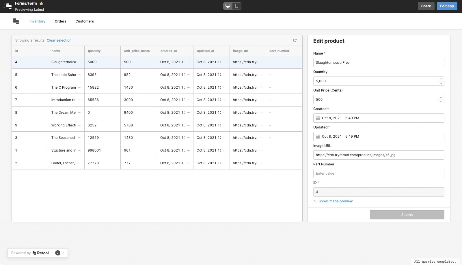
The following example combines these concepts to create a user subscription dashboard that can filter, search, and edit users. Selecting a user in the table opens the Drawer frame with input fields prefilled with the selected row data.