Display data with Collection mobile components
Learn how to customize the design and layout of Retool Mobile apps.
You can present data using Card Collection and List Collection components that dynamically map data and display it using prebuilt layouts. These components use Mapped options settings in the Inspector to configure item properties and how they appear.
Display cards
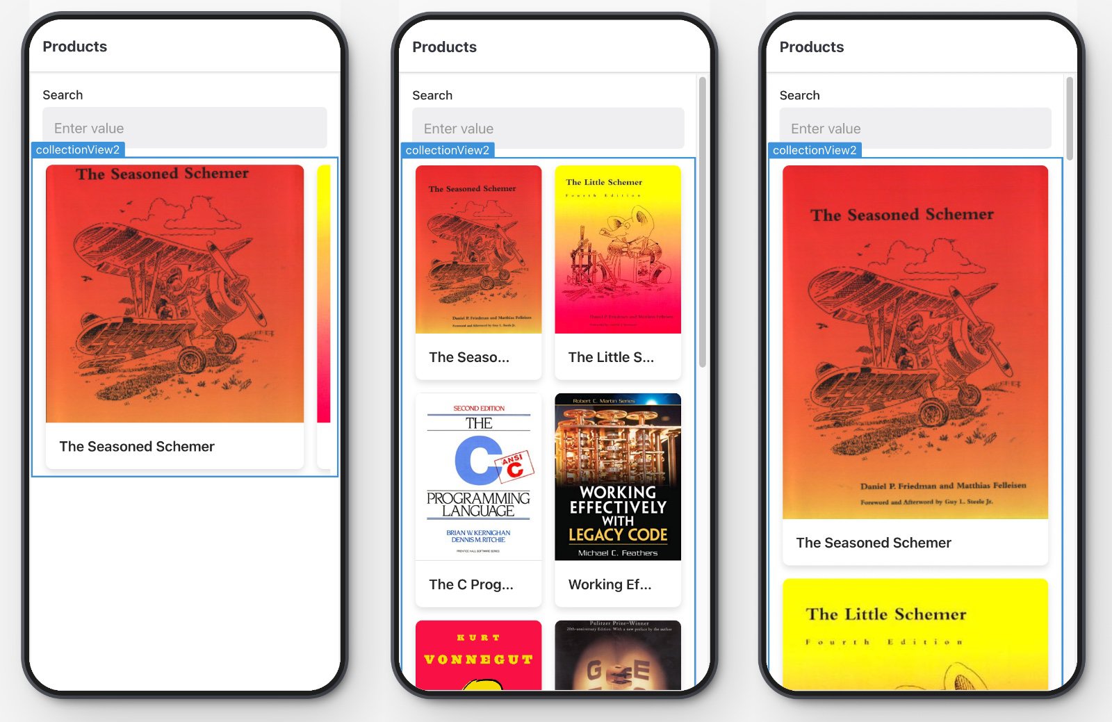
The Card Collection mobile component display items in a card layout. It combines an image or icon with text information.

You can control the appearance of cards using the Data Layout settings in the Inspector. Options include:
- Style: Flat renders cards without a background and applies rounded corners to images. Elevated renders cards with a distinct border, shadow, and padding.
- Scroll: Vertical renders cards in a vertically scrolling column. Horizontal renders cards in a horizontally scrolling row.
- Size: Full renders full-size cards. Half renders half-size cards. If Scroll is set to Vertical, cards are displayed as either a single column or two-column grid.
You can also configure the image dimension ratio, such as 1:1 or 4:3 to display images to best fit your needs.
Display lists
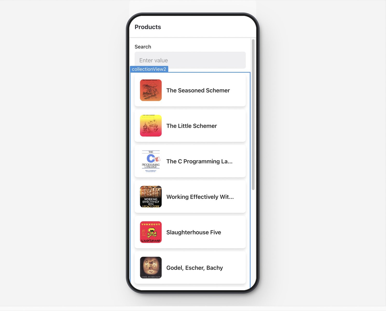
The List Collection component renders each row of data using a list layout. It combines an image or icon with text information.

You can control the appearance of list items using the Data Layout settings in the Inspector. Options include:
- Style: Flat renders list items with no margin or background, and can include an optional separator between list items. Elevated renders list items with a distinct border, shadow, and padding.
Assemble a custom collection
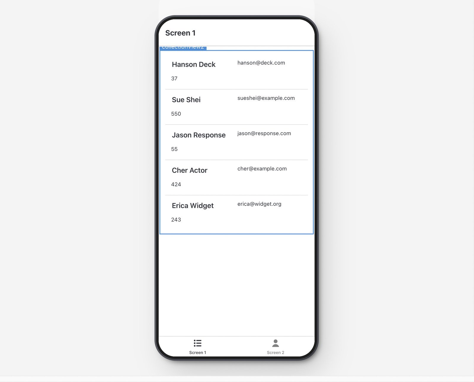
The Custom Collection mobile component allows you to build your own collection using other mobile components. This gives you control over which mobile components to include.

You add mobile components to a Custom Collection by clicking the + button or dragging them into the collection. You also use item and i to reference the current data source and set these as values for each mobile component.
Select collection items
You can configure event handlers to trigger an action when a user selects a collection item, such as navigating to another screen or triggering a query. When a user selects an item, the item's data is stored in the collection's selectedItem property. This allows you to use details about a selected item elsewhere.
For example, each item contains a URL, item.url, to a web page that should open when selected. To achieve this:
- Select a collection and click + Add in the Interaction settings to add an event handler.
- Set the Action to Open URL
- Set the URL to
{{ self.selectedItem.url }}
When an item is selected in a collection, the mobile app opens the web page using the URL of the selected item.