Getting started with frames
Learn how to use frames to organize content in an app.
Frames are special containers that enable you to divide and manipulate the app viewport in different ways.
All apps contain a Main frame, which takes up the entire canvas area by default.
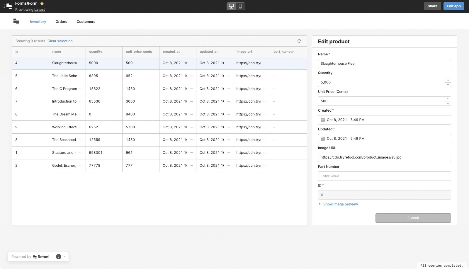
The following demo shows an app that utilizes all types of frames:
Frame types
The following sections outline the different frame types.
Header frame
The Header frame allows you to build a header for your app. Once enabled, it initially contains a Navigation component to create a horizontal navigation menu.

This frame is globally-scoped and persists across all pages.
Sidebar frame
The Sidebar frame is primarily for building navigation into your apps. On first use, it initially contains the following components:
- An Image component with a default logo.
- A Navigation component.
- An Avatar component.
You can drag any components into the Sidebar frame the same way as the Header and Main frames. As the Sidebar frame is designed to appear vertically, it has specific size and layout constraints:
- Fixed 240px width.
- Positioned to the left of the Main frame.
- Rendered below the Header frame (if visible).
The Sidebar frame is also optimized for mobile. It is hidden by default when viewed on a mobile device and is accessible using a menu button that is automatically included. When pressed, the Sidebar frame slides into view.
This frame is globally-scoped and persists across all pages.
Drawer frame
The Drawer frame adds a slide-out container to the right side of your app. It's commonly used to display forms, or detailed data for a particular item, user, or product.
You can open the Drawer frame using event handlers on components such as Button, Table, or List View.
Split Pane frame
The frame adds a resizable canvas adjacent to the Main frame. It can be used to display a detail view relative to the main frame or split the app for multitasking.
You can open the Split Pane frame using event handlers on components like Button, Table, List View, and so on.
Modal frame
The Modal frame adds a popup window to your app. You could use this frame to display information to users before they access your app, or to complete authentication using the Auth Login component.
You can open the Modal frame using event handlers on components like Button, Table, or List View.
Frame scopes
The Header and Sidebar frames are globally scoped and persist across all pages. Any components within these frames inherit this behavior and are globally scoped. All other frames (e.g., Modal and Drawer) are page-scoped and only available within the app in which they reside. Find more information about scopes in the Quickstart.
Features
- Optional headers and footers for certain frames.
- The ability to group related components together within a frame.
- Event handlers and other opportunities for interaction.
- Customizeable styles.
Specify content options
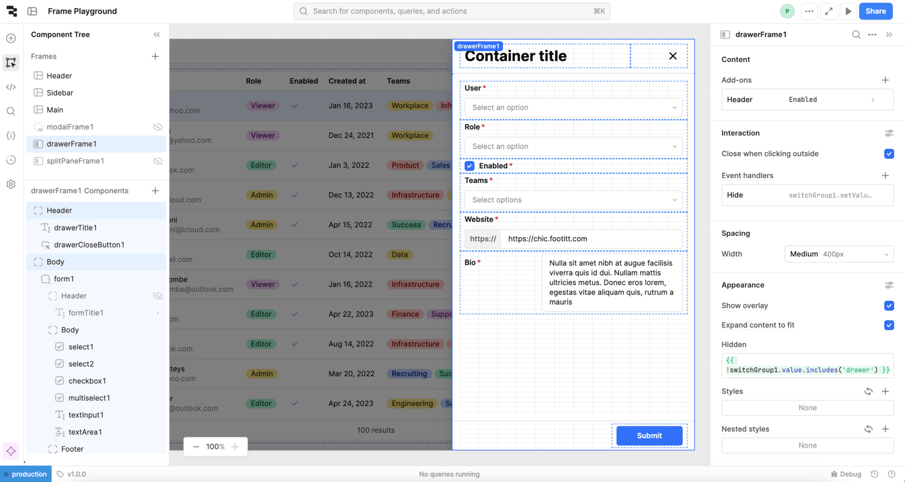
The Component tree tab of the IDE contains two sections: Frames and Components. Select a frame to view the components that are nested inside it.
Some frames (Sidebar, Modal and Drawer) support a header and footer within the frame itself. Enable these using the Add-ons setting in Content section of the Inspector.
In the following image, you can see all the components that are nested within the Header and Body of the Drawer component. Note that the Header setting is enabled in the Inspector on the right side of the screen.

Main, Header, and Split Frame have no settings in the Content section of the Inspector because all settings are applied at the component level.
Configure user interaction
Event handlers which listen for and handle interactions with your components. You configure these in the Interaction section of the Inspector.
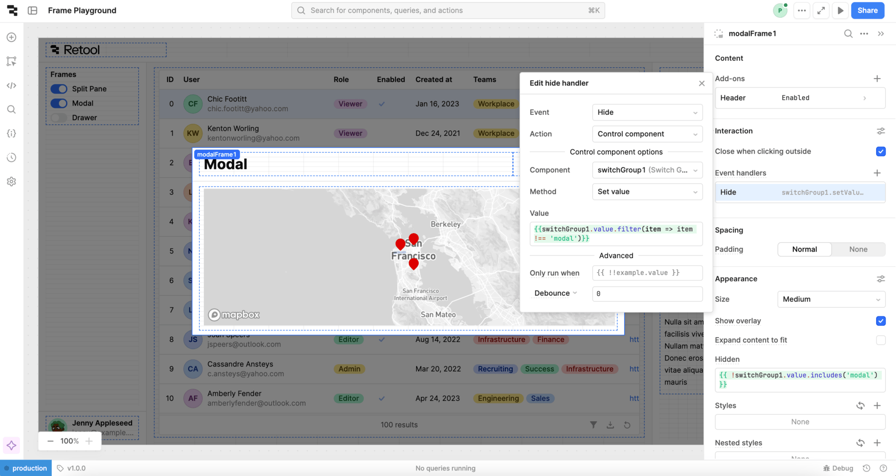
The Show and Hide events enable you to trigger actions when a user opens or closes a frame. For example, in the following screenshot, a Hide event handler turns off the Modal toggle in the Switch Group by setting the value to {{ switchGroup1.value.filter(item => item !== 'modal') }}.

You can also close a Modal or Drawer using the Close when clicking outside or Close when pressing Escape settings.
Customize appearance
You can customize the presentation of your component in the Spacing and Appearance sections of the Inspector.
All components have a Hidden setting, which you can dynamically control with a truthy value that evaluates to true or false. You can also control the hidden property for a component using the .setHidden() method from event handlers and JavaScript queries.
You can also create custom style rules using the Styles setting. Each component has different styles that you can configure, but common ones include colors, fonts, and text styles. Use app-level or organization-level themes to set these styles across all components.
The following settings are useful for customizing frames:
- Show overlay: Show an overlay behind a Drawer or Modal component that darkens the rest of the app. Turn off this setting to be able to drag content from Main to a Drawer or Modal frame.
- Expand content to fit: Removes all padding and margin, and causes the frame to take up the entire screen. Can only be used when there is a single component in the frame.
- Hidden: A truthy value that shows the frame when set to
true. The.setHiddenmethod is also useful for dynamically hiding a frame. - Styles: Updates the style of the frame as a whole.
- Nested styles: Applies style changes across all components inside the frame, but not to the frame itself.