Customize mobile app style
Learn how to customize the design and layout of Retool Mobile apps.
You can customize the appearance and layout of mobile apps in a number of ways. Use Collections to display data using prebuilt card and list layouts, or create your own with mobile components. Configure your app's layout and tailor the design to meet your needs, and include additional UI elements to further extend functionality.
Customize the layout with containers
Retool Mobile apps arrange mobile components in column (vertical) and row (horizontal) layouts. Container components include additional layout settings to control the layout of nested components.
Horizontal layouts
You can arrange nested components horizontally:
- Click + in the Components section and add a Container mobile component to your mobile app.
- Add some mobile components to this Container, or drag existing ones into it.
- Configure the Container to arrange nested mobile components in a row layout by selecting a Layout type of ➜.
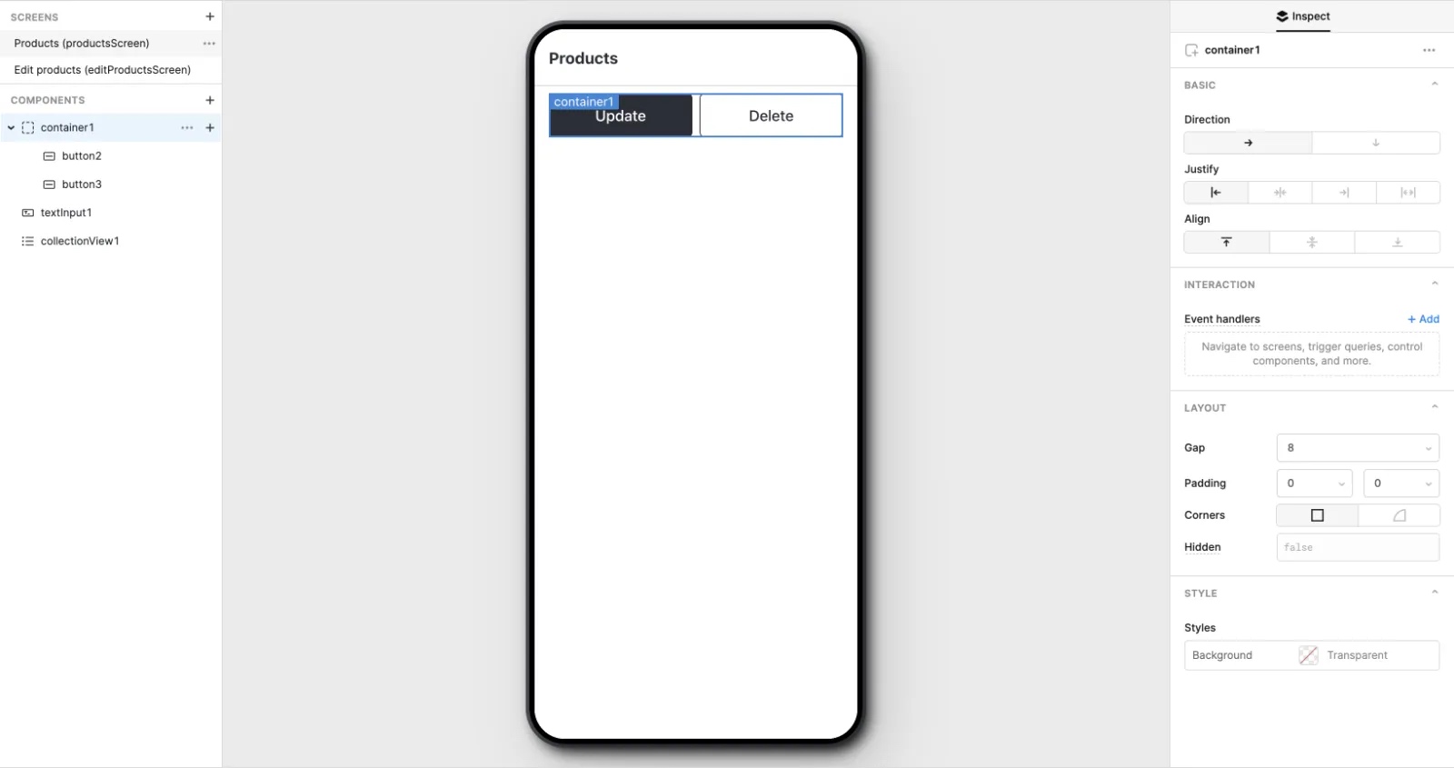
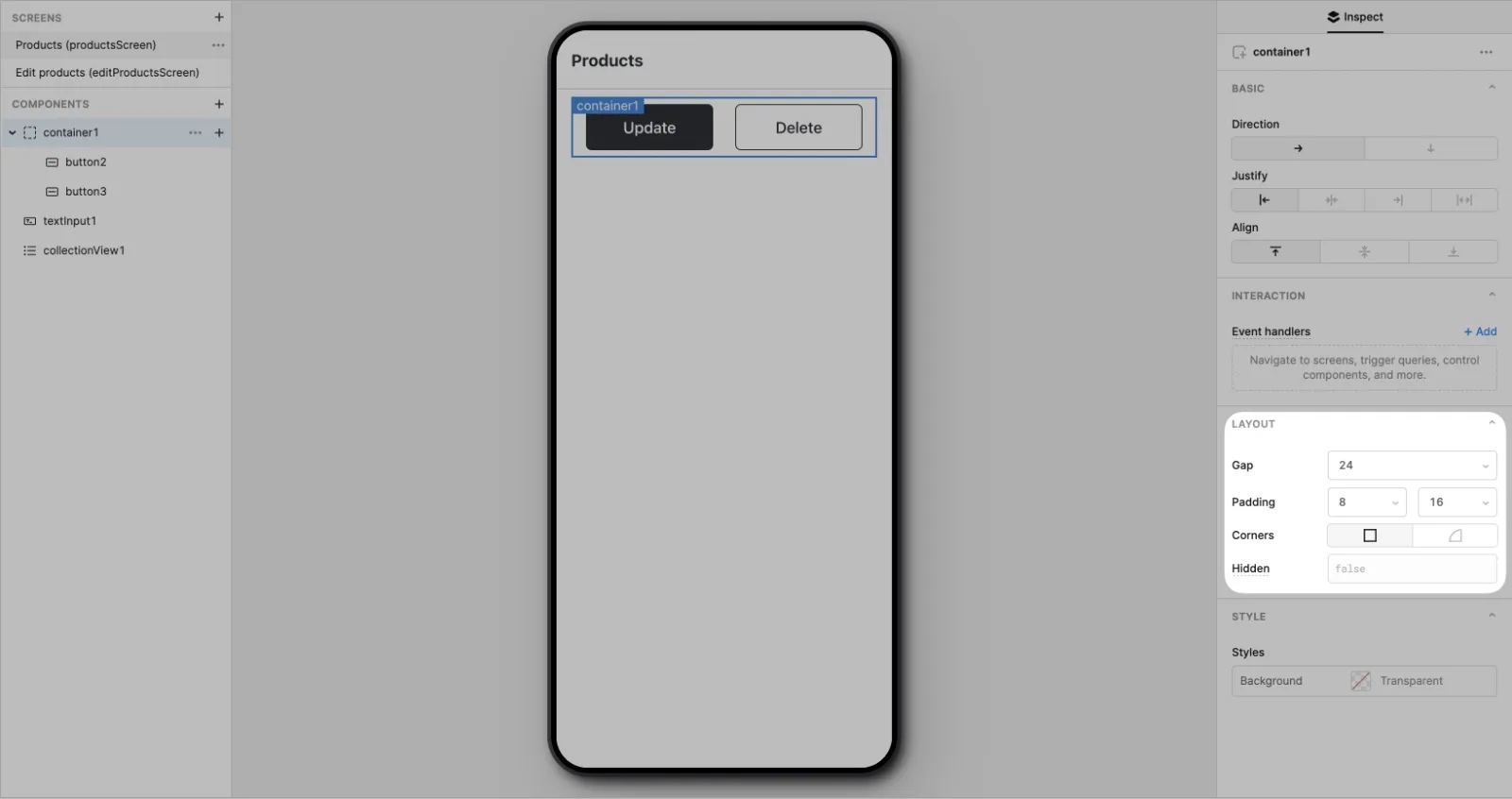
Gap and padding
You can use Gap and Padding settings to fine-tune their layout.
- Gap controls the space between nested mobile components.
- Padding controls the space surrounding all nested mobile components.
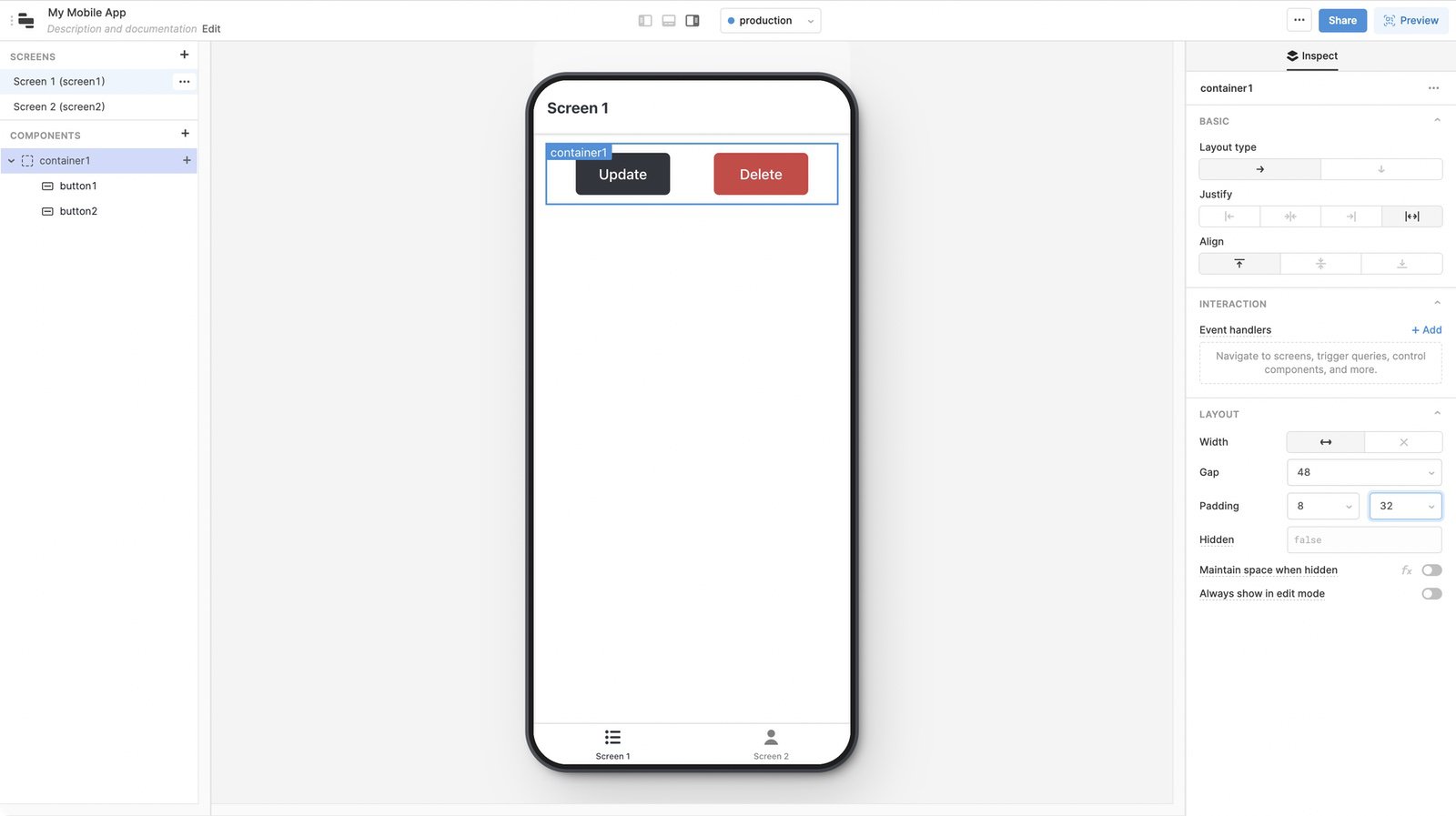
You may need to adjust these settings whenever you make significant changes to your app's layout.
If you use nested mobile components extensively, you can use Gap and Padding settings to fine-tune their layout.
- Gap controls the space between nested mobile components.
- Padding controls the space surrounding all nested mobile components.
You may need to adjust these settings whenever you make significant changes to your app's layout.
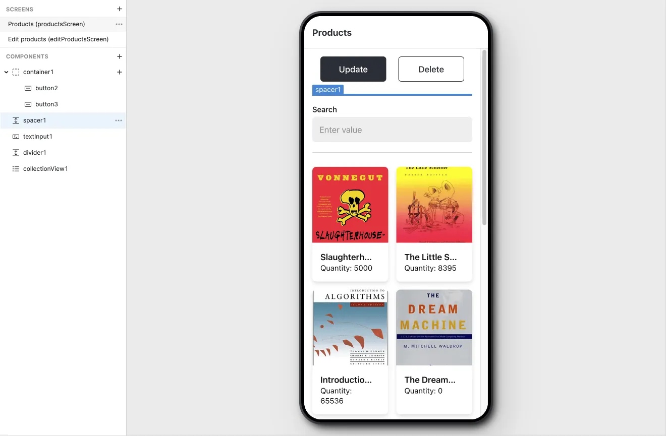
Spacing
Use the Divider and Spacer mobile components to visually separate vertical areas of your mobile app with dividing lines or empty blocks of space.
Use collections to present data
You can present data using Card Collection and List Collection components that dynamically map data and display it using prebuilt layouts. These components use Mapped options settings in the Inspector to configure item properties and how they appear.
You can also create your layout of mobile components with Custom Collection.
Cards
Card Collection display items in a card layout. It combines an image or icon with text information.
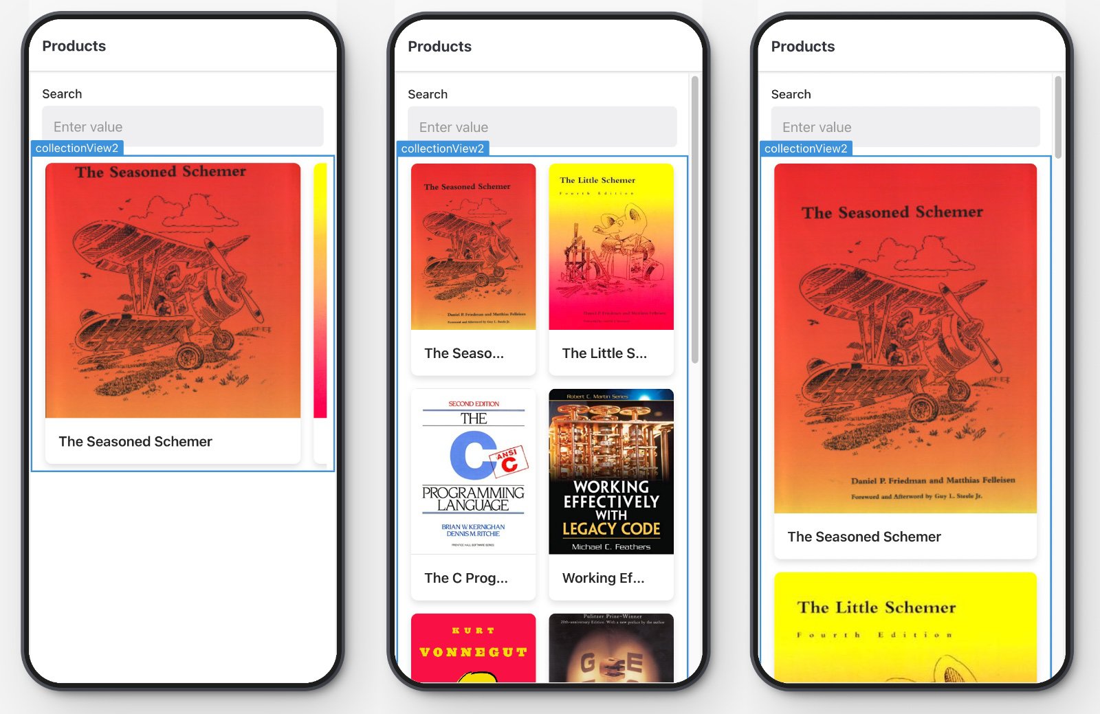
You can control the appearance of cards using the Data Layout settings in the Inspector. Options include:
- Style: Flat renders cards without a background and applies rounded corners to images. Elevated renders cards with a distinct border, shadow, and padding.
- Scroll: Vertical renders cards in a vertically scrolling column. Horizontal renders cards in a horizontally scrolling row.
- Size: Full renders full-size cards. Half renders half-size cards. If Scroll is set to Vertical, cards are displayed as either a single column or two-column grid.
You can also configure the image dimension ratio, such as 1:1 or 4:3 to display images to best fit your needs.
Lists
List Collection renders each row of data using a list layout. It combines an image or icon with text information.
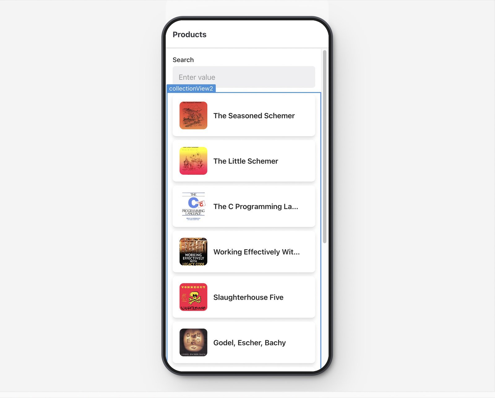
You can control the appearance of list items using the Data Layout settings in the Inspector. Options include:
- Style: Flat renders list items with no margin or background, and can include an optional separator between list items. Elevated renders list items with a distinct border, shadow, and padding.
Custom Collection
Custom Collection allows you to build your own collection using other mobile components. This gives you control over which mobile components to include.
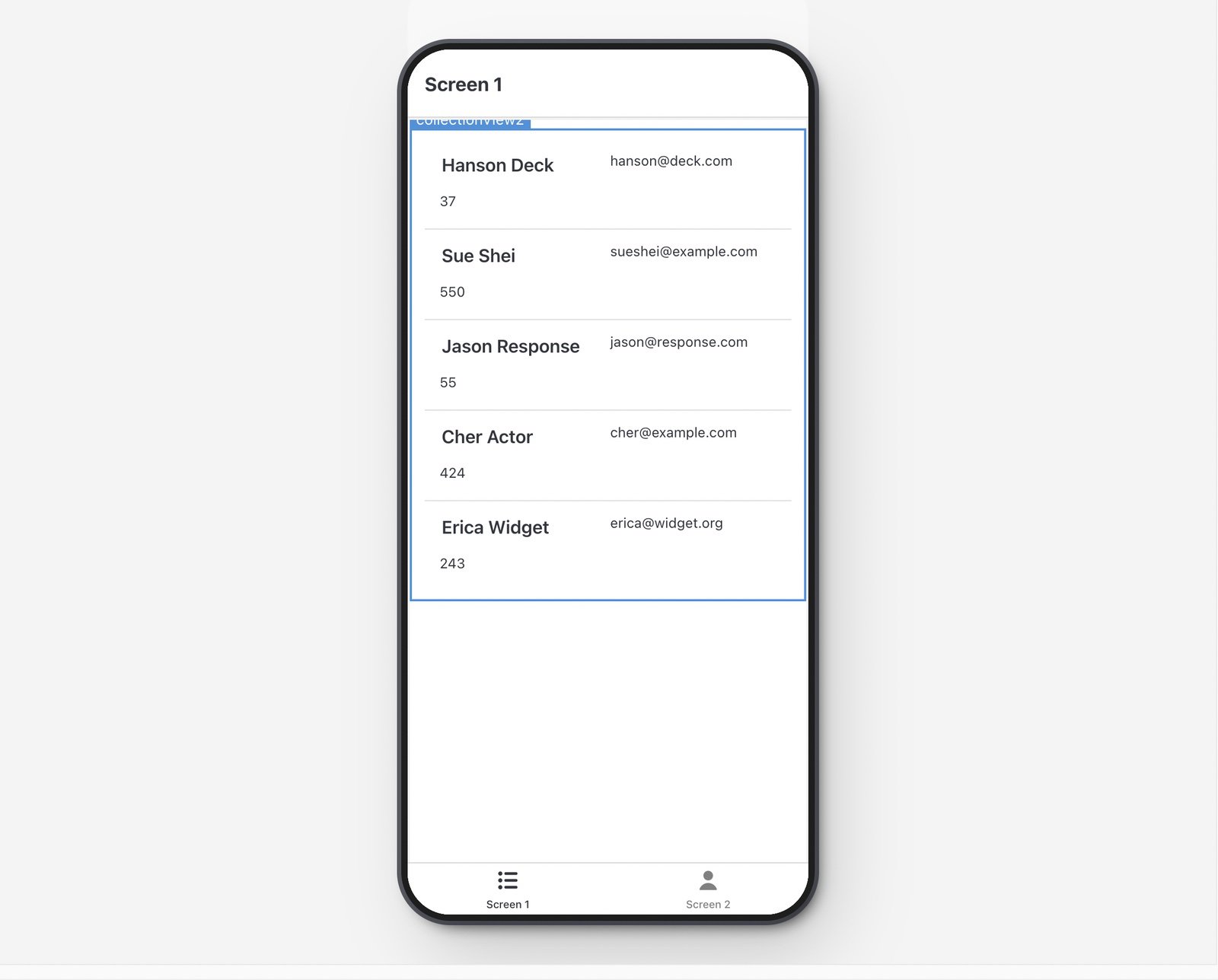
You add mobile components to a Custom Collection by clicking the + button or dragging them into the collection. You also use item and i to reference the current data source and set these as values for each mobile component.
Select collection items
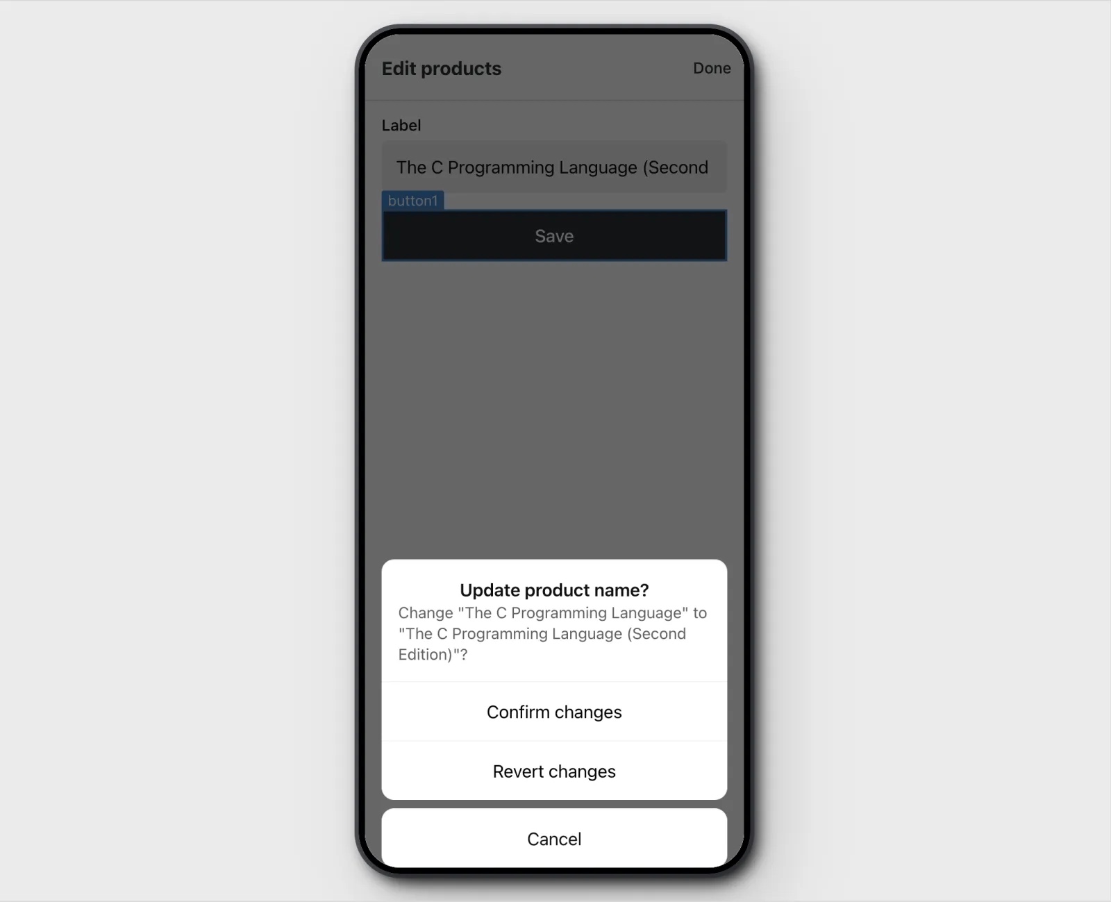
You can configure event handlers to trigger an action when a user selects a collection item, such as navigating to another screen or triggering a query. When a user selects an item, the item's data is stored in the collection's selectedItem property. This allows you to use details about a selected item elsewhere.
For example, each item contains a URL, item.url, to a web page that should open when selected. To achieve this:
- Select a collection and click + Add in the Interaction settings to add an event handler.
- Set the Action to Open URL
- Set the URL to
{{ self.selectedItem.url }}
When an item is selected in a collection, the mobile app opens the web page using the URL of the selected item.
Additional UI elements
Retool Mobile event handlers include actions to display supplemental UI elements with additional actions or information.
Action sheets and alerts are modals that provide additional information and event handler actions for users to select. These actions allow users to trigger queries, navigate to a screen, etc. Both Action sheets and alerts can also include a title and description, allowing you to provide more context to users.
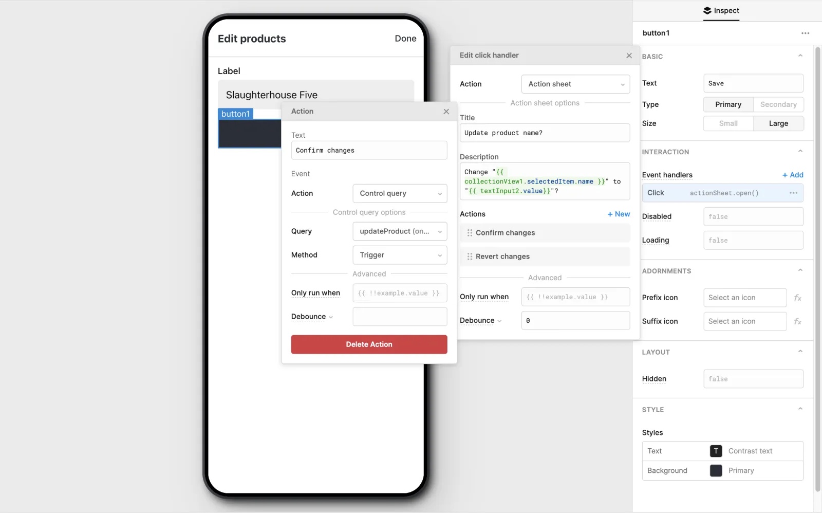
Display an action sheet
An action sheet is an overlay modal that appears at the bottom of the screen. It contains a title and description, along with a list of actions from which a user selects.
To create an action sheet:
- Add a new event handler.
- Set the Action to Action sheet.
- Click + New to add a new action to the sheet.
You configure event handlers for each menu item in an action sheet.
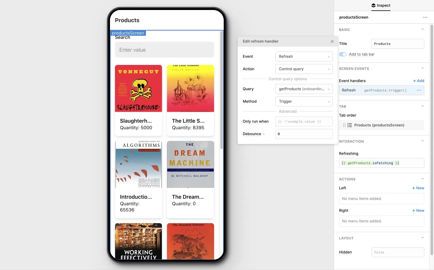
Reload data with pull-to-refresh
Retool Mobile supports the pull-to-refresh gesture on screens by configuring the Refresh event handler. This allows users to trigger a specific action by performing the gesture on the specified screen.
A common use for this is to reload data in the current screen. If your screen contains components that use data from a query, you can configure the event handler to trigger the query. This reloads the query data and updates the components, refreshing the app with the latest data.
To enable pull-to-refresh on a selected screen:
- Click + Add to create an event handler.
- Select the Refresh event.
- Select the Trigger action and specify the query to run.
Display an alert modal
An alert is a modal that appears at the center of the screen. It contains a title and description, along with a maximum of two actions.
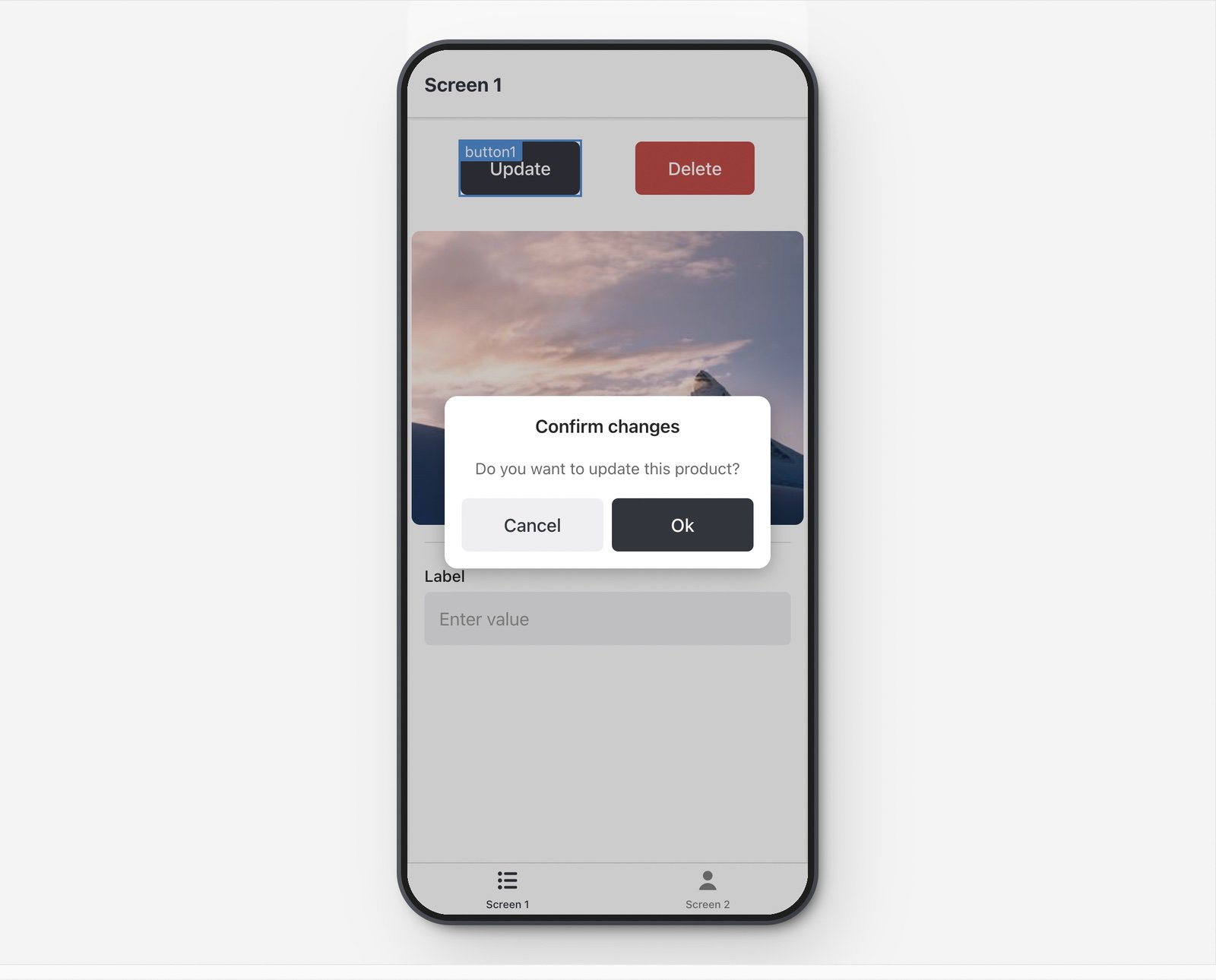
To create an alert:
- Add a new event handler.
- Set the Action to Alert.
- Click + New to add a new action to the alert.
Display in-app notifications
Retool Mobile notifications are in-app banners. They are not push notifications.
A notification is an informational modal that appears at the bottom of the screen.
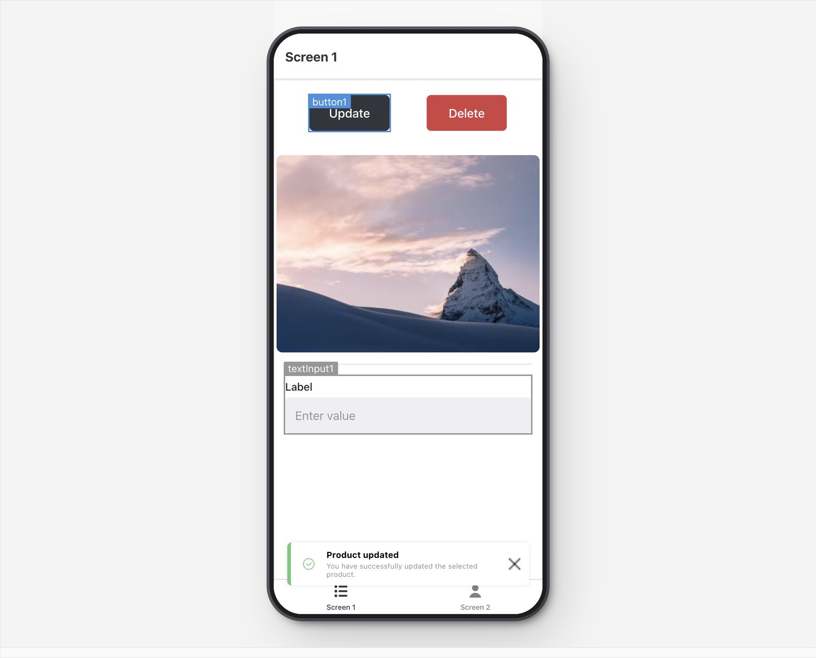
To create a notification:
- Add a new event handler.
- Set the Action to Notification.
- Specify the Title, Description.
- Select the Type of notification
The notification's Type reflects the severity of the notification, changing the icon and color used. You can also control the duration that notifications remain on the screen.
Apply custom theme styles
Retool Mobile app themes function separately from Retool web app themes.
You can create and manage custom styling for your mobile apps with themes. To customize your app's theme, click the ••• App actions menu and select App theme.
- Primary: The default accent color used by most mobile components.
- Header: The background color for the title area of screens.
- Buttons: The corner style for buttons.
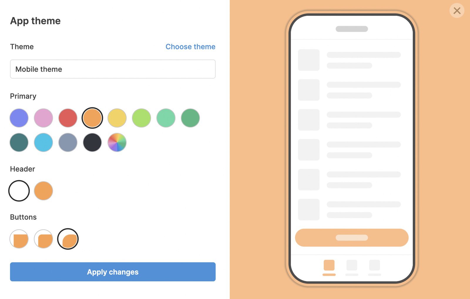
You can create custom themes and apply them to your mobile apps.