Changelog

Updates, changes, and improvements at Retool.

Fixes and improvements

  • Fixed an edge case where MSSql query errors were not surfaced to users
  • Fixed various bugs and polish in the MongoDB query editor
  • Added support for additional GCP BigQuery regions
  • Added support for Snowflake form generation
  • Added support for Elasticsearch, MongoDB, MSSql, Cassandra, Postgres, and Redis users to explicitly opt out of TLS certificate validation
  • Fixed the Postgres connector so that connections are not held open unnecessarily

Check out this guide to see the on-prem versions and their release notes. These fixes and improvements will be rolling out to on-prem customers in the next few weeks.

Fixes and improvements

  • Added a range of valid values for the Rating component (between 0 and 20)
  • Fixed the Table component's cell colors when using a theme
  • Improved the Multiselect component to scroll to the last selected item, rather than the first
  • Fixed the default item name of new options created for the Split Button and Dropdown Button components
  • Fixed incorrect overlays when certain components were placed in nested Modal components

Check out this guide to see the on-prem versions and their release notes. These fixes and improvements will be rolling out to on-prem customers in the next few weeks.

Introducing the Explorer

We’re rolling out a redesigned left panel that makes it easy to navigate to anything in your app from one place. See everything on the canvas in the Components section, or create and manage queries, transformers, and temporary state from the Code section. The Model Browser is still available via the State tab.

The Component Tree gives you a full view of everything in your application, including things that aren’t currently visible, such as components in non-active Views in a Tabbed Container. Clicking on the item will select it, and will handle cases such as making its containing views active, or making the hidden item visible!

You can take quick actions on your components, such as renaming them inline, or right-clicking on them to bring up their full context menu.

We’ve also made the Left panel resizable to give editors greater control of their experience and visibility into the state of their application.

Creating and managing Temporary state has moved into the unified Code section, along with the rest of your existing Resources. Editing a Temporary state value has moved into the Bottom panel, streamlining the editing experience.

The Explorer is available to all of our cloud customers and will be rolling out to on-premise customers in the coming weeks! Let us know if you have any feedback in the community forum.

Fixes and improvements

  • Added support for "Auto" height on the List View component
  • Added support for "Auto" height on the Table component, with a max height of 20 rows
  • Added a Slack query setting to override the channel or user the message will be sent to
  • Added a Slack query setting to convert Markdown to Slack's non-standard "mrkdwn" format
  • Improved the Table component such that columns now include a dropdown that lets you specify "sort ascending" or "sort descending" more easily
  • Added support for arrow keys to navigate between sections of the Table component
  • Improved the visual appearance of the Table component's header cells
  • Improved the Google Sheets query editor such that it now parses columns with headers but no cell data, and columns with empty and non-empty cell data
  • Added a default spreadsheet selection to the Google Sheets query editor
  • Fixed component and query renaming to prevent using invalid identifiers that could cause the app to crash
  • Fixed an edge case where custom document titles would sometimes not appear
  • Improved Table keyboard navigation to make the behavior for scrollable tables match paginated tables
  • Fixed the ordering of Table component's action button queries so that they're correctly triggered before row select event handlers
  • Fixed an edge case where queries that reference transformers would not run on page load, even if specified
  • (On-prem only) Fixed OAuth 1.0 implementation to generate token header even when no token secret is supplied
  • (On-prem only) Improved the LDAP group mapping feature so that you can map a single google group to multiple retool groups (using the LDAP_ROLE_MAPPING env variable)

Check out this guide to see the on-prem versions and their release notes. These fixes and improvements will be rolling out to on-prem customers in the next few weeks.

Fixes and improvements

  • Added support for "Auto" height on Modules
  • Improved drag-and-drop so that components roughly maintain their sizes when dragged into Container components
  • Fixed the user "Download as CSV" so that the last active date always appears
  • Added validate and clearValidation APIs for the Form component
  • Improved selection in the Table component such that selected rows will now be selected and deselected correctly while filtering
  • Fixed the Date Time component so that the Date subfield correctly persists its value
  • Fixed alignment in the query editor for REST API queries
  • Added a new "Reset state" action to the component context menu
  • Fixed an edge case the Select component would unexpectedly reset the input value when connected to a dynamic datasource
  • Fixed an edge case where adding Chart components to empty List View components would cause the editor to crash
  • Fixed an edge case where scrolling a Select component in a Modal component would sometimes scroll the application
  • Fixed multiple component selection so that text isn't additionally selected

Check out this guide to see the on-prem versions and their release notes. These fixes and improvements will be rolling out to on-prem customers in the next few weeks.

  • Fixed the Modal component so that it cannot open behind existing modals
  • Fixed the List View component so that the first row is vertically sized correctly
  • Added a new option to the Table component "Reset after successful save" that allows you to control whether the Table data should reset after saving or adding new rows
  • Fixed the height of the first line of text in the Text component
  • Improved drag and drop behavior on Safari for the Image component
  • Fixed theme in the hover model browser so that it shows changes correctly
  • Added the ability to save a query even when it's running Check out this guide to see the on-prem versions and their release notes. These fixes and improvements will be rolling out to on-prem customers in the next few weeks.

More customizable Select components

Select, Listbox, and their Multiselect variants are getting a lot more customizable! Using the recently launched option list editor, you can easily assign a color, image, icon, and prefix text to each option. The layout will automatically adapt as you mix and match settings, and you can adjust the image size and shape in the Style Editor.

Theme and Style Editor updates

The color picker in the Style Editor now includes all of the swatches from your Theme, including two new optional colors: Secondary and Tertiary. We’ve also added a theme global, so you can reference theme colors directly in your code. For example, conditionally indicate success or failure with {{ someCondition ? theme.success : theme.danger }}.

Automatic colors

Last but not least, Themes have also been updated with a collection of Automatic colors that can be used by components like Tags, Select, Listbox, and Avatar. Colors from this collection are deterministically assigned based on text in the component. For example, the tag “Foo” will get the same color assignment no matter where it appears in your app.

Configure your automatic colors directly in your Theme Editor

Fixes and improvements

  • Improved query creation from event handlers so that it default creates the last selected query type
  • Fixed the Table component's "select all" menu for checkbox selection
  • Fixed an edge case where transformers would not run on page load
  • Improved the experience of resizing components
  • Fixed Select components that were incorrectly showing validation errors when required was set to true
  • Fixed the Table component's "row select change" event that was incorrectly firing twice
  • Added a new setting so that Modal .open() and .close() can optionally trigger the Open and Close event handlers
  • Added support for the Image component to have a smaller height in Fixed height mode
  • Fixed component repositioning via keyboard
  • Fixed keyboard navigation on the canvas such that arrow keys do not swap component positions
  • Added a warning in edit mode when Table "save changes" events are not configured
  • Fixed the Table component's "Row select change" events that were firing twice when rows were selected via keyboard arrow keys
  • Fixed Range Slider and Toggle Button components so that they don't automatically trigger dependent queries with the "Run query only when manually triggered" setting on
  • Consolidated the 'Dynamically show column' and 'Show column' fields into a single 'Show column' field for the Table component's column editors
  • Fixed the Modal component so that it maintains visual height when switched to Fixed height
  • Fixed the ability to show/hide a button to clear selection in the Table component
  • Fixed "text auto" colors for modules being used in applications

Check out this guide to see the on-prem versions and their release notes. These fixes and improvements will be rolling out to on-prem customers in the next few weeks.

Table updates

Working with Table just got a lot more efficient thanks to major improvements to keyboard navigation and new UI for multi-row selection!

Keyboard navigation

We’ve vastly expanded keyboard navigation support in Table, enabling your end users to work much more quickly.

Use the arrow keys to move between cells, with up/down now respecting the sort order (a long-standing bug). On editable cells, hit** **Enter to edit or just start typing to replace the content. Hit Enter again to commit your edits and move down a row, Tab to commit and move to the next column, or Esc to revert. You can also clear the focused cell with Delete/Backspace and copy the contents with CMD+C (**CTRL+C**).

We also added a Double click to edit option in the Inspector section, on by default for upgraded Tables. Turn this off to return to the old single-click mode.

Existing Table components can be upgraded in the Inspector, enabling keyboard navigation and converting all columns to the new column types announced a few weeks back. To access legacy column types, choose Downgrade component from the ••• menu.

Checkbox selection

We’ve also added an optional checkbox column for Tables with multi-row selection enabled. When the setting is turned on (Use checkbox column for selection under** Row Selection**), an additional column will appear on the left with checkboxes to control row selection. The header also includes a checkbox to instantly select every row, along with a menu to select all rows on the current page.

Fixes and improvements

  • Added a new "Auto" height option for Modules, allowing them to resize themselves to fit their contents
  • Fixed Form components in Modules so that validation and submit buttons work properly
  • Added support to control which menu items are highlighted in the Navigation component
  • Fixed dynamic height components so that they don't shift the canvas layout when deleted
  • Increased the size of handles on components to make resizing easier
  • Improved drag-and-drop such that moving a component into a Container component will preserve its width as much as possible
  • Fixed action buttons for the Table component so that they fire on first click in editor mode
  • Fixed the editor canvas so it does not change it's size when dragging components
  • Fixed component selection so that hidden containers stay visible when you're selecting any component inside of them
  • Fixed the Slider component and the Range Slider component's outputs when the value is over 1,000
  • Fixed layout issues with dragging around hidden components
  • Fixed an edge case where style editor colors would occasionally display incorrectly
  • Fixed an issue where you could not programmatically call selectRow in Table components with multiple selection enabled
  • Added the ability to dynamically set whether a Table component supports selecting multiple rows

Check out this guide to see the on-prem versions and their release notes. These fixes and improvements will be rolling out to on-prem customers in the next few weeks.

Multiple environments

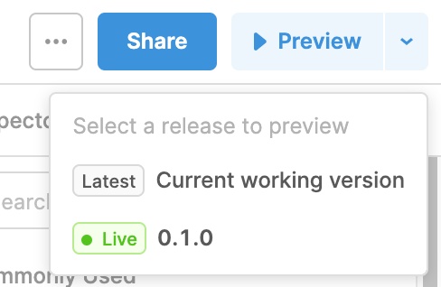
We’ve added support for multiple, user-defined environments, making it easy to build, run, and test applications to suit your development needs. Now, you're not constrained by only **Staging **and Production: admins can configure as many environments as they need under Organization Settings > Environments:

To set these up on the resource level, define configurations for all environments under Resources:

As you're editing and previewing applications, switch between environments to quickly test against different scenarios (e.g. switching between QA data and production data).

This feature will be available on all plans, and is rolling out to customers in the next few weeks. If you have any feedback, let us know in the community forum!

Fixes and improvements

  • Fixed keyboard shortcuts that were occasionally not firing in editor mode
  • Fixed an edge case where multiple options' tooltips could display at the same time for Select, Multiselect, Listbox, and Multiselect Listbox components
  • Fixed resizing widgets when scrolling the canvas
  • Added automatic code hinting to the options list editor for components like Select and Multiselect
  • Added an option to order columns via the Table component's dynamic column settings
  • Fixed git syncing with GitHub, which was failing due to an error about using RSA key with SHA-1

Check out this guide to see the on-prem versions and their release notes. These fixes and improvements will be rolling out to on-prem customers in the next few weeks.

HTML component

We have introduced the new HTML Component so that you can quickly add custom HTML and sandboxed CSS to your apps. This component is perfect for use cases that require a little bit of custom UI without the full scripting capabilities that Custom Component provides. The HTML component is live for all cloud customers, and will be rolling out to on-premise customers in the coming weeks.

Icon component

We have also introduced a standalone Icon component with over 3,400 icons to choose from! It supports alignment options, alt text for accessibility, and optional click event handlers.

Dynamically set the icon based on any state from your application to give helpful visual clues:

The new Icon component is live for all cloud customers. We're working on rolling out our new icon library and this component to our on-premise customers in the coming weeks. If you have any questions or feedback, let us know in the community forum.

Fixes and improvements

  • Fixed layout issues with dragging hidden components
  • Fixed an edge case where style editor colors would occasionally display incorrectly
  • Fixed an issue where you could not programmatically call selectRow in Table components with multiple selection enabled
  • Added a new "Auto" height option for Modules, allowing them to resize themselves to fit their contents
  • Added the ability to dynamically set whether a Table component supports selecting multiple rows
  • Fixed the Table component's "sort change" event handlers which were temporarily not firing

Check out this guide to see the on-prem versions and their release notes. These fixes and improvements will be rolling out to on-prem customers in the next few weeks.

Fixes and improvements

  • Fixed event handlers in the Split Button component and the Dropdown Button component when options are hidden
  • Fixed the confirmation message when deleting queries, transformers, and temporary state
  • Added markdown syntax highlighting to tooltip fields in the Inspector
  • Fixed the Table component's "Add new row" action so that it no longer overwrites the first row in your Table when uploading an image
  • Adjusted the amount the Container component grows when dragging in child components
  • Fixed the _focus _JavaScript APIs for the Listbox and Multiselect Listbox components
  • Improved the editing experience when working with the Container component
  • Fixed app URL parameters when they reference components
  • Added the ability in edit mode to select components when a Container component is in a loading state
  • Fixed an edge case in the options list editor where items would be duplicated in Manual mode
  • Fixed the Dropdown Button component so that it is square when it only has an icon and no text
  • Fixed validation for icons configured via the options list editor in Mapped mode
  • Fixed the Date Time component so that it is not editable in readonly mode
  • Fixed the Form component so that it doesn't clear its fields if the submit event fails

Check out this guide to see the on-prem versions and their release notes. These fixes and improvements will be rolling out to on-prem customers in the next few weeks.