Getting started with the Table component
Learn how to display and interact with data using tables.
Tables are a common way to view and interact with your data. The Table component enables users to sort, filter, paginate, and download rows of information. It also supports row selection and insertion, server-side pagination, and custom columns.
Demo
The following demo classic app uses server-side pagination with the NASA Image Library API to display results in a table. Each page contains ten results and updates whenever the page or search term changes. You can expand each row to reveal the image caption.
Features
Key features of the Table component include:
- Column formats, such as tags and checkboxes.
- Editable columns and adding new rows.
- Row grouping by column.
- Expandable rows that can contain other components.
- Filter, sorting, and search options.
- Server-side pagination.
- Customizable toolbar and row action buttons.
Configure content options
When you add a Table component to a classic app, it attempts to display data from the most recently created query. If your app doesn't have a query, the component includes demo data instead.
The data source needs to be an array of objects. Table creates columns for each key and its rows map to array items.
Specify the data source
You can change the data displayed in a table using the Data source setting. From the dropdown, you can select a resource or JavaScript query, transformer or variable, or an array.
The Table component supports both client-side and server-side pagination. You can specify the number of rows to display and the table automatically paginates the current data. With server-side pagination, you can write performant queries that retrieve only the required data to display in the table.
Set the primary key
Retool recommends you select a primary key column to uniquely identify each row of data. If your data already has an ID column, Retool automatically uses it for the primary key. You can also manually set it to any column that is guaranteed to be unique.
If you don't want to show the primary key in your table, click to open the contextual menu for the column and select Hide column.
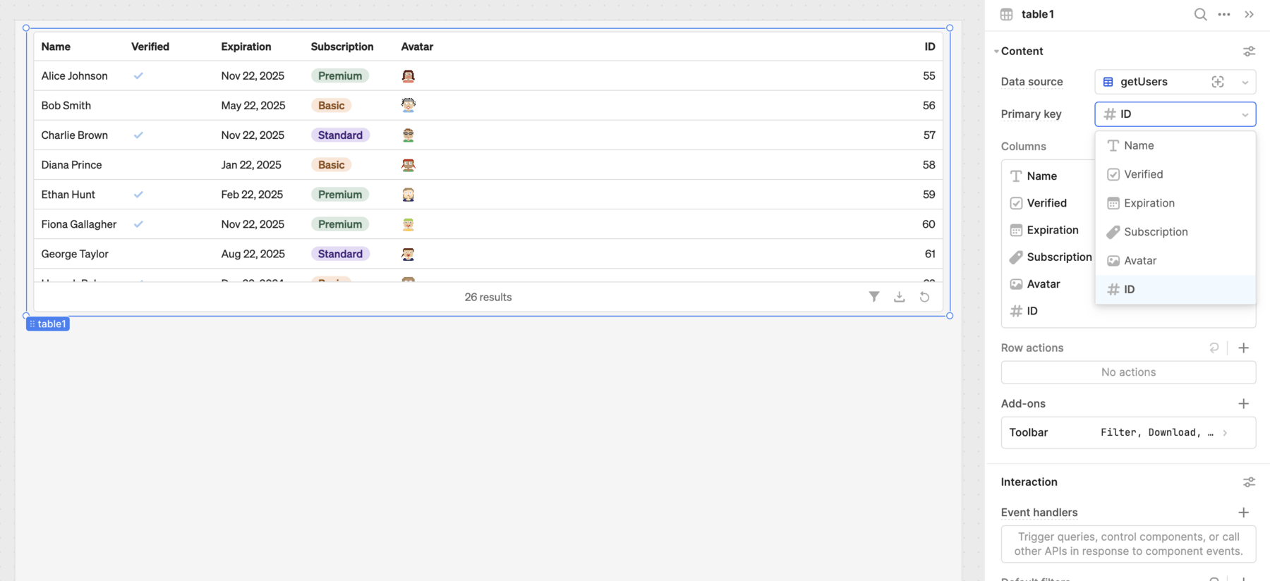
Set the primary key.
Configure columns
Retool automatically generates columns from the specified data source. You can configure columns with a number of options, available by clicking on each column in the Inspector.
When you add tables to the canvas, Retool automatically attempts to configure the options for each column, such as their type. Each column has a source key that maps to the data source. You can optionally specify a source key for custom columns, should you want to use it for column values.
The Table component can also summarize column values using different aggregation methods.
Configure rows
You can add row actions buttons that appear for each row on mouse hover and trigger event handlers when clicked. The Table component also includes a number of additional interface features which you configure in the Add-ons section, such as expandable rows that can contain components.
Configure user interaction
The Interaction section of the Inspector contains settings that control user interaction, such as:
- Row and cell selection that control how users select values.
- Event handlers that listen for and handle interactions with your components.
- Default filters that initially filter data based on specified criteria.
- Search options that enable users to search within the table.
Customize appearance
You can customize the appearance of tables. The Table component supports automatic and fixed height so it can automatically expand based on the row count or remain a fixed height and scroll. It also supports fixed or dynamic row height that expands to fit cell content.
All components have a Hidden setting, which you can dynamically control with a truthy value that evaluates to true or false. You can also control the hidden property for a component using the .setHidden() method from event handlers and JavaScript queries.
You can also create custom style rules using the Styles setting. Each component has different styles that you can configure, but common ones include colors, fonts, and text styles. Use app-level or organization-level themes to set these styles across all components.
Next steps
Learn more about using the Table component.
Columns
Learn how to configure, edit, and sort table columns.
Customization
Learn how to customize the Table component using different styles and add-ons.
Filters
Learn how to filter and search table data.
Pagination
Learn how to implement server-side pagination of data with the Table component.
Rows
Learn how to configure table rows.