General availability of error monitoring for apps
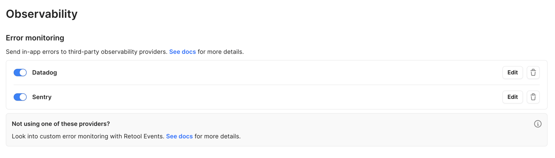
You can set up integrations with Datadog and Sentry. With these integrations, app errors are reported with a callstack and descriptive tags when you view and interact with an app in preview or public (end-user) mode.
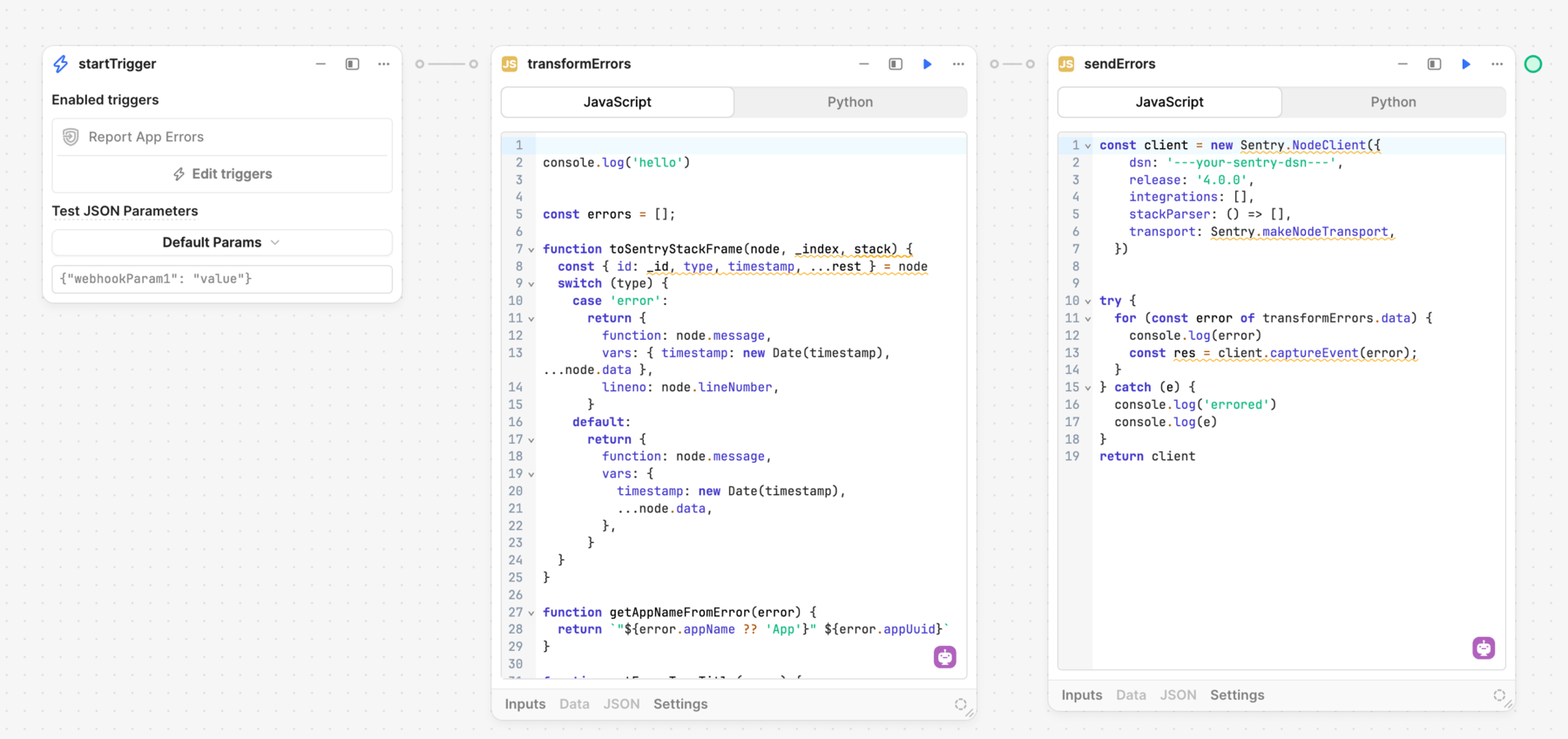
To connect third-party observability providers, you can report app errors using Retool Events and build a workflow that triggers whenever an app error occurs and automatically notifies your observability provider.