Changelog

Updates, changes, and improvements at Retool.

Editable Text and Number

We’ve overhauled Editable Text and added a new Editable Number. Like all of our new inputs, these offer brand new configuration options, built-in and custom validation rules, and expanded style editor support. These components were also built with accessibility and data density in mind.

The Editable inputs display static text that can be edited on click. In edit mode, Editable Text has all the same powerful, new functionality of our Text Input component, including: configurable prefix/suffix text, a prefix/suffix icon, read only mode, and more. In addition, Editable Number supports the functionality of the Number Input component, including currency support, percentage formatting, and control over decimal places and padding zeros.

Helper text

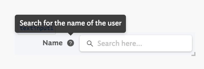
All keyboard inputs–like Text Input, Number Input, Editable Text and Number, Currency, and more–can now optionally configure a tooltip that is visible below the input only on focus:

Like the regular tooltip, helper text supports GitHub flavored markdown.

We’re continuing to ship new components each week! Drop us a note at support@retool.com if you have any feedback. Editable Text and Number are rolled out to all plans on Retool cloud, and will be included in the next on-premise release.

Fixes and improvements

  • Fixed an edge case where Text components could be rendered at the wrong height
  • Added support for freezing action button columns to the left or right of the Table component
  • Added the ability to add the currently viewed folder to your favorites list
  • Fixed focus, hover, and disabled styles for the clear button on input components
  • Added support for null values for sliders in the JSON Schema Form component
  • Fixed rendering of short Listbox components with labels
  • Added lastReceivedFromResourceAt attribute to queries to track when the query response was last received from the resource
  • Added the current page index and total number of rows to the footer of the Table component
  • Fixed label width default to be 40% instead of 33%

Check out this guide to see the on-prem versions and their release notes. These fixes and improvements will be rolling out to on-prem customers in the next few weeks.

Input improvements

We've added 5 new and improved options for input components in the Inspector (right-hand panel), including:

  • Read only: read only inputs are focusable and selectable but cannot be modified. They look the same as normal inputs.
  • Label width: set the width of the label as a percentage of the component width (%), pixels (px), or grid columns (col).
  • **Decimal places: **set the maximum number of digits after the decimal, and optionally pad trailing zeros.
  • **Allow null value: **Number Input components can now have an empty state of null instead of 0.
  • **Show clear button: **Number Input components can now optionally show a clear button.

If you want further configuration options for any of our components, drop us a note at support@retool.com!

Fixes and improvements

  • Added a keyboard shortcut–⌘ + D (CTRL + D)–to duplicate a component on the canvas
  • Added a keyboard shortcut–?–to show a list of all of the other built-in editor shortcuts (like ⌘ + D!)
  • Added a "Hide submit button" option to the JSON Schema Form component
  • Fixed vertical alignment of multiline labels on the Checkbox and Switch components
  • Added a "Row Select Change" event handler for the Table component
  • Adjusted default hover and active colors for Button
  • Fixed automatic text color for components inside of the Header frame
  • Updated read only input components to hide the optional clear button
  • Simplified the empty state for Container components
  • Fixed a delay with updates to dynamic height components
  • Removed an incorrect error message when selecting components in the same container
  • Fixed migrations to respect DATABASE_URL (on-prem only)

Check out this guide to see the on-prem versions and their release notes. These fixes and improvements will be rolling out to on-prem customers in the next few weeks.

Retool for Startups

Eligible startups now get 12 months of free Retool credits (up to $1200 value), and we've partnered with companies like HubSpot, Segment, DigitalOcean, and Brex to offer many more startup discounts (apply here!).

If you applied and were accepted into the Retool for Startups program, you now have access to a new Startup Offers section in your Settings. To view more details and redemption instructions, go to Settings > Startup Offers:

Questions about the program? Enrolling in these offers? Drop us a note at support@retool.com (also, if you'd like to feature a startup deal for your company on the Startup Offers page, apply here).

Fixes and improvements

  • Added a new event handler action type to set and clear local storage key/value pairs
  • Added a toggle to the Number Input component to allow null values
  • Fixed a regression that would cause the editor to crash when deleting temporary state variables
  • Improved the app homepage search results to show what folders apps are in
  • Fixed the "hide reset button" switch on the Wizard component
  • Fixed default values and "Change" event types for the Range Slider component
  • Fixed app versioning such that the editor always shows the most up to date version, even if an earlier release is published
  • Added a tooltip to display the full app name on hover for the "Go to app" event handler
  • Fixed the Tags component so that it can reference other queries/components (e.g. {{ .. }}) when setting tag titles
  • Updated the labels for undo/redo shortcuts to be platform-specific

Check out this guide to see the on-prem versions and their release notes. These fixes and improvements will be rolling out to on-prem customers in the next few weeks.

Switching between component types

You can now easily switch the type of a component (e.g. Button →Link), and we’ll transfer over all applicable settings like label configuration, tooltips, and more! Let's say that you’ve set up a Number Input with a default value, min/max, label, and tooltip, and then you decide you actually want your users to be able to select their value via a Slider.

Previously, you’d have to drag out a new Slider component and manually copy over each of your settings one by one. Now, all you need to do is click on the three dots menu in the component inspector (right-hand panel) and click “switch component":

For most input components, you can now switch to a preset or other similar component type (for Number Input, that’s Slider, Percent, Currency, Rating, and Range Slider). Sometimes, we’ll prompt you for additional action when we can’t automatically convert all of your settings: like when switching from a Slider to a Range Slider, you’ll have to choose start and end values. There are so many different options to try out: like switching between different styles of Buttons (Button, Outline Button, and Link)!

We’re rolling out this new functionality to all users over the next week. Additionally, we’re working on fully overhauling additional components like Select and Multiselect, so you won’t see these options on those components just yet. Let us know how “Switch component” works for you, and any other components/presets you’d like to see at support@retool.com!

Fixes and improvements

  • Improved start time when running query
  • Improved performance during drag-and-drop
  • Fixed an edge case where multiple queries to the same resource would occasionally fail
  • Added support for plain numbers in the border radius style editor (assumes px unit)
  • Fixed file parsing for the new file input component types on Windows
  • Added a new option to the Text Input component to show a character count
  • Improved search in the component list
  • Fixed a rare edge case where the preview button in editor mode would hang indefinitely
  • Fixed GraphQL queries to exclude empty optional fields
  • Added support for using self-signed certificates with MongoDB connection string

Check out this guide to see the on-prem versions and their release notes. These features and performance improvements will be rolling out to on-prem customers in the next few weeks.

Resource permissions

All admins will now be able to assign two different permission levels for any given resource: (1) "use," which allows an editor to write queries with that resource and (2) "edit," which additionally allows an editor to modify the resource's configuration.

Previously, admins had minimal control over permissions to resources — any resource permission granted at a group level would allow members of that group to modify the configuration of the resource. We know configuration for some resources can be sensitive and complex to change, so we've shipped these new permission levels to give admins more control over their user's access.

Additionally, to allow editors to create new resources or delete existing ones, admins can assign a group to have “universal access” at the “edit” level. As always, a “viewer” of an app (e.g. no edit permissions) can still view and use an app that leverages a resource for which they do not have explicit permissions granted.

These new resource permissions are available to all admins across Pro+ plans. Drop us a note at support@retool.com to let us know how they're working for you!

Fixes and improvements

  • Added a new Progress Bar component with an indeterminate state
  • Added a new scalable Progress Circle component
  • Fixed local storage dependencies such that values nested inside a third level now trigger updates correctly (e.g. localStorage.values.x.y)
  • Fixed dynamic height for direct children of Modules and Modals
  • Removed inconsistent right panel behavior in favor of the pop out code editor
  • Updated the Divider component to support an optional text label
  • Added the ability to see tables that are related to your query in the query editor's schema browser
  • Fixed the visible scrollbar on single line, fixed height Text components
  • Fixed an issue where transformers do not run on page load if they depend on disabled queries

Check out this guide to see the on-prem versions and their release notes. These features will be rolling out to on-prem customers in the next few weeks.

Event handlers for queries

When your query succeeds or fails, you can now trigger other queries, control components, call additional APIs, and more–all using event handlers!

New event handlers for queries

For most Retool apps you've built in the past, you've probably set up the "After this query runs" triggers. For example, let's say you have a query, selectUsers, populating a Table component; if you insert a new record to the users table, you probably want to re-run that selectUsers query so that your Table is up to date:

Previous query triggers

However, anything more complex–showing a notification, controlling components (e.g. opening a modal)–previously required creating and wiring up a JavaScript query, and writing custom code.

A few months ago, we rolled out new event handlers to all of your components. We're now replacing the old query triggers, and bringing those powerful event handlers to your queries! You can configure any number of event handlers to run when your query succeeds or fails (e.g. on success, show a notification to your end user and open a modal to prompt a new workflow).

Anything you can do with Retool’s JS API (e.g. query1.trigger(), modal.open(), utils.showNotification(...)) you can do with event handlers. If you do have a need to write some custom JavaScript, it's even easier than before. You can just use the "run script" event handler and write your code, without creating and wiring up a new query.

As you build with these new event handlers on your queries, we want to hear from you! Are there more kinds of event handlers you'd like to see us add? Any feedback? Drop us a note at support@retool.com.

Fixes and improvements

  • Updated default component IDs to use camelCase (e.g., checkboxGroup1)
  • Added advanced editor features to the Text Area component, including autocomplete, autocapitalization, and spell check
  • Added support for exploring queries and transformers in the model browser (left-hand panel) while actively editing a different query or transformer
  • Added a change event handler to BoundingBox component
  • Added a Front integration
  • Fixed Folders and Apps so that they're sorted consistently
  • Fixed an edge case with query trigger migrations for the new query event handlers
  • Fixed an edge case where the "Go to app" event handler wouldn't successfully navigate

Check out this guide to see the on-prem versions and their release notes. These features will be rolling out to on-prem customers in the next few weeks.

9 new components–File Inputs, Buttons, Tags, Listbox and more!

We’re rolling out 9 redesigned and rebuilt components, including fully overhauled, existing components (Button, File Button, Link) and brand new components (Tags, File Input, File Dropzone, Listbox, Multiselect Listbox).

Just like the input components we released a few weeks ago, these offer brand new configuration options, built-in and custom validation rules, and expanded style editor support. These components were also built with accessibility in mind.

Listbox and Multiselect Listbox

Listbox and Multiselect Listbox

Listbox and Multiselect Listbox allow you to display a list of selectable item(s) to your end users. You can dynamically set the default selected item(s) and/or disabled item(s). There’s also built-in support for fuzzy search on the values or labels, all you have to do is set the search term (e.g. {{ textinput1.value }}).

There are plenty more settings you can configure, even down to the empty state when no options match your search term. Additional functionality includes: an optional Tooltip with support for GitHub flavored markdown, custom validation (e.g. min/max items, custom error messages), event handler support, and more!

Button, Outline Button, and Link

The refreshed Button component and new Outline Button component have lots of new functionality. For example, you can dynamically set the loading state (e.g. {{ query1.isFetching }} ) to show a loading animation and disable interactivity for your users while your query is running.

You can switch between a regular, Solid Button and an Outline Button directly in the “Style” section of the Inspector for either component–you’ll also find more advanced style editor support.

Lastly, we have a new Link component that supports additional configuration like prefix/suffix icons and an optional Tooltip. You can use the Link component with any event handler, like opening a webpage or another Retool application.

File Button, File Input, and File Dropzone

File Button, File Input, and File Dropzone

We now have 2 new ways for your end users to browse and upload files–File Dropzone and File Input–and we’ve rebuilt and redesigned File Button. All of these now support single or multiple file uploads, and have 3 consistent properties to interact with and reference elsewhere in your app: (1) value: an array of base64 encoded strings for the selected file(s) (2) files: an array of file metadata, like when it was last modified, the file name, type, and size (3) parsedValue: an array of JS objects or arrays that Retool automatically parses from uploaded files (Excel, JSON, CSV, TSV and text files are supported).

They also support custom validation (e.g. min/max file size, custom error messages), prefix/suffix text and icons, an optional Tooltip, and so much more functionality.

Tags

Tags

Lastly, we’ve also added a new Tags component, a presentational component typically used in apps for things like categorization. It now has dynamic and automatic height: growing as you add additional tags as well as support for an optional Tooltip.

These components won’t be the last–we’re continuing to expand our component library and add more functionality and customizability to those you’re using today. Drop us a note with any feedback (or requests for new components!) at support@retool.com.

Fixes and improvements

  • Added a button to the Users page for admins to download their user list as a CSV
  • Fixed previewing apps with multiple versions so that we now support previewing any published release, as well as the current working version
  • Added appName to retoolContext so you can dynamically access the name of the current app (e.g. {{retoolContext.appName}})
  • Added the ability to copy table names from the database schema browser in the editor
  • Added a submit event to the Notes component
  • Added the ability to set custom content-type on Google Cloud Storage upload query
  • Simplified the History modal further by removing an unneeded entry type
  • Fixed cases where drag-and-drop could get blocked by iframes on the canvas
  • Fixed unexpected layout shifts on some apps with multiple Text components
  • Improved performance of apps with many dynamic height components
  • Improved the query selection dropdown for event handlers to include the name of the resource for a given query
  • Improved performance on initial render of the canvas and Container components
  • Added a new option to Tabbed Container to preserve UI state across hidden tabs
  • Improved the dialog when deleting multiple components to show child components that will also be deleted
  • Added an option to customize the 'no rows found' text when a Table component is empty
  • Fixed overflow issues with long before/after text in Text, Number, and Password inputs

Check out this guide to see the on-prem versions and their release notes. These features will be rolling out to on-prem customers in the next few weeks.

Performance

Switching between edit and preview is now much snappier! When building an app in Retool, you’ll often jump back and forth between editing your app and previewing what it looks like for your end users. We’ve just shipped some big performance improvements to the path:

Performance is always top of mind for us. In an effort to make every app load faster, we’ve leveraged code splitting to reduce the size of our main Components bundle by 63%. Now, your apps only pay a performance cost for the components you use. We have several engineers focused on burning down a list of similar improvements to app performance–drop us a note at support@retool.com if there are parts of Retool you want us to focus on!

Fixes and improvements

  • Added a keyboard shortcut ⌘ + U (CTRL + U) to toggle the right panel (Inspector) open/close
  • Added a keyboard shortcut ⌘ + . (CTRL + .) to toggle open/close whichever panels you’re currently using
  • Fixed localStorage.setValue so that it will no longer trigger queries that depend on other keys in local storage
  • Added the ability to write a table name dynamically in Snowflake GUI mode queries
  • Improved performance of evaluating dependencies (e.g. component/query references) in applications
  • Enabled search by component type in the Event Handlers component dropdown
  • Improved REST API queries to respect the DBCONNECTOR_QUERY_TIMEOUT_MS setting
  • Improved the pop out code editor to maintain the cursor position of its in-line editor
  • Protected Apps (Enterprise plan)
    • Added additional logging for syncing single pages
    • Fixed incorrect links to pages in the releases and history modal

Event handlers: run script

You can now run JavaScript with side effects directly inside of an event handler without having to create and manage a separate JavaScript Query.

Previously, if you wanted to run JavaScript with side effects—like triggering a query query1.trigger() or downloading data utils.downloadFile(…)—you had to create a new JavaScript query, write your code, save your query, and wire up a “Trigger query” event handler.

To streamline this common workflow, you can now write custom JavaScript code directly in your event handler with the new “Run script” action. You can utilize Retool’s full JavaScript API that allows you to control components (e.g. modal.open(), table.selectRow(index), input.setValue(…)), show notifications utils.showNotification(…), set temporary state state.setValue(…), set key/value pairs in local storage localStorage.setValue(…), and more. Check out this guide to learn more about what you can do with JavaScript in Retool.

Additional API methods you’d like to see us add? Any other feedback while working with “Run script” or JavaScript queries? Drop us a note at support@retool.com.

Fixes and improvements

  • Added a Divider component to create a horizontal rule
  • Fixed the keyboard shortcut ⌘+C (CTRL+C) to copy text from an input component while in editor mode
  • Added support for Snowflake OAuth at the user level
  • Added new tooltips for components that render error messages in context, replacing the generic “has an error in property” warning
  • Fixed the "run query automatically when inputs change" setting so that it’s not overwritten for imported queries
  • Added the ability to automatically paginate Stripe queries
  • Fixed a flash of content rendering issue in the inspector when selecting multiple components
  • Fixed a rendering issue with the user menu for embedded apps
  • Removed redundant fields in the app YAML serialization
  • Added 5+ different design polish improvements to the Resources page

Protected apps (Enterprise only)

  • Improved publishing and unpublishing releases
  • Fixed an edge case when protecting an already protected app

Check out this guide to see the on-prem versions and their release notes. These features will be rolling out to on-prem customers in the next few weeks.

New canvas frames and a Navigation component

We’ve removed the Retool header from end user mode, giving you full control over your app’s presentation. User-specific actions have moved to a new location, and we’ve introduced a new sticky header frame, along with a Navigation component for building your own custom headers.

Editor mode

Floating user menu

In end user mode, Retool-specific actions have been moved to the floating menu in the lower left corner of your apps. Here your users can navigate to different Retool apps, edit their user settings, logout, and more.

If you are viewing an app where you have edit permissions, you’ll still see a Retool header above your app with editor-specific actions. End users will not see this.

Header frame

The canvas area is now split into two frames: Header and Main. Put any component into the Header — including the new Navigation component — and your app will have a sticky header.

The new Navigation component allows you to configure a list of menu items and submenus. Each item can open another app, link to a URL, run a query, and more. You can also add a logo, control alignment of the menu items, and style it all via the Style Editor. With modules, you can even reuse your Navigation across multiple apps.

Configuring the Navigation component

The Header frame and Navigation component will be rolling out in one of the next stable releases for on-prem customers, but is available today for all cloud customers.

Fixes and improvements

  • Improved performance of component interactions by 2x for applications with a large number of components
  • Fixed arrow keys to use the new row height when moving a component up or down
  • Fixed the order of menu items in the Navigation component after using the inspector
  • Polished design in various places in the editor
  • Improved initial render time for apps with many input components
  • Added the ability to change your first and last name in Account Settings
  • Fixed event handlers for generated Forms
  • Fixed S3 file downloads of non-binary type files
  • Added the ability to input Redis commands in raw format, similar to redis-cli
  • Fixed editor keyboard shortcuts when certain input components have focus
  • Added the ability for editors to set a description for module inputs
  • Fixed Form's "clear after submission" option with new input components
  • Fixed spacing around components inside of a ListView
  • Added additional user metadata to the Releases and History modal
  • Added a warning when additional configuration is needed to connect a Google Sheets resource

Check out this guide to see the on-prem versions and their release notes.