Design organization and app themes
Learn more about how to create organization and app themes.
You can create and manage themes from your organization's Themes settings, or create custom themes that apply to individual apps. Organization-level themes are only available on a Business or an Enterprise plan. Custom themes are available on all plans.
Organizations on the Enterprise plan can manage organization level themes using the Retool API and can utilize Source Control to track changes.
Create organization-level themes
| Organization-level Themes Availability | |||
|---|---|---|---|
| Cloud | Generally Available | ||
| Self-hosted Edge 3.36 or later | Generally Available | ||
| Self-hosted Stable 3.33 or later | Generally Available | ||
Navigate to Settings > Themes to create an organization-level theme. Click Create new > Theme and enter a name. You can then select an existing Retool theme and primary color from which to start. Retool's template themes are optimized for high-contrast use.
The theme editor displays a live preview of your style options and how they apply to your apps. Style options are broken down into different sections in the Theme menu on the right.
Use / + to undo changes in the theme editor. Use / + + to redo changes.
Define theme modes
Organization-level themes have the ability to contain several modes. Access the modes with the drop-down in the Theme menu. Retool can create a preset template for Light mode, Dark mode, or both.
Access the mode from within an app using theme.setMode(‘modeName’, { persist: true }). This method makes it easy to change modes based on user interaction—for example, you can create a Switch component that toggles between light and dark mode. The persist parameter maintains the mode selection for a user's subsequent sessions.
Create colors
The Colors section defines the primary and additional colors for your app. User colors are tokens that can be reused throughout your apps. These tokens take the place of the secondary and tertiary colors in app-level themes.
The Retool Theme Generator plug-in for Figma enables you to easily migrate variables to use in Retool themes. This tool eliminates the need for manually creating many user colors.
To add new colors, click the + in the User colors section. Edit the name and hex value of your new color. Open the color settings, and select Set value in all modes.
Use the token icon next to a Core color to map the value to a User color. Open the color settings, and select Set value in all modes.
Apply typography settings
Use the Typography section of the theme editor to change the font style, size, and weight for your app. In the User typography section, define typography presets that can be reused as tokens throughout your apps.
You can also add new fonts from Google Fonts or from a custom CSS file.
To add a custom font, click the + button in the Fonts section. Select the Custom tab, and enter your font information. The Import URL must be a link to a CSS file with at least one @font-face rule. Choose the font weights you want to include, and optionally set the font as the default.
For example, to use the Patua One font from Google:
- Set the Font family to
Patua One - Set the Import URL to
https://fonts.googleapis.com/css2?family=Patua+One.
Define metrics
Set any size requirements in the Metrics section of the theme editor. You can edit the default Border radius to be applied to components. You can also add new settings in the User metrics section, which are reused as tokens throughout your apps.
Add shadows
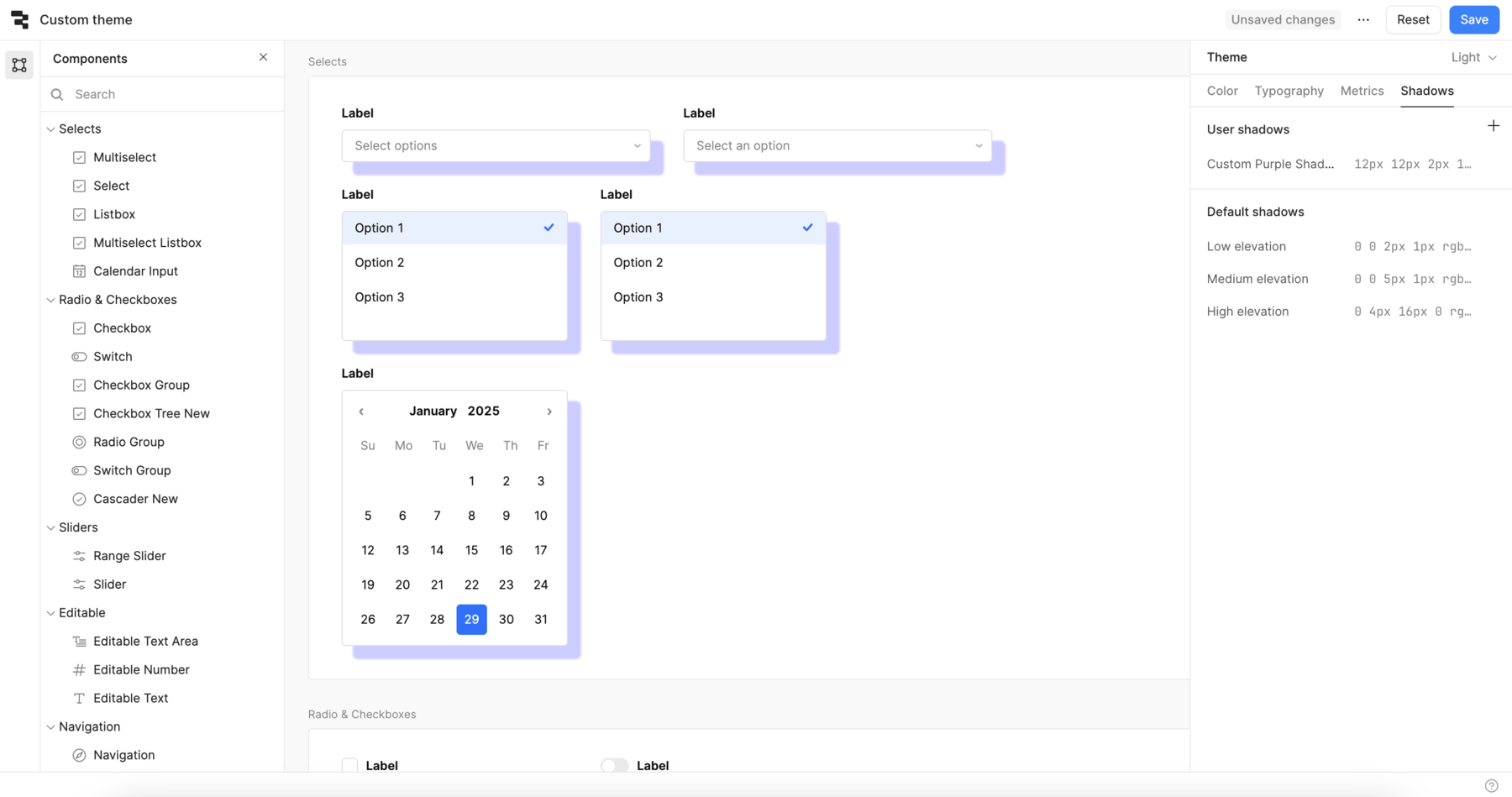
Use the Shadows section of the theme editor to create and edit shadows. You can use the Default shadows, or add a new shadow in the User shadows section. Shadows can be reused as tokens throughout your apps.
Shadows are available for most, but not all components.
Shadow values use CSS box-shadow syntax. For example, 12px 12px 2px 1px rgba(0, 0, 255, .2) creates the custom purple shadow in the following image.

To remove a shadow—in situations where you want to override a theme—set the value to none.
Apply component-level theme overrides
To edit the settings for a component, select the component from the canvas or from the Components menu on the left. The Theme editor updates to show component-specific settings that override the organizational-level theme. For each of the settings, choose a custom value or a token.
Configure app-level themes
App-level themes are available to users on all plans.
Within an app, you can apply organization level themes or create a custom theme. Open the App Settings tab to get started. You can choose to apply an organization-level theme, or apply a custom theme for this app.
Any theme changes apply to the current app only, and you can't edit organizational level themes from within an app. Note that you can't define custom color tokens, font tokens, or metric tokens for a custom app theme.