Getting started with images
Learn about the different ways to include images in your classic apps.
You can display images in classic apps in a variety of ways. Multiple components support images and can support different methods for providing an image source.
Add images with the following components:
Features
Key features of image components include:
- The option to provide an image from URL, Base64 string, Retool Storage, or JavaScript file object.
- Event handlers triggered on image click.
- Style configuration.
- Interactive and customizeable annotations through the Bounding Box component.
Specify content options
For each Image or Circular image, you can provide a URL, Base64 string, Retool Storage object, or JavaScript image object.
Image Grid enables you to manually display images from URL or Base64, or you can dynamically map images from a data source. Refer to Define option lists for more on mapping data.
If you are using Source Control, large images uploaded to the Image component are not committed and stored in Source Control in order to reduce file size and adhere to industry standard best practices. Instead, Retool recommends hosting the image on a public URL and using the URL option for the image source.
Display images from URL or Base64
For Image and Circular Image, set the Image source setting to URL to reference an image via URL or Base64 string. You can use the direct string, or reference it using JavaScript with embedded expressions. For example, if you're working with a Table and you want to reference an image in the selected row, you could use {{ table1.selectedRow.image }} as the image source.
For Image Grid in Manual mode, click each image and add the URL or string to the Source field.
Display images from Retool Storage
For Image and Circular Image, set the Image source setting to Storage to reference a file from Retool Storage.
Select a file that already exists in Retool Storage, or upload a bmp, gif, jpg, png, svg, or webp file directly from the Inspector. Uploaded files are added to Retool Storage.
Display images with JavaScript
For Image and Circular Image, set Image source to JS to reference a hard-coded JavaScript file object or the output of a query.
The file object must have the following schema:
{
  data: "image/*",
  sizeBytes: 30000,
  name: "sample image",
  base64Data: "iVBORw0KGgoAAAANSUhEUgAAAGQAAABkCAIAAAD/gAIDAAABYElEQVR4nOzSoU3cARyG4bvm79oBmtSermlS17SiphNU1FQRHISwA4KEHVAIcIQJMKBBMQGSCwZFmOFNfo7nGeATb77l38GyGvLt8O/U1PmXP1NTz0c3U1MfpobeA7ECsQKxArECsQKxArECsQKxArECsQKxArECsQKxArECsQKxArECsQKxArECsYL11er/1NbLw3pqav92Z2rq+93e1JRnBWIFYgViBWIFYgViBWIFYgViBWIFYgViBWIFYgViBWIFYgViBWIFYgViBWIFYgXLr9cfU1vbp09TU78vTqemrjeXU1OeFYgViBWIFYgViBWIFYgViBWIFYgViBWIFYgViBWIFYgViBWIFYgViBWIFYgViBUs98dnU1tftx+npnZ/fp6aejzZTE15ViBWIFYgViBWIFYgViBWIFYgViBWIFYgViBWIFYgViBWIFYgViBWIFYgViBWIFbwFgAA//8hwRgJea5fggAAAABJRU5ErkJggg=="
}
Configure user interaction
The Interaction section of the Inspector contains settings that control user interaction. Use event handlers to listen for and handle clicks on each image.
For Image Grids in Manual mode, click each image to configure event handlers on the individual image.
Customize appearance
You can customize the presentation of your component in the Spacing and Appearance sections of the Inspector.
All components have a Hidden setting, which you can dynamically control with a truthy value that evaluates to true or false. You can also control the hidden property for a component using the .setHidden() method from event handlers and JavaScript queries.
You can also create custom style rules using the Styles setting. Each component has different styles that you can configure, but common ones include colors, fonts, and text styles. Use app-level or organization-level themes to set these styles across all components.
Resize images
Images scale to the size of the component. Click and drag a corner of the component to resize it.
You can resize images displayed in other components using the img HTML tag by setting width and height values:
<img src="your-url.com/image" width="200px" height="200px" />
You can also use percentages:
<img src="your-url.com/image" width="80%" height="80%" />
Percentage values are evaluated based on the size of the Text or Table component used to display the image.
Display images in other components
You can insert images into several other components, including Text and Table, using an HTML img tag.
Display images in Text components
You can also display images in Text components using an HTML img tag.
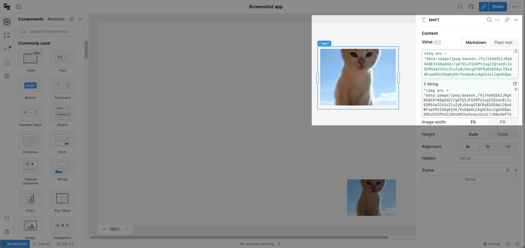
Set the src of the image tag to either a URL or a Base64 string. If you include a Base64-encoded string, prepend the src string with the following: data:image/jpeg;base64,.
You can also reference strings from elsewhere in your classic app using {{ }} embedded expressions. For example, <img src={{ "data:image/jpeg;base64," + query1.data.imageString }}> pulls an image from query1, and prepends the string with data:image/jpeg;base64,.
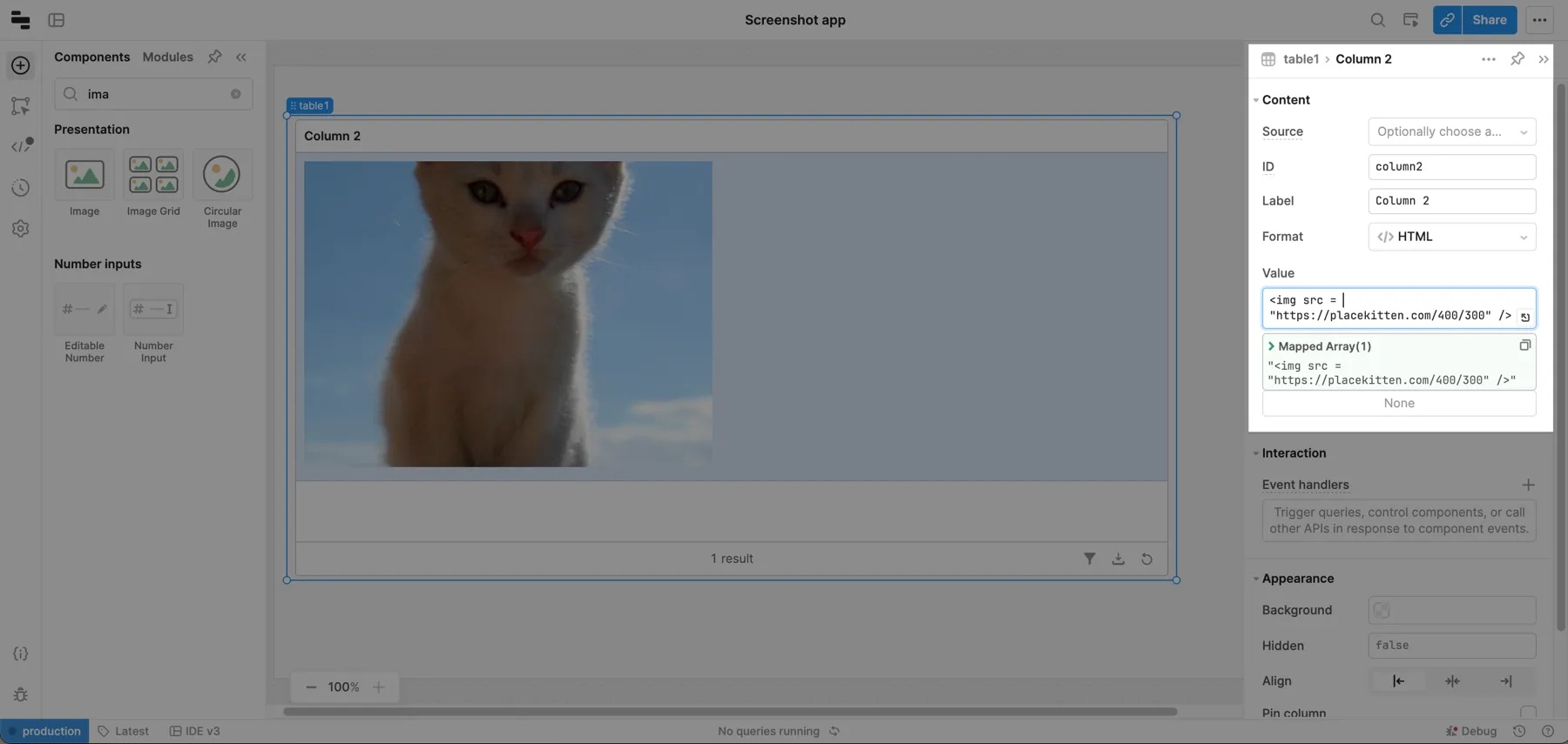
Display images in Table components
You can display images in Table components using the HTML column type and the img HTML tag. Add data to your table and then set the column type to HTML on the column that you want to render images in. Use the Mapped value property to pass in the img tag and the image's source.
Display an image with the Bounding Box component
The Bounding Box component has additional functionality beyond the basics of the other image components. The user can draw green, transparent boxes around certain areas of the image, categorize the boxes, and delete boxes.
In the Content section of the Inspector, identify the image using the Image src URL setting. Other image source types are not supported. Identify the List of possible labels as the possible categories for the bounding boxes, and the Initial Bounding boxes to set the defaults.
Bounding boxes are defined as an array of objects in the following format:
  {
    "x": 364.33285687062585,
    "y": 455.1241526664781,
    "height": 234.01870447637899,
    "width": 460.11987944778207,
    "label": "Car"
  }
Once created, bounding boxes are stored in the boundingBoxes property.
The Interaction section of the Inspector contains settings that control user interaction. Use event handlers to listen for and handle changes to the bounding boxes.