Getting started with the Timeline component
Learn how to use the Timeline component to display date information in a Gantt chart format.
Use the Timeline component when you want to display events in a Gantt chart format. This component is useful for project tracking, planning, and visualizing dates and date ranges.
Features
Key features of the Timeline component include:
- Manually or dynamically define the events that appear.
- Configurable color, metadata, and tooltips for each event.
- Meta events and milestones to add to the Timeline.
- Event handlers triggered on click.
- User-configurable timescale.
- Customizeable format and style of the Timeline.
Specify content options
The Content section of the Inspector contains settings that control the content of the Timeline, including the Data source and Add-ons.
Define the data source
You can define the Data source as an array of data either manually or dynamically. To manually define the data, select JavaScript from the dropdown and manually enter your array. To dynamically define the data, select a query from the dropdown list. Refer to Define option lists for more information about dynamically referencing arrays.
Next, define the mapped events for each item in your array:
- ID: The identifier for the event.
- Title: The title of the event. This is displayed on top of event ranges, and to the right of single-date events.
- Start date: The start date of the event. This value is
nullfor single-date events. - End date: The end date of the event.
- Color: The color of the event in the Timeline. You can manually set the color, or you can reference a theme color, such as
{{ theme.tertiary }}. - Properties: Any metadata that you want to associate with events, formatted as an object. Use properties to group events. To expose all fields for grouping, set this value to
{{ item }}. - Tooltip: The format for a tooltip, displayed on hover. When this setting is left blank, the default tooltip format is
Start Date -> End Date (Duration).
Define add-ons
Use the Add-ons setting to provide additional information about the Timeline.
Create groups
Use the Grouping add-on to organize events based on one of the values defined in the Properties setting. You can optionally define the event groups that you want to be displayed by default. Nested groups are supported, and you can reorder the groups to define which should be applied first. Classic app users can also choose to maniupulate the grouping using the icon in the top right corner of the component.
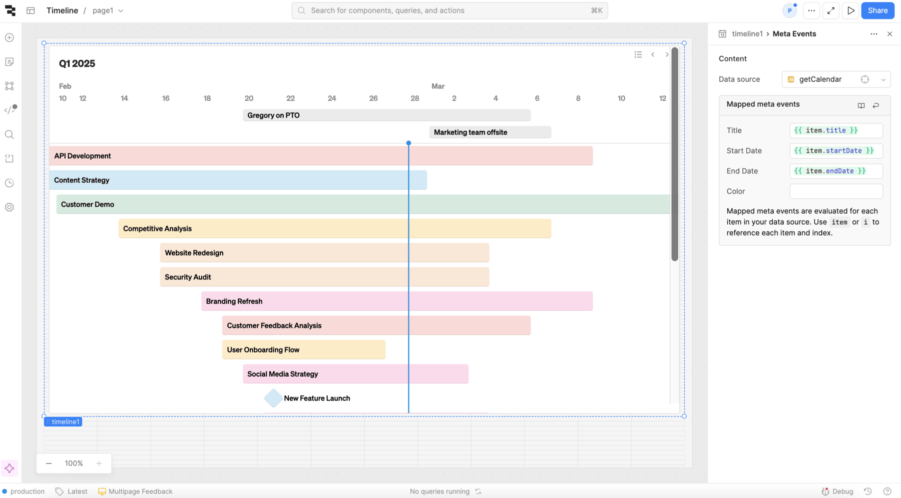
Define meta events and milestones
You can define additional sets of events that appear on your Timeline using the Meta Events and Milestones add-ons.
- Meta events
- Milestones
Meta events appear in a separate section above the main Timeline. For example, you could use meta events to make note of when certain employees will be out of the office.
Milestones are single-date events that appear as vertical lines layered over the main Timeline. For example, you could use milestones to make note of certain important dates or accomplishments. The Title of milestones is displayed on hover.
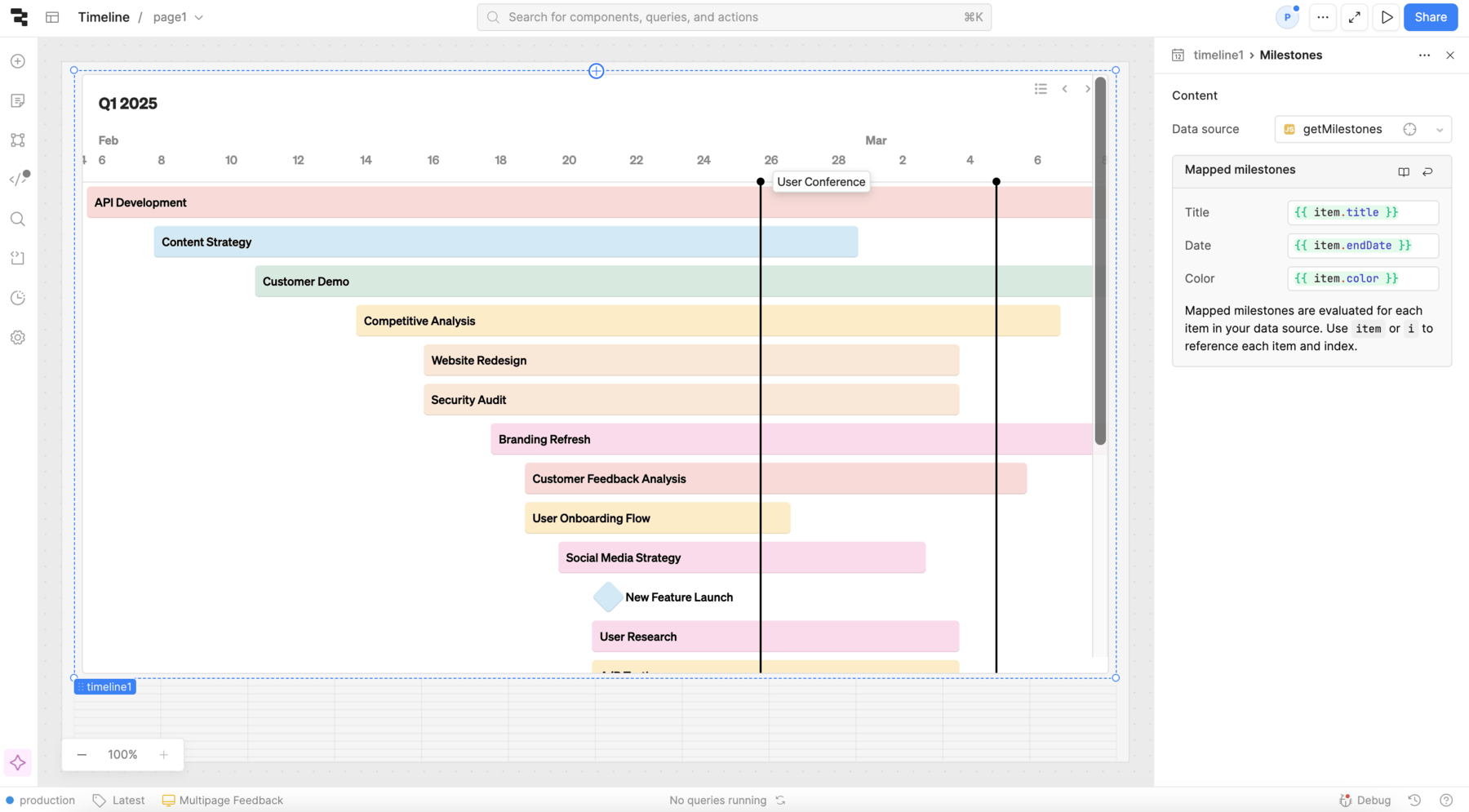
Defining the data for meta events and milestones works similarly to defining the data source, but these add-ons do not support tooltip label changes or properties.
Configure user interaction
The Interaction section of the Inspector contains event handlers, which listen for and handle interactions with your components. For the Timeline component, events trigger when users click the Timeline.
Customize appearance
You can customize the presentation of your component in the Spacing and Appearance sections of the Inspector.
All components have a Hidden setting, which you can dynamically control with a truthy value that evaluates to true or false. You can also control the hidden property for a component using the .setHidden() method from event handlers and JavaScript queries.
You can also create custom style rules using the Styles setting. Each component has different styles that you can configure, but common ones include colors, fonts, and text styles. Use app-level or organization-level themes to set these styles across all components.
This section is also where you customize Timeline-specific settings, such as the Timescale, intervals, and initial date of the Timeline. Open the Advanced settings to adjust the month and day on which the quarter starts.