Group components with the Mobile Container component
Learn how to customize the design and layout of Retool Mobile apps.
Retool Mobile apps arrange mobile components in column (vertical) and row (horizontal) layouts. Container components include additional layout settings to control the layout of nested components.
Horizontal layouts
You can arrange nested components horizontally:
- Click + in the Components section and add a Container mobile component to your mobile app.
- Add some mobile components to this Container, or drag existing ones into it.
- Configure the Container to arrange nested mobile components in a row layout by selecting a Layout type of ➜.
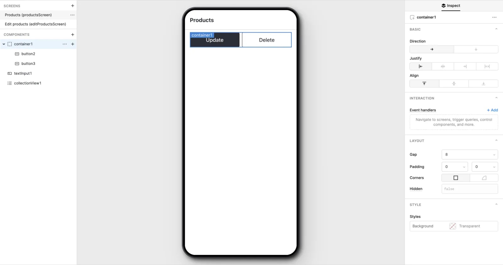
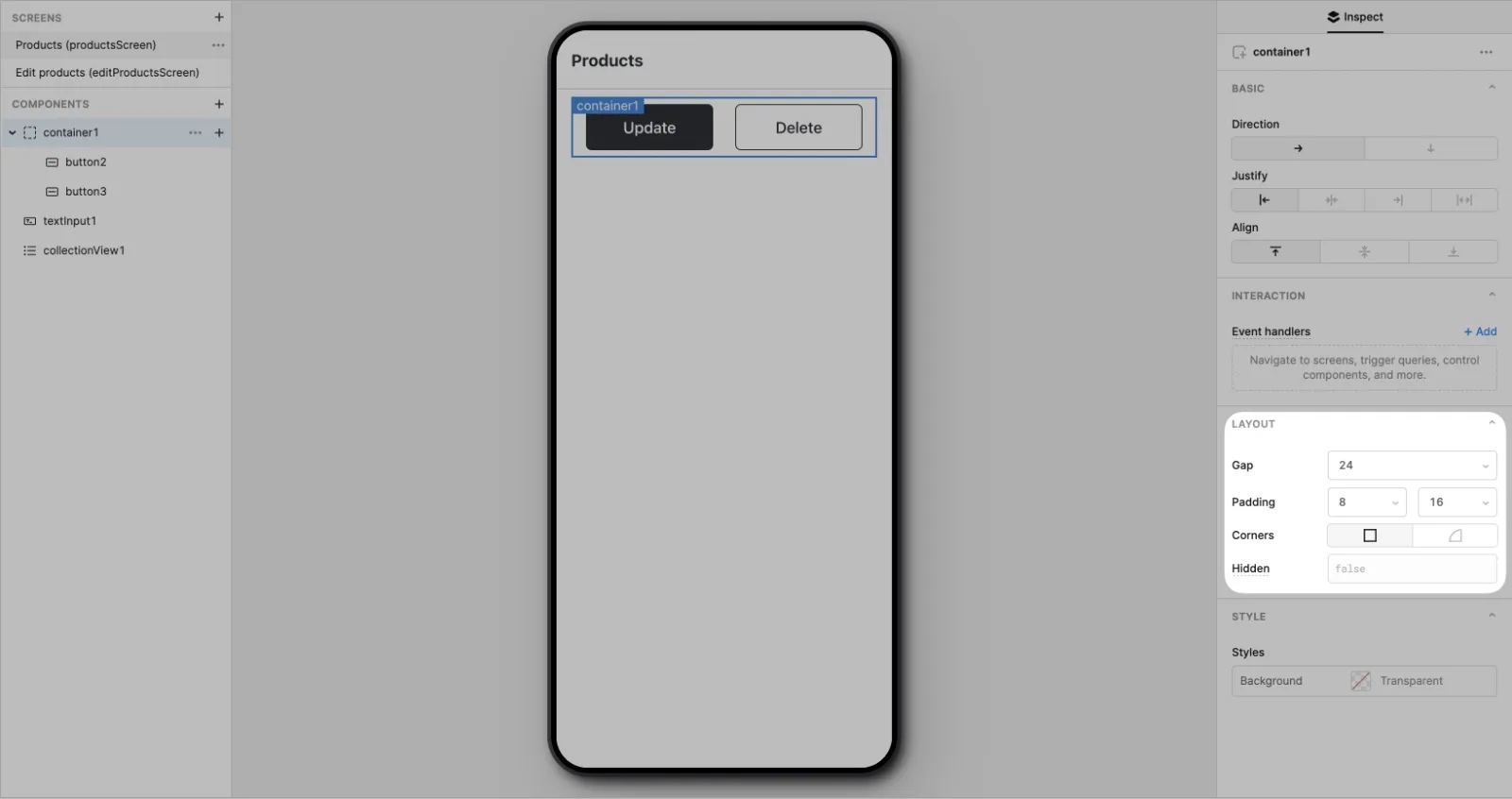
Gap and padding
You can use Gap and Padding settings to fine-tune their layout.
- Gap controls the space between nested mobile components.
- Padding controls the space surrounding all nested mobile components.
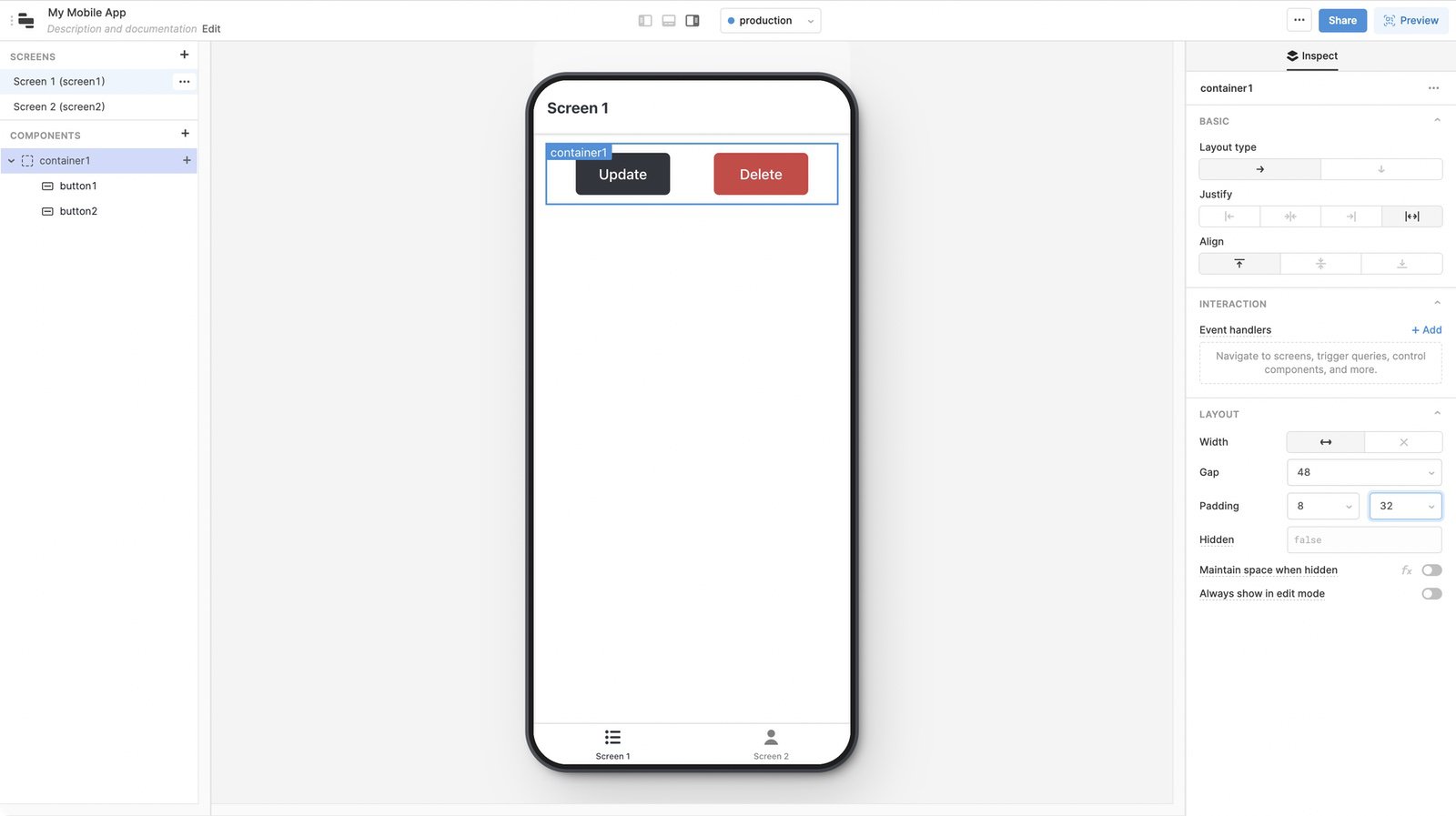
You may need to adjust these settings whenever you make significant changes to your app's layout.
If you use nested mobile components extensively, you can use Gap and Padding settings to fine-tune their layout.
- Gap controls the space between nested mobile components.
- Padding controls the space surrounding all nested mobile components.
You may need to adjust these settings whenever you make significant changes to your app's layout.
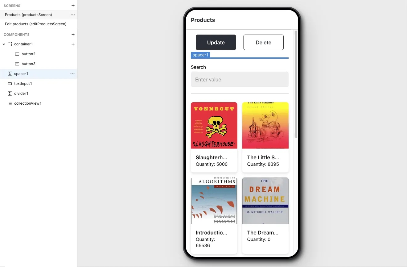
Spacing
Use the Divider and Spacer mobile components to visually separate vertical areas of your mobile app with dividing lines or empty blocks of space.