Getting started with boolean inputs
Learn how to add, configure, and set the value of boolean input components in Retool web apps.
You can use the following components to accept boolean user inputs:
- Checkbox
- Checkbox Group
- Checkbox Tree (a preset of Checkbox Group)
- Switch
- Switch Group
Features
Key features of boolean inputs include:
- Manual or mapped option lists in Checkbox Group, Checkbox Tree, and Switch Group.
- Nested option lists in Checkbox Group, Checkbox Tree, and Switch Group.
- Input validation, including marking components as required or creating custom rules.
- Event triggering based on status of the boolean input.
- Style configuration.
Specify content options
The Content section of the Inspector contains settings that control the content of an input field, such as:
- Default value: Pass in a single value or an array of values that correspond to the items you want checked or switched "on" by default.
- Check strictly: When checked, removes the association between parent and child. For example, checking the parent option does not automatically check the nested child options.
- Delimiter: The string delimeter to use on nested items in the
checkedPathStringsandleafPathStringsproperties. For example, setting this value to-would result in a string formatted as follows:"Shoes-Sandals-Flip-Flop".
All boolean components include an Add ons section, which enables you to add a label or tooltip to the component.
Define options
You can define the options for Checkbox Group, Checkbox Tree, and Switch Group either manually or by mapping data. Refer to the Define option lists guide for more information.
If you're mapping data for Checkbox Group, Checkbox Tree, or Switch Group, your data must be in a flat array format.
Identify parent
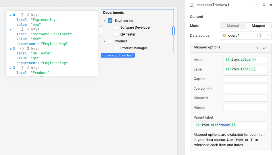
Checkbox Tree uses the Parent label setting to identify where each option should sit in the nested option list. This setting must correspond to the value of another key in the dataset, which identifies the parent of the item. Items without a parent label appear at the top level.
For example, to create a Checkbox Tree, you could have a JavaScript query, query1, that includes the following code:
const jobs = [
  {label: 'Engineering', value: 'eng'},
  {label: 'Software Developer', value: 'dev', department: 'Engineering'},
  {label: 'QA Tester', value: 'qa', department: 'Engineering'},
  {label: 'Product', value: 'prod', },
  {label: 'Product Manager', value: 'pm', department: 'Product'},
];

return jobs;
Set the Data source to query1, and set Parent label to {{ item.department }}. The Checkbox Tree appears as follows:
- Engineering
- Software Developer
- QA Tester
- Product
- Product Manager
Configure user interaction
The Interaction section of the Inspector contains settings that control user interaction and validation, such as:
- Event handlers, which listen for and handle interactions with your components.
- Validation rules, which define the types of user inputs that your components accept.
Customize appearance
You can customize the presentation of your component in the Spacing and Appearance sections of the Inspector.
All components have a Hidden setting, which you can dynamically control with a truthy value that evaluates to true or false. You can also control the hidden property for a component using the .setHidden() method from event handlers and JavaScript queries.
You can also create custom style rules using the Styles setting. Each component has different styles that you can configure, but common ones include colors, fonts, and text styles. Use app-level or organization-level themes to set these styles across all components.
Configure group layout
Checkbox Group and Switch Group each support different Group layout settings.
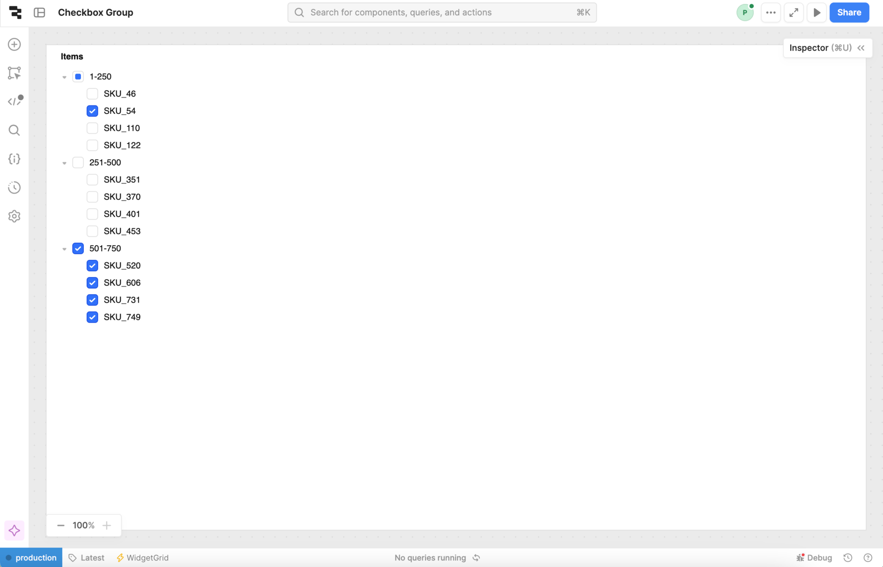
When using Checkbox Tree or the component has a nested option list, Retool enforces the Tree group layout.
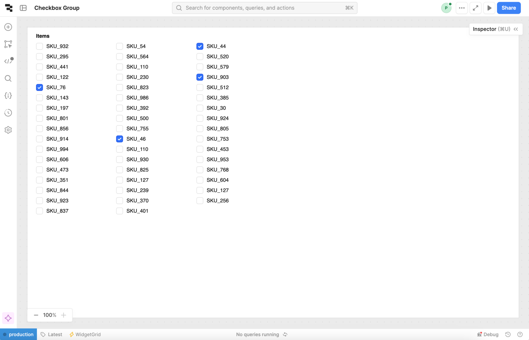
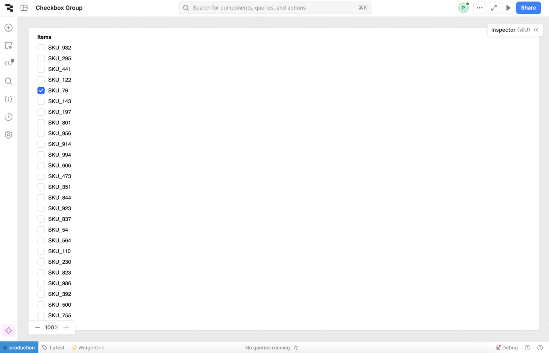
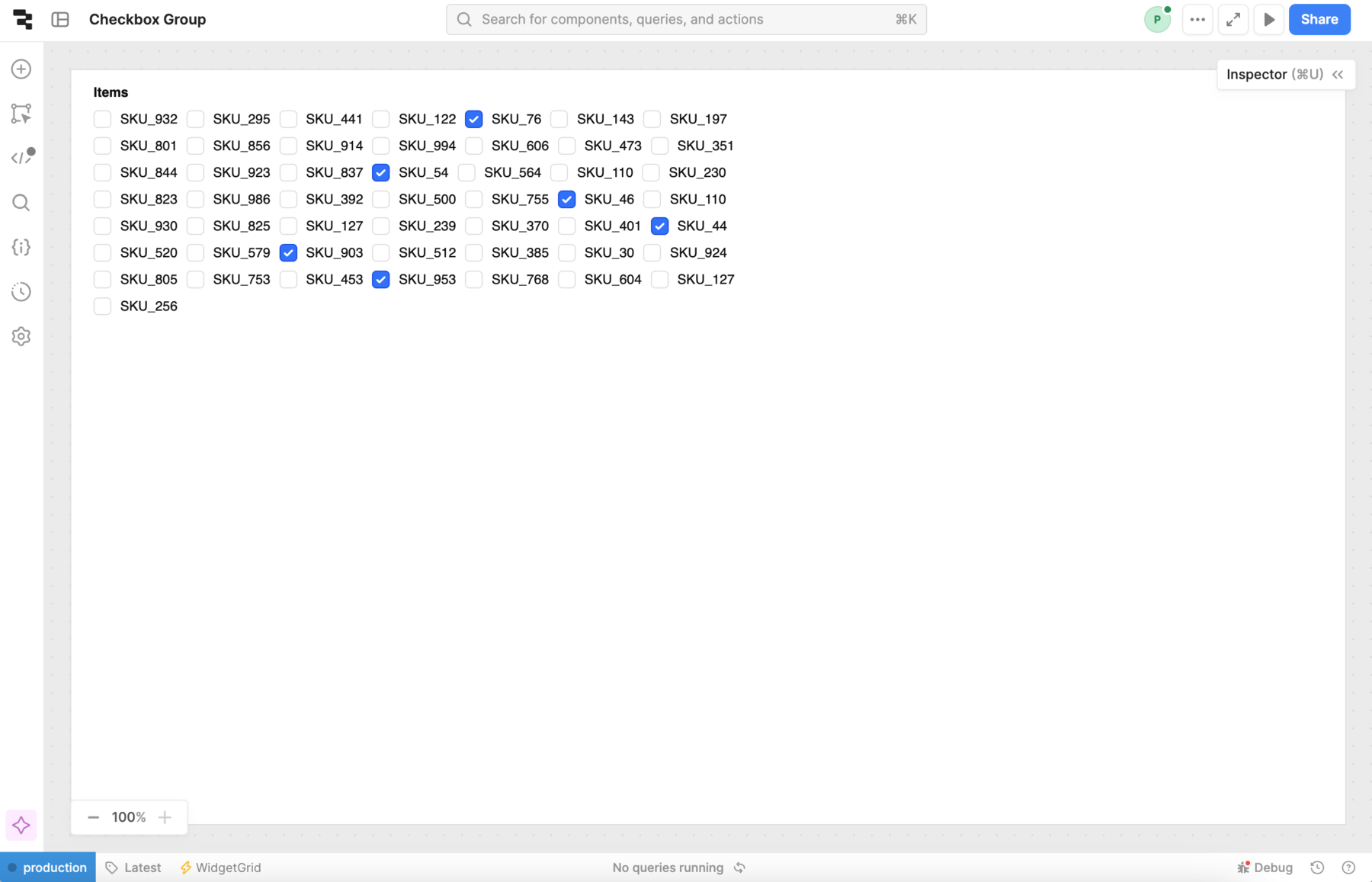
The following screenshots show the different layout options available.
- Auto column
- Single column
- Wrap
- Tree
Create a dark mode switch
A common use for Switch is it create a dark mode toggle. This example also demonstrates how to set the default value of the component and add event handlers. Use the following instructions to add a dark mode toggle to your app.
Organization-level themes are available on a Business or an Enterprise plan only.
- Create an organization-level theme with a light mode and a dark mode.
- Navigate to your app's settings, and select the theme you just created.
- Add a Switch component to the canvas. Update the label to
Dark mode. - Set default value to
{{ theme.mode === "Dark" }}. This ensures that the switch position corresponds to the current state of the mode. - Add a new event handler with the following settings:
- Event: True
- Action: Set theme mode
- Mode name: Dark
- Persist: Checked
- Add a new event handler for when the Switch is set to False.
- Test out your dark mode toggle.