Getting started with number inputs
Learn how to collect number values with input components in classic apps.
You can use the following components to accept number-based user inputs:
Features
Key features of number inputs include:
- Stepper arrows.
- An optional "clear" button.
- Informational icons for currency code and country.
- Decimal rounding.
- Input validation, including minimum and maximum values.
- Style configuration.
Specify content options
The Content section of the Inspector contains settings that control the content of an input field, such as:
- Default value
- Placeholder
- Label and caption
Format presets
Configure the format of your input using the Format setting.
Currency and Percent components are presets of the Number Input component with preconfigured Format settings.
Decimal places
The Number Input component and its presets accept integers (numbers without a decimal place) and floating-point numbers (numbers with a decimal place).
Use the Decimal places setting to configure the maximum number of digits after the decimal. Retool rounds numbers to adhere to the configured decimal places when the input exceeds this limit.
The following defaults apply to numeric user inputs:
- Standard format defaults to up to three decimal places.
- Percent format defaults to up to three decimal places. The user's input is converted to a floating-point number
valuebetween 0 and 1. - Currency format defaults to the standard number of decimal places for that currency.
JavaScript uses the IEEE 754 double-precision floating-point format, which allows for up to 16 significant decimal digits.
Checking the Pad decimal places setting includes trailing zeros to match the specified number of decimal places.
Currency code
The Currency component requires the Currency code setting. This setting accepts three-letter country codes defined by ISO 4217. Retool updates the icon to the left of the input field with the corresponding code or icon.
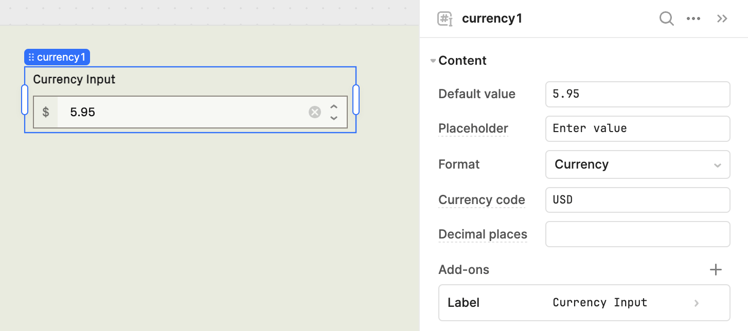
The Currency code setting defaults to USD.
Configure user interaction
The Interaction section of the Inspector contains settings that control user interaction and validation, such as:
- Event handlers, which listen for and handle interactions with your components.
- Validation rules, which define the types of user inputs that your components accept.
Customize appearance
You can customize the presentation of your component in the Spacing and Appearance sections of the Inspector.
All components have a Hidden setting, which you can dynamically control with a truthy value that evaluates to true or false. You can also control the hidden property for a component using the .setHidden() method from event handlers and JavaScript queries.
You can also create custom style rules using the Styles setting. Each component has different styles that you can configure, but common ones include colors, fonts, and text styles. Use app-level or organization-level themes to set these styles across all components.