Getting started with select inputs
Learn how to provide a list of options from which users can select in Retool web apps.
You can use the following components to present a set of options from which users can select:
- Cascader
- Listbox
- Multiselect
- Multiselect Listbox
- Radio Group
- Segmented Control
- Select
Specify content options
The Content section of the Inspector contains settings that control the content of an input field, such as:
- Default value
- Placeholder
- Label and caption
Most select input components include an Add ons section, which enables you to add items such as a label or tooltip to the component.
Define options
You define the options for most select input components manually or dynamically by mapping to an array of data. Refer to the Define option lists guide for more information.
Identify parent
Cascader uses the Parent value setting to identify where each option should sit in the nested option list. Items without a parent value appear at the top level. The value of the Parent value setting must correspond a key in the dataset, which identifies the parent of the item. The value of this key must correspond to the value of the parent item.
For example, to create a Cascader, you could have a JavaScript query, query1, that includes the following code:
const jobs = [
  {label: 'Engineering', value: 'eng'},
  {label: 'Software Developer', value: 'dev', department: 'eng'},
  {label: 'QA Tester', value: 'qa', department: 'eng'},
  {label: 'Product', value: 'prod', },
  {label: 'Product Manager', value: 'pm', department: 'prod'},
];

return jobs;
Set the Data source of the Cascader to query1, and set Parent value to {{ item.department }}. Note that the eng department corresponds to the value of another item in the array.
The Cascader is structured as follows:
- Engineering
- Software Developer
- QA Tester
- Product
- Product Manager
Configure user interaction
The Interaction section of the Inspector contains settings that control user interaction and validation, such as:
- Event handlers, which listen for and handle interactions with your components.
- Validation rules, which define the types of user inputs that your components accept.
You can set the value of a selection component programmatically using the .setValue() method.
Select all options
Multiselect and Multiselect Listbox both enable a user to select all options in the list using the UI, or programmatically with the .values property or .setValues() method.
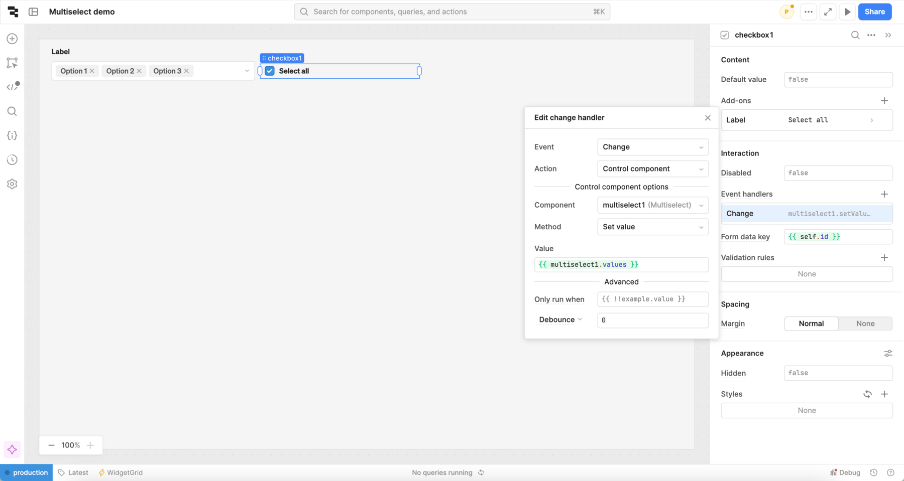
For example, you could add a Checkbox component that, when checked, selects all values for the Multiselect component. To accomplish this, add a Multiselect component and a Checkbox component to the canvas.
In the Checkbox inspector, add an event handler with the following settings:
- Event: True
- Action: Control component
- Component:
multiselect1 - Method: Set value
- Value:
{{ multiselect1.values }}

Customize appearance
You can customize the presentation of your component in the Spacing and Appearance sections of the Inspector.
All components have a Hidden setting, which you can dynamically control with a truthy value that evaluates to true or false. You can also control the hidden property for a component using the .setHidden() method from event handlers and JavaScript queries.
You can also create custom style rules using the Styles setting. Each component has different styles that you can configure, but common ones include colors, fonts, and text styles. Use app-level or organization-level themes to set these styles across all components.
Use the Show clear button setting to show an icon that lets the user clear the input field and return it to the Placeholder text. Multiselect Listbox includes Show footer setting instead, which displays Select all and Clear options in the footer.