Getting started with the Form component
Learn how to assemble an input form using the Form component.
The Form component functions as a container for input components, providing complete control over a form's layout and design. You create a form by adding input components or generating them automatically using the schema of a Table or a connected PostgreSQL, MySQL, or MS SQL database.
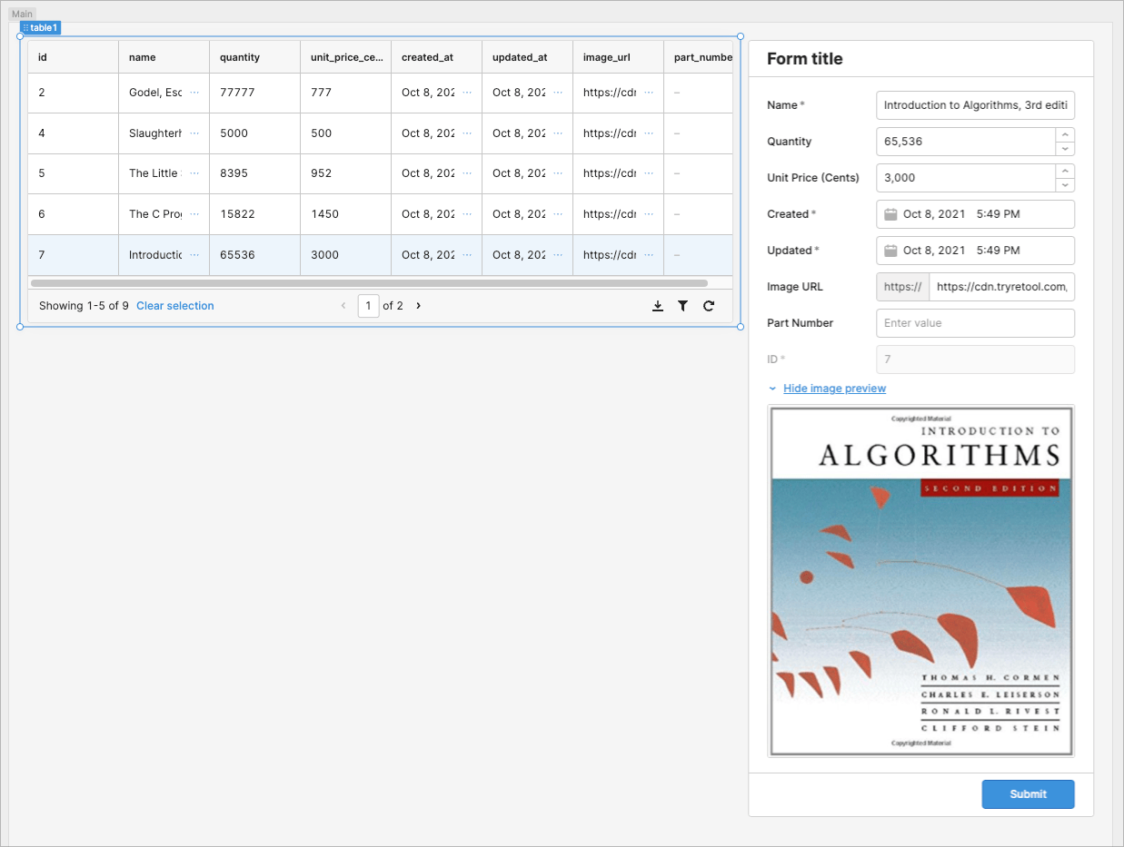
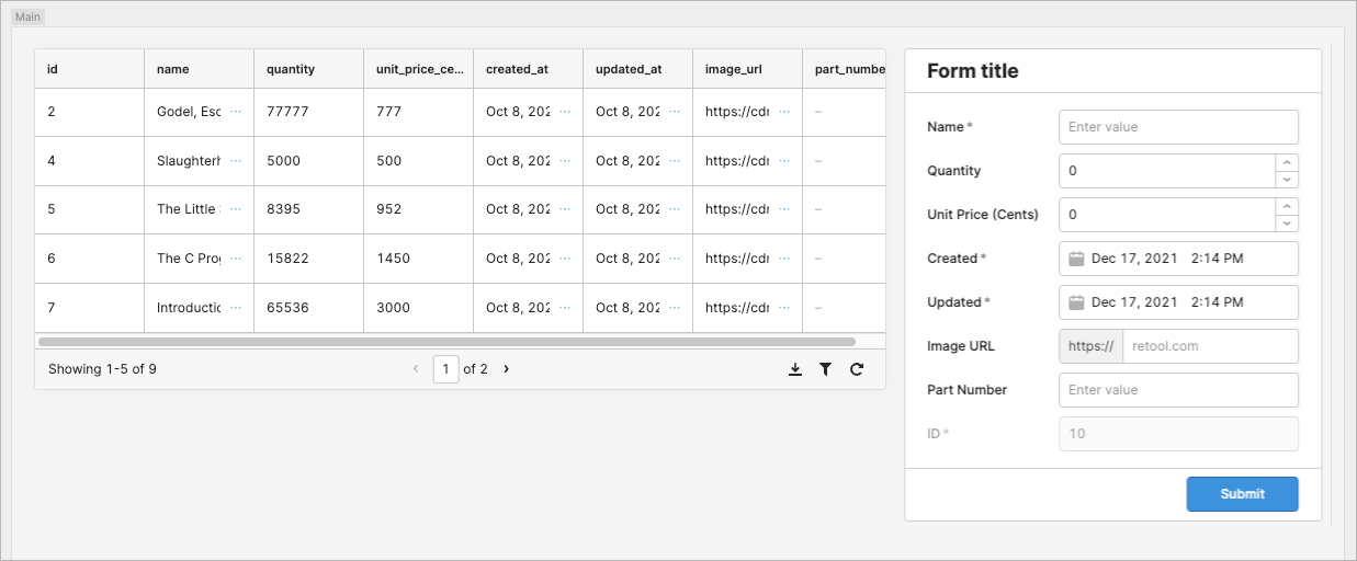
This guide walks you through building an app and form using the Form component. You can fill in the form to create a record or update existing data by selecting a record from a table and populating the form. The form also increments IDs automatically.
Try out the app to see the form in action (submissions are disabled).
Features
Key features of Form include:
- Automatically generate a form schema from a database or table.
- Manually add any component to the form.
- Input validation of the form.
- Customizeable styles.
Specify content options
The Content section of the Inspector contains settings that control the content of your form, including Data source and Add-ons.
Generate the inputs
You can manually add form inputs or generate them from a resource or table. To generate inputs, add a form to the canvas and click Generate from database. This opens a modal where you can select a resource or table, along with the inputs.
If your app already includes a table, your new Form includes a Generate from table option, instead of Generate from database.
Retool evaluates each column to set an appropriate label and input type, but you can edit these properties as well. You can uncheck individual columns to exclude them from the form. This is useful if you don't want users to provide certain information, such as IDs or timestamps. You can also change the generated input type or label, and whether the field should be required.
Each input is generated with a value for Form data key—shown in the Interaction section of the Inspector—that corresponds to the column name from the table. The Form data key is the key used to identify data in the form.data object.
Set the form title
Update the form's title so it's clear to the user if they are creating a record or updating an existing one. Select the form's title and change the Value:
#### {{ table1.selectedRow ? 'Edit' : 'Create new' }} product
This displays either Edit product or Create new product, depending on whether a table row is selected or not.
Configure user interaction
The Interaction section of the Inspector contains settings that control user interaction and validation, such as:
- Event handlers, which listen for and handle interactions with your components.
- Validation rules, which define the types of user inputs that your components accept.
Validate submissions
Forms can check the validation status of inputs. For more information, refer to the Input validation guide.
Clear the form
To clear values from the form after submissions, enable Reset after successful submit in the Interaction section of the form's Inspector. This setting resets the values to those in the form's Data source field.
Create a query to update the dataset
When you generate a Form using the Generate from database option, Retool automatically creates a query (form1SubmitToProducts in the screenshot) to insert new records into the database when the form is submitted.
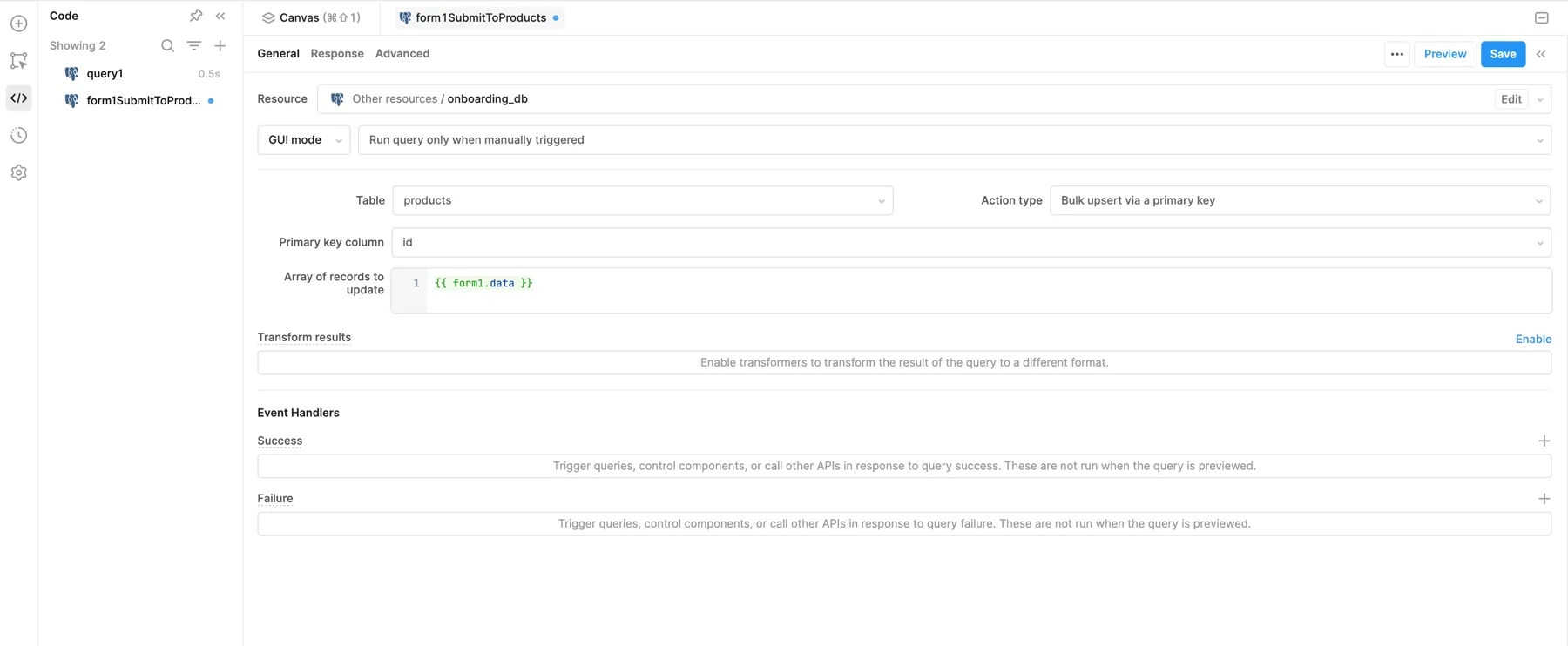
If your form is generated from a table or manually, you must create this query manually and attach it to the form as an event handler.
Use the form to update existing records
You can also use this form to make changes to an existing record. A common approach is to populate a form with data from a selected table row and then submit changes to update the record.
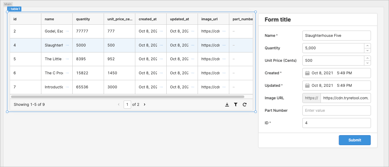
Use the Data source property to automatically populate the form's inputs using the selected table row data. The Form component matches each input's Form data key to a corresponding column name from the table to determine where values should go.
For example, this ternary operator sets the form's initial data only if a table row is selected:
{{ table1.selectedRow ? table1.selectedRow : null; }}
If set, a form's Data source overrides any default values for nested components.
Change the query action type
The form's existing query only creates new records. However, you can update the existing query to update records when the form is submitted. Select the existing query, form1SubmitToProducts, and change the Action type to Bulk upsert via primary key.
Remember to save changes to your queries by clicking Save.
This action requires a Primary key column in the Table so the query knows which record to update. This should be a unique identifier to avoid incorrect changes. In this case, set the value to id.
When the form is submitted, the query looks for an existing record using the provided ID. If there's a match, that record is updated. If not, the query creates a new record instead.
Include the form data
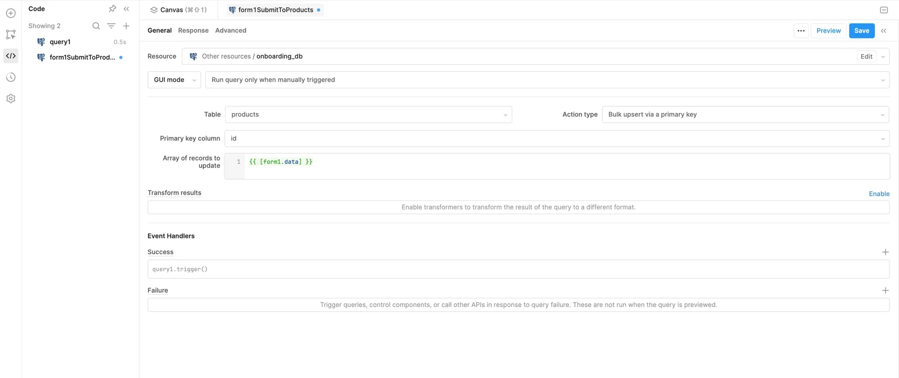
The form data isn't included in the new action type. Set the Array of records to update to {{ [form1.data] }}. Note that the form data is wrapped in brackets to provide it as an Object.
Refresh the table after submission
You might want to automatically update other components in your app (like a Table) based on the database changes. You can create an event handler to refresh the table to show the changes automatically:
- Add a new event handler for a Success event.
- Select Trigger query as the action to perform.
- Select query1. Triggering this query retrieves the dataset, including your additions, and updates the table.
Customize appearance
You can customize the presentation of your component in the Spacing and Appearance sections of the Inspector.
All components have a Hidden setting, which you can dynamically control with a truthy value that evaluates to true or false. You can also control the hidden property for a component using the .setHidden() method from event handlers and JavaScript queries.
You can also create custom style rules using the Styles setting. Each component has different styles that you can configure, but common ones include colors, fonts, and text styles. Use app-level or organization-level themes to set these styles across all components.
The Styles setting updates the style of the Form component as a whole. The Nested styles setting applies changes across all components inside the Form.
Customize the form
The following section includes additional ways that you can consider customizing your form.
Increment IDs automatically
The form in this example currently allows users to specify an ID. Since this form also creates and updates records, users could accidentally overwrite a record if they provide an existing ID. Instead, you should automatically increment the ID and prevent users from providing one in the form.
The following guidance is provided for demonstration purposes. Retool recommends using your database's auto-increment feature to create unique identifiers automatically.
For this guide, use Math to find the highest ID number and use it to increment to the next ID automatically:
Math.max(...query1.data.id) + 1;
First, disable the ID input by setting the value for Disabled to true in the Interaction section of the Inspector. Next, update the form's Initial data to provide a new ID if a row isn't selected:
{
  {
    table1.selectedRow
      ? table1.selectedRow
      : { id: (Math.max(...query1.data.id) + 1).toString() };
  }
}
Display image preview
The Form component can contain any other components, not just inputs. You can include an optional image preview using the provided image URL.
Add toggle
- Drag a Toggle Link component and position it below the input fields. This toggle is used to show or hide the image preview.
- Update the value for Text to
{{ self.value ? 'Hide' : 'Show' }} image preview. - Set the value for Disabled using the value of the image URL input, such as
{{ !textInput2.value }}. This disables the toggle if the input doesn't have a value.
Toggle Link has a value of false when in a closed state and displays the text Show image preview.
Add image
- Drag an Image component and position it below the toggle.
- Set the Image source using the value of the input, such as
{{ textInput2.value }}. - Set the value for Hidden to
{{ !toggleLink1.value || toggleLink1.disabled }}. This hides the image preview if Toggle Link is either disabled or returns a value offalse.
The image preview can now be toggled but is hidden automatically if no image URL is present.
