Define option lists
Use the option list editor to configure options manually or map data to generate them dynamically.
Many components present a list of options, such as the dropdown in a Select or the menu of a Split Button. Each option contains a number of settings depending on the component—value, label, caption, tooltip, and disabled, and more.
Select option mode
For components that support multiple options, you can either manually configure each option or dynamically map them from an array of data, such as query results or transformer values. Select either the Manual or Mapped mode to use the respective method.
- Manual
- Mapped
Select Manual mode in the Content settings of the Inspector to configure options using a reorderable list. This mode is suited for lists that contain:
- A small, maintainable number of options.
- Options that are static (e.g., not from an API or database).
- Options used by only one component.
Click + to add an option and configure the available settings, or click an existing option to edit. You can duplicate or delete an option by clicking the ••• icon.
The value (or key for some components) must be unique for each option. If duplicate values are found, only the first option is rendered.
Select Mapped mode in the Content settings of the Inspector to generate options from a data source. This is similar to using a .map method on an array: each item in your data source is mapped to each option. This mode is best suited for lists that contain:
- A large number of options.
- Options with a dynamic data source (e.g., from an API or database).
- Options used by multiple components.
Specify a data source
Specify the data to evaluate in the Data source setting. Select from your queries or transformers, or switch to JavaScript mode (fx) to provide an array of values or an object of arrays by key. You can also reference data from anywhere in your app.
Selecting Use JavaScript or Use an array switches the field to an input. Click 𝘧𝑥 to switch back to a dropdown menu.
Configure mapped options
The Mapped options section contains settings that are evaluated for each item in your data source.
Use item to reference the current data source item being evaluated and i to reference the current index. For example, if the items in your data source have an id ([{ id: 1 }, { id: 2 }]), reference this using {{ + item.id + }} in any setting.
You can test out mapped options by generating sample data from Retool's REST API Generator app.
| Column title | Data type | Description |
|---|---|---|
name | Numbers/Product ID | Product SKU |
quantity | Numbers/Random | Item quantity |
unit_price_cents | Numbers/Random | Item price in cents |
created_at | Dates | Date created |
Click Generate API to generate a test API and save its URL. You can now use this sample data to map options from a query.
First, create a query:
- In the query editor, choose RESTQuery (restapi).
- Select GET as the Action Type.
- In the URL field, enter the endpoint URL you created.
- Click
Run. You should see results from the sample API data.
Next, add and configure a Select component:
- Drag a Select component to the canvas.
- Select Mapped mode.
- Set Data source to the query you created.
You can now map option settings using item.
| Mapped option setting | Evaluated item data |
|---|---|
| Value | {{ + item.id + }} |
| Label | {{ + item.name + }} |
| Caption | {{ + '$' + (item.unit_price_cents / 100 ).toFixed(2) + }} |
| Tooltip | {{ + moment(item.created_at).format("MMM Do YY") + }} |
| Disabled | {{ + item.quantity == 0 + }} |

You can use JavaScript almost anywhere in Retool and create logic that provides greater flexibility. In this example, item.unit_price_cents and item.created_at are displayed in a more readable format, and options for products with quantity: 0 are disabled.
If you want to use mapped values outside the component (e.g., in a query or another component), you can use properties like data and selectedItem. For example:
{{ + listbox1.data['4'].name + }}evaluates to the name of the fifth item.{{ + listbox1.selectedItem.name + }}evaluates to the name of currently selected item.
Use options to trigger events
Certain components, such as Navigation, support options with event handlers. Manually defined options include an additional Event handlers setting that you can configure.
You can also reference a selected option when configuring a component-level event handler with item or the item's current index using i. For example, you can configure an event handler for Dropdown Button to display the selected option's label in a notification with {{ + item.label + }}.
Arrange nested options
Certain components, such as Navigation and Checkbox Group, support nested options. When in use, a child option is nested under a parent option.
Both manual and mapped modes allow for nested options, if supported by the component.
- Manual
- Mapped
You can drag options to a different position to reorder them. If the component supports nested options, you can drag an option and position it to be nested under a parent.
To configure nested options from mapped data, each option must have a reference to the parent option under which it should nest. If the mapped data does not already include this, you can transform the data instead.
For example, the following data represents menu items to use in a customer support app. Each item contains a list of child items.
[
  {
    "key": "dashboard"
  },
  {
    "key": "tickets",
    "children": [
      {
        "key": "allTickets"
      },
      {
        "key": "openTickets"
      },
      {
        "key": "closedTickets"
      }
    ]
  },
  {
    "key": "knowledgeBase",
    "children": [
      {
        "key": "articles"
      },
      {
        "key": "faqs"
      }
    ]
  },
  {
    "key": "customers"
  },
  {
    "key": "reports",
    "children": [
      {
        "key": "ticketReports"
      },
      {
        "key": "customerSatisfaction"
      }
    ]
  },
  {
    "key": "settings",
    "children": [
      {
        "key": "accountSettings"
      },
      {
        "key": "notificationSettings"
      }
    ]
  }
]
This current structure does not conform to what the Navigation component can use. You can use a transformer to manipulate the data and transform it into the required structure.
// Menu item data
const menuItems = {{ +  menuItems.value  + }}

const result = [];

function flatten(items, parentKey = null) {
  items.forEach(item => {
    const { children, ...rest } = item;
    const newItem = { ...rest, parentKey };
    result.push(newItem);

    if (children) {
      flatten(children, item.key);
    }
  });
}

flatten(menuItems);
return result;
This transforms the data into a flattened array. Each item includes a parentKey value that is set to the key value of the parent item, if the original menu item was nested.
[
  {
    "key": "dashboard",
    "parentKey": null
  },
  {
    "key": "tickets",
    "parentKey": null
  },
  {
    "key": "allTickets",
    "parentKey": "tickets"
  },
  {
    "key": "openTickets",
    "parentKey": "tickets"
  },
  {
    "key": "closedTickets",
    "parentKey": "tickets"
  },
  {
    "key": "knowledgeBase",
    "parentKey": null
  },
  {
    "key": "articles",
    "parentKey": "knowledgeBase"
  },
  {
    "key": "faqs",
    "parentKey": "knowledgeBase"
  },
  {
    "key": "customers",
    "parentKey": null
  },
  {
    "key": "reports",
    "parentKey": null
  },
  {
    "key": "ticketReports",
    "parentKey": "reports"
  },
  {
    "key": "customerSatisfaction",
    "parentKey": "reports"
  },
  {
    "key": "settings",
    "parentKey": null
  },
  {
    "key": "accountSettings",
    "parentKey": "settings"
  },
  {
    "key": "notificationSettings",
    "parentKey": "settings"
  }
]
The Navigation component can now map this data to a list of options with nested items. Any event handlers can reference the selected option using index.
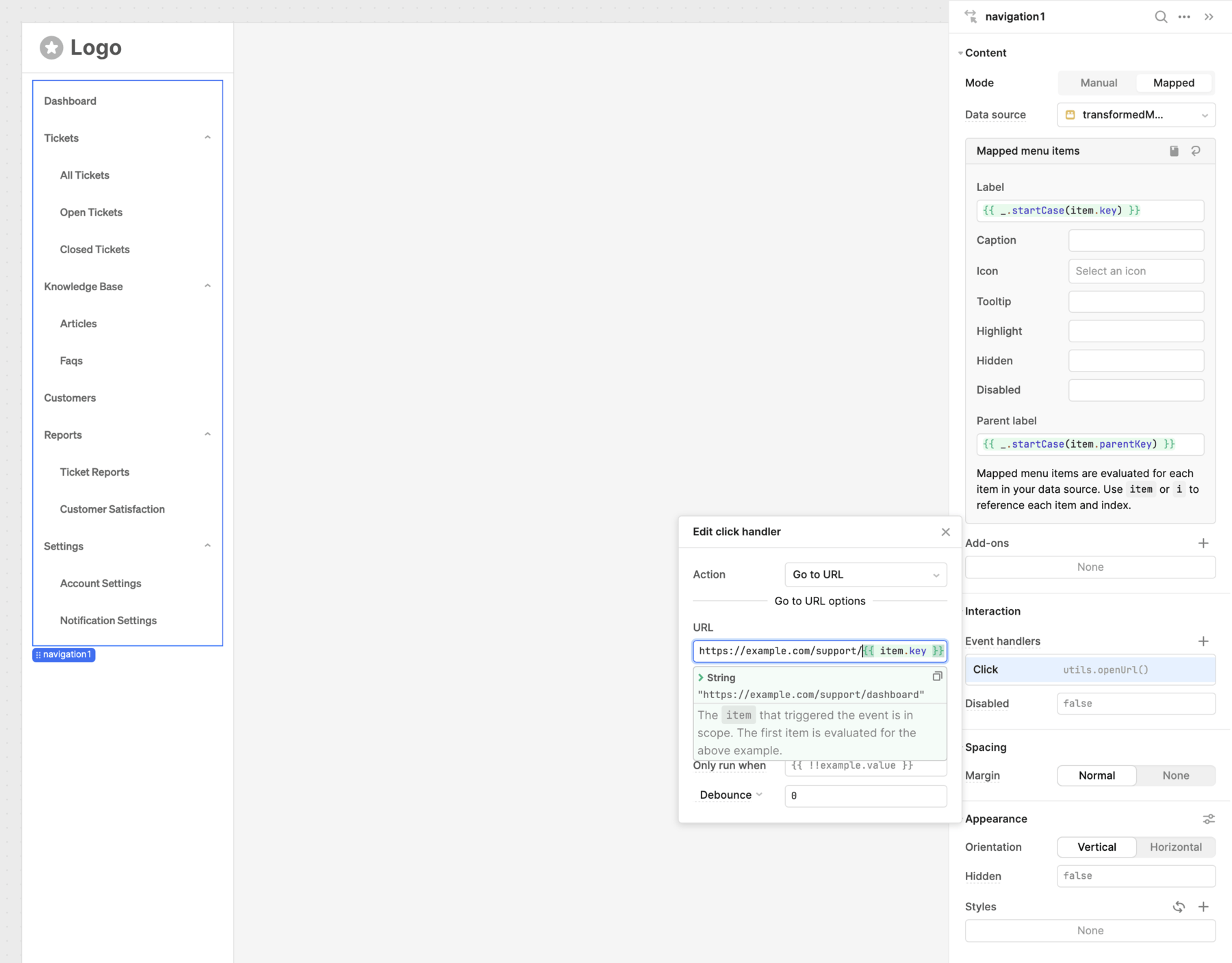
Mapped options with nested items.
Some components only support one level of nested options. In this case, a child option cannot also be a parent option.