Design
Design within Retool is supported via a wide range of capabilities, settings, configurations, and approaches. The following are a distillation of some of the repeatable practices.
Best practices
The best Retool applications have consistent user experience design practices. These practices range from the use of Retool themes, color control, page layout, and navigation to name a few.
Design product features
Themes and colors
Resource: https://retool.com/components/color-input Resource: https://docs.retool.com/docs/app-themes
Themes are the best way to maintain a clean and org-wide design pattern. We expose a number of key values that can be globally configured in the organization settings page. These are applied directly to apps, creating a unified branding and color schema.
Most components have a number of color and style options that can be modified on a per-app level. You can reference your theme colors in your component styles, for example {{theme.secondary}}.
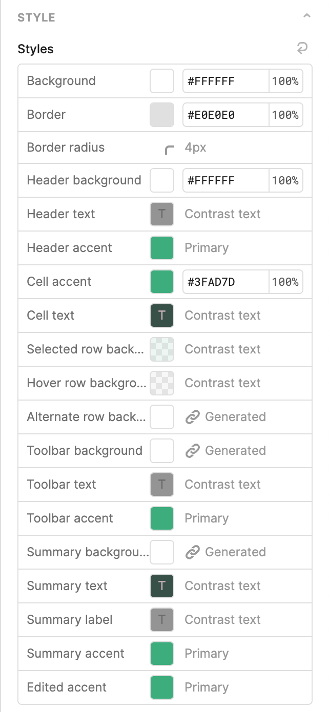
Best practices for color in apps:
- There should only be 2 main colors in an app. A primary color or brand color to set brand identity, usually in the background of a navigation header. And an accent color to draw attention to important actions.
- Solid colors draw a lot of attention, so use them sparingly. Use semi-transparent backgrounds.
Custom CSS (org level and app level)
You can add custom CSS to make granular component edits. You can either do this globally or locally for one app. To find the component you wish to target, you’ll need to inspect the element using your browser’s Inspector tool. We prefix our components with _retool-, so if you have a component named ‘textInput1”, it would have a class of _retool-textInput1.
We generally recommend that you don’t rely too heavily on this practice, as we sometimes change the underlying class names, which may affect the CSS selectors.
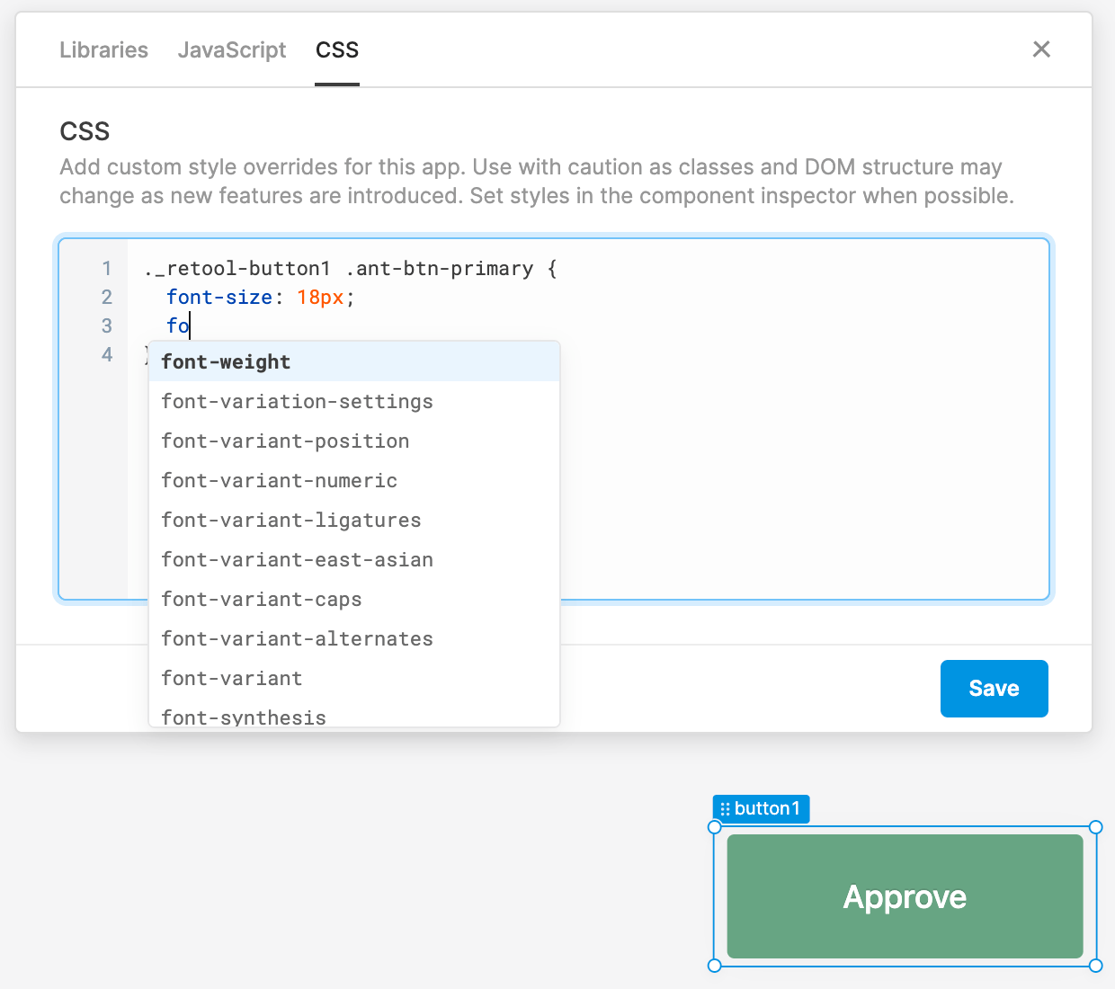
Custom CSS snippet import family from CDN
The following example provides CSS for importing from a content delivery network.
@import url('https://fonts.googleapis.com/css2?family=Montserrat:ital@0;1&display=swap');

.editor-canvas-container * {
  font-family: cursive !important;
}
.retool-canvas * {
  font-family: cursive !important;
}
Dynamically computed CSS
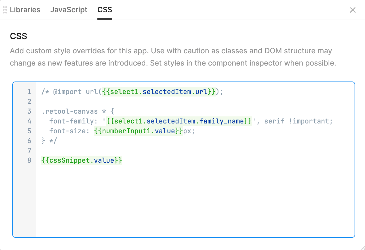
Retool supports CSS that uses values retrieved from the application using JavaScript. These values can be used to then affect the styling of the Retool application CSS. The following image shows an example where CSS is dynamically set by collecting the font url, font family and font size shown in the comments and executed by cssSnippet, a JavaScript transformer.
Buttons
Resource: https://docs.retool.com/reference/components-buttons
Reserve solid backgrounds for the most important actions, as shown in the following figure. One app should not have more than 2 solid buttons in one view.
Secondary actions can be outlined buttons, buttons with gray background, or link buttons as shown in the following figure. The underline of the link buttons can be removed.
Use split button or dropdown button for a list of actions.
Icons
Resource: https://retool.com/components/icon
Icons elevate the look and feel of an app. We recommend sticking to one style of icon for the entire app. Some icons have a lot of details, while others look minimalistic. Some use outlines, some are filled.

Avoid deprecated components
Resource: https://docs.retool.com/docs/upgrade-deprecated-components
We regularly update our components with more functionality and better performance. Over time, we’ll entirely deprecate old components in favor of new versions. An example of this is the new Table component. These components typically have automatic upgrade paths.
Multi-page apps
Resource: https://docs.retool.com/docs/store-temporary-data
A common practice is to use the Retool Navigation Bar to direct users to appropriate functionality via links. That functionality is represented as separate Retool applications. When clicking these links, the destination application may require context / state of the current application. The resource provided above identifies some options that can be considered to store and share context between applications. (NOTE: Temporary State only is available within the source application. Use localStorage and Query Strings to share between applications)
Working with Tables
Cleaner tables
Resource: https://retool.com/components/table-new
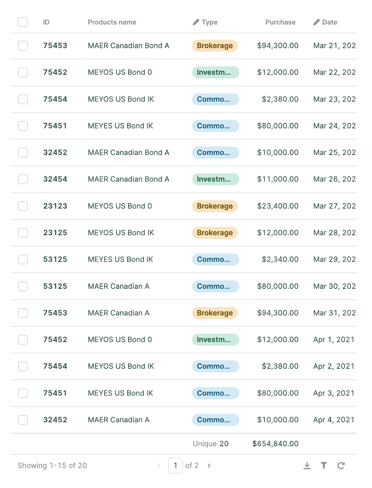
A simpler more efficient table design can be achieved by removing the outside border, vertical border, and box shadow. Only add very light, semi-transparent background colors to cells.
Column styles
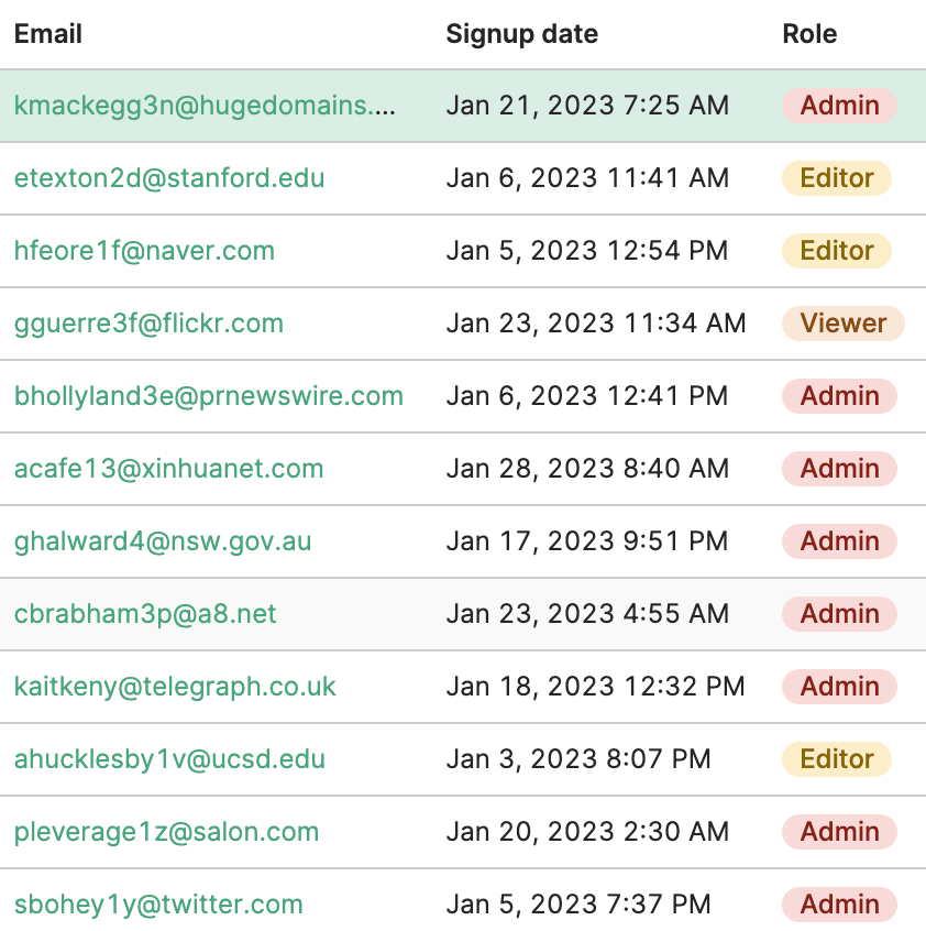
Tags columns provide a simple way to help categorize rows visually and support improved filtering.
Trend indicators
Resource: https://retool.com/components/statistic
For numerical values within a table, providing visual cues for increasing or decreasing quantities simplifies a table’s interpretability as shown in the following figure.
Tag label parameter
The following is a code sample for the labels including percentage and arrows using a JavaScript Ternary Operator.
{{ self < 0 ? self + `%↓` : `+` + self + `%↑`}}
Tag color parameter
The following is a code sample for the color using a JavaScript ternary operator and your organization's theme.
{{ self < 0 ? theme.primary : theme.secondary }}
Bar charts
Bar charts are helpful for comparison data.
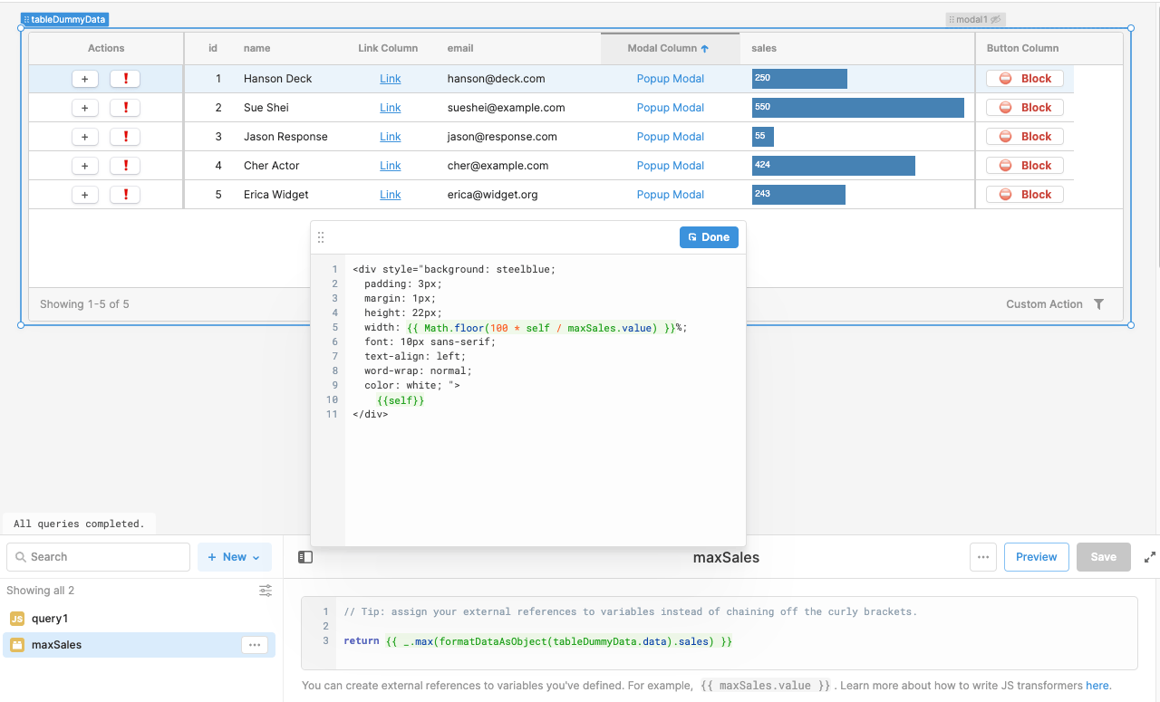
The following code sample provides an example of combining HTML and JavaScript to generate bar chart visuals in the Sales column.
<div style="background: steelblue;
  padding: 3px;
  margin: 1px;
  height: 22px;
  width: {{ Math.floor(100 * self / maxSales.value) }}%;
  font: 10px sans-serif;
  text-align: left;
  word-wrap: normal;
  color: white; ">
    {{self}}
</div>
Button column type HTML
The following code sample provides an example of using HTML to adjust the rendering of the button. This requires that the Button Column Type property Render cell as pure HTML be enabled.
<span style="padding: 0 10px 0 0">⛔️</span>
<span style="color:{{ theme.danger }}; font-weight:bold">Block</span>
Markdown columns
Resource: https://docs.retool.com/docs/retool-markdown-html-reference Resource: https://www.markdownguide.org/getting-started/
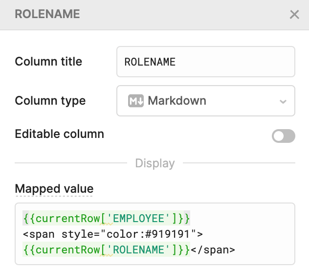
Markdown provides a lightweight way of specifying the text formatting used within a column. The following image shows a column with Rolename.
Freeze columns
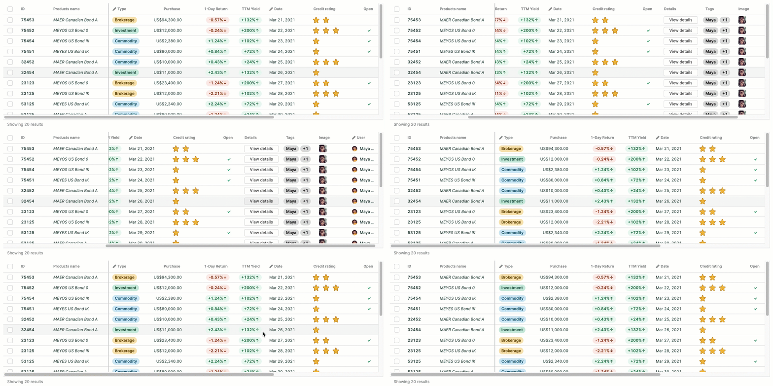
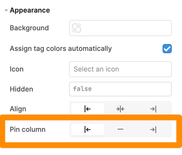
Freeze columns exposes important columns in tables where not all the columns can fit.
Page composition and layout
Navigation
Resource: https://docs.retool.com/reference/components-navigation
Navigation is a crucial part of the user experience. Users should be able to easily find what they’re looking for and easily move between applications in the same workflow.
Building a navigation bar
Resource: https://retool.com/components/navigation
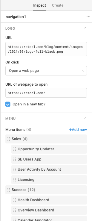
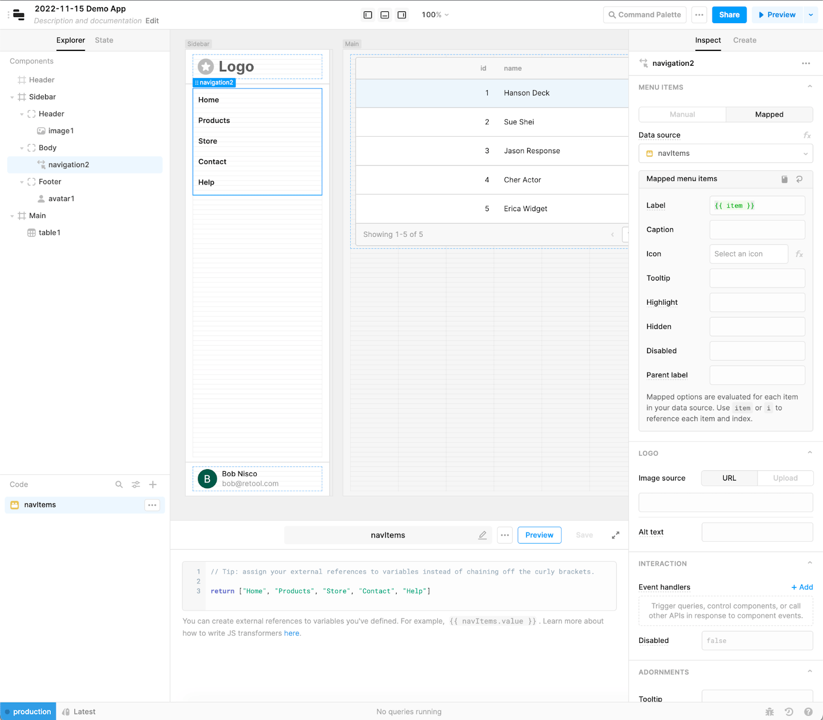
Navigation bars provide a simple / effective mechanism for users to navigate to Retool application(s) and supporting resources. Navigation bars are typically located at the top or side of the application.

Building a card layout from containers
Resource: https://retool.com/components/container
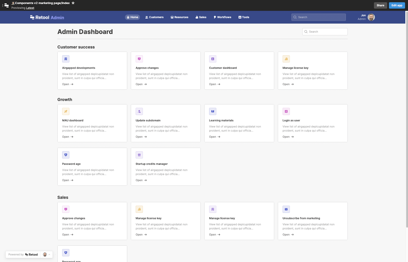
An alternate approach towards navigation is via cards. This layout provides an alternative to drop down lists and visually exposes applications / capabilities quickly to the user. A template of this app can be downloaded here.
Building guided steps
Resource: https://retool.com/components/steps
When working with a business process or activity sequence that needs to be completed, using an interface that clearly identifies the steps and current step is recommended.
Page composition
Layout
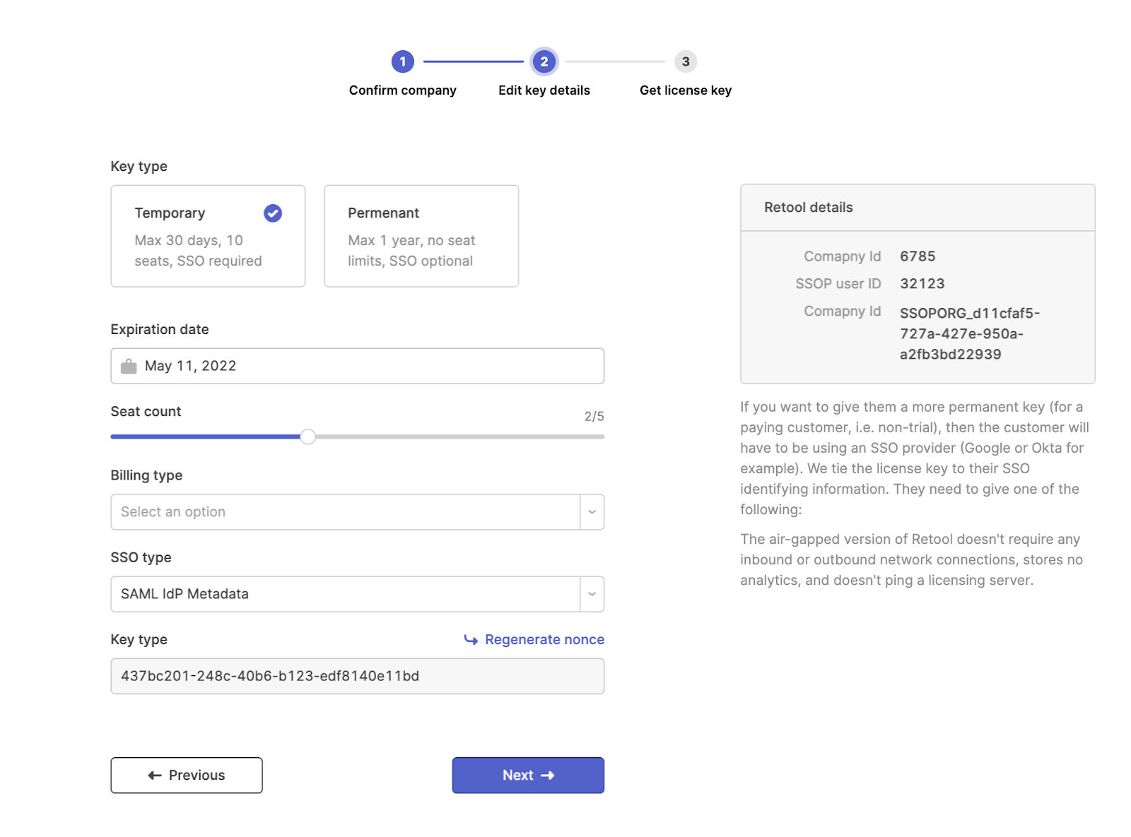
We recommend standardizing layouts for consistent user experiences. For example:
- If a form input has a text label on top, then all inputs in the form should have text labels on top.
- For conditional layouts use multiview or stepped containers to show/hide views based on certain conditions. This is a great way to guide users through your app, rather than presenting all the information at once.
The following figure provides examples of text labels and the use of only exposing the necessary information in the UI based on the current step in the process.
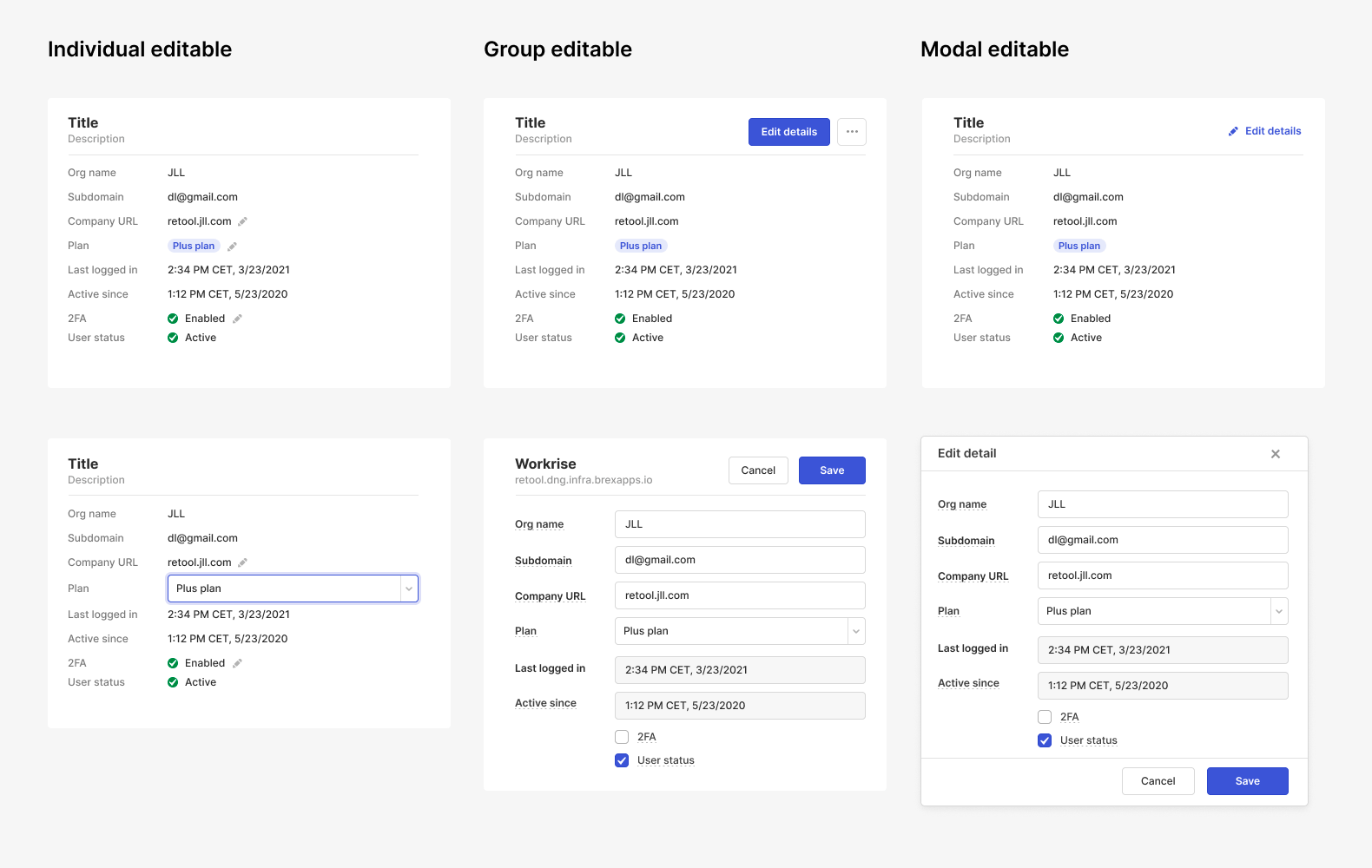
Editing Multiple Items
Use the “individual editable” layout for few editable items with non-destructive changes. Use the “group editable” layout for many editable items with complex validations and confirmations. Use the “modal editable” layout to draw immediate attention from the user. The following figure demonstrates these three different options.
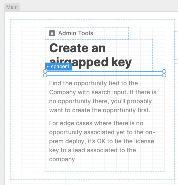
Using Spacers
Resource: https://retool.com/components/spacer
Spacers provide a means to properly space and organize content within an application making it easier to navigate and discern the layout.
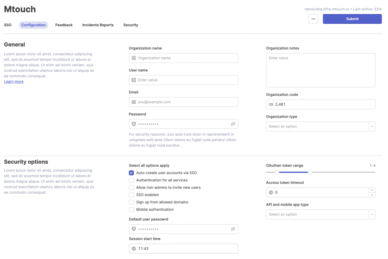
Multi-section Form
Within a form, information can be organized around different functions and placed into different sections.
Action Panels
Action panels group common actions as shown in following figure where we use:
- Link components without the underline
- Grey Text component titles to keep the focus on the actions
- Icon prefixes in the link component
- Spacers
Data Visualization
Resources: https://docs.retool.com/docs/build-charts-graphs Resources: https://github.com/tryretool/data_visualizations Resources: https://www.npmjs.com/package/plotly.js/v/1.58.4 Resources: https://plotly.com/javascript/
Retool is leveraging 1.58.4 of the JavaScript library
Data visualizations help improve data discovery and interpretation. For applications that leverage data for decision making, the following advanced examples of charts and graphs can be employed in Retool with many more identified in our Github repo. Retool’s chart component uses Plotly to define its data and layout.
We have two case studies for operations dashboards in this webinar.
| Name | Description | Example Chart |
|---|---|---|
| Bubble Chart | "A bubble chart presents three dimensions of data in a two dimensional graph. The location (x, y) coordinates and the size of the bubble. This chart type is a variation of a scatter plot with the ability to provide the third dimension." | 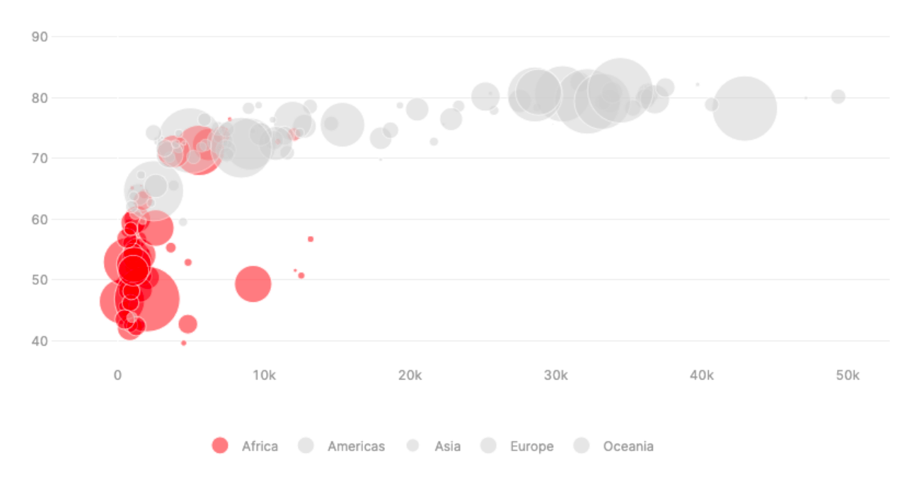 |
| Bullet Chart | "Stephen Few's Bullet Chart was invented to replace dashboard gauges and meters, combining both types of charts into simple bar charts with qualitative bars (steps), quantitative bar (bar) and performance line (threshold); all into one simple layout." | |
| Multi Axes | A double y-axis allows one to add another dimension of data using the right hand side for the second measure. | |
| Sankey Diagram | "Sankey diagrams visualize the contributions to a flow by defining source to represent the source node, target for the target node, value to set the flow volume, and label that shows the node name." | 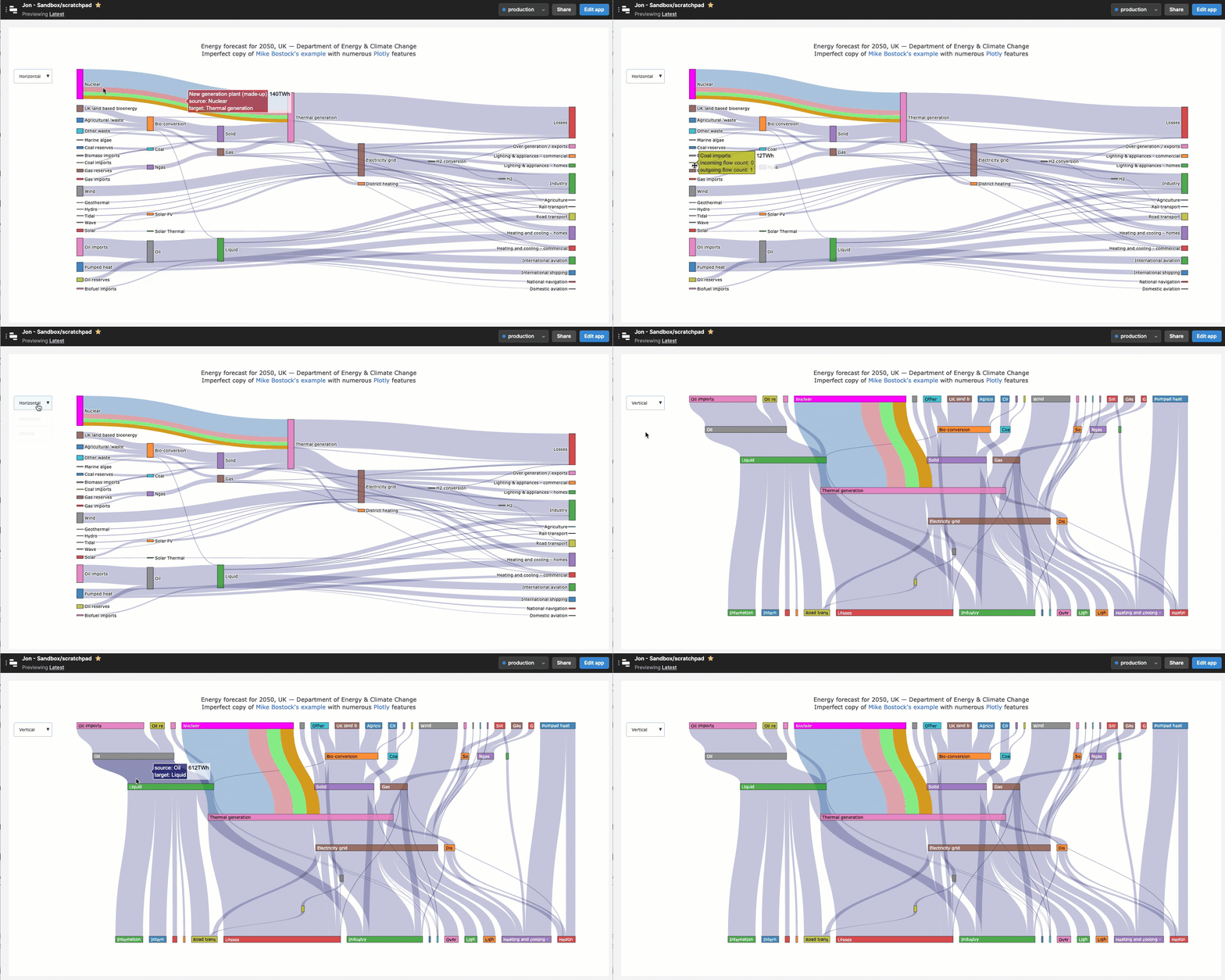 |