Changelog

Updates, changes, and improvements at Retool.

{{ self }}

Components can now reference themselves in the inspector using the {{ self }} keyword! Access any component properties using {{ self }}, like the component’s value/values, label/labels, settings like disabled, hidden, readOnly, and validation properties such as maxCount.

For example, in a component like Select or Multiselect, you can set the labels to dynamically update to the capitalized values with {{ self.values.map(_.startCase) }} –this will actually be the new default going forward! It also makes dynamic styling much more powerful–for example, you can style the Statistic component’s trend green when {{ self.secondaryValue > 0 }} and red otherwise to indicate upward or downward trends.

{{ self }} is available for all components, and works in their event handlers, too! We’ve updated a bunch of our components to use {{ self }} for better defaults–but we’re excited to see what you configure with it. Drop us a note in the community forum with any examples, feature requests, or feedback! This feature is available to all cloud customers, and will be included in the next on-premise release.

Fixes and improvements

  • Fixed unexpected layout shifts in some apps while dragging/resizing
  • Fixed form generation to set labels correctly for checkboxes
  • Improved performance when querying the audit log
  • Added the ability to enable/disable release management across an organization from Advanced Settings

Check out this guide to see the on-prem versions and their release notes. These fixes and improvements will be rolling out to on-prem customers in the next few weeks.

Statistic

We overhauled our Statistic component! Previously, you could only set a single primary value, and we supported limited formatting options. Now, you can also set a secondary value to compare metrics over different time periods (e.g., to show monthly revenue growth). Additionally, the primary and secondary values have the same powerful customization options as our Number Input component, including currency and percent formatting, decimal place control, and more. The new Statistic component supports more features, including the ability to dynamically control positive and negative trend color, set a caption text, control alignment, and more.

Like all of our new components, the Statistic component also has expanded style editor support. You can automatically migrate your old Statistic components to this new version, too! As always, post in our community forum if you have feedback on this new component or feature requests.

Icon library

We now offer over 3,000 searchable icons with support for bold and outline styles. You’ll have access to this library anywhere where you can set an icon in Retool. To use any of our old icons, choose the deprecated icon set. These are rolling out to editors over the next week.

Fixes and improvements

  • Added documentation for the majority of component properties, visible in autocomplete and model browser tooltips
  • Improved app performance on page load
  • Fixed Google Datastore ordering options
  • Fixed public apps in Incognito mode for Chrome
  • Improved SQL auto-formatting
  • Fixed "body query type" for REST APIs with custom auth
  • Fixed the layout for Image components in Firefox
  • Added support for upgrading caret type Toggle components to the new Toggle Link component
  • Fixed unexpected layout shifts in apps with tall dynamic height Text components
  • Fixed SQL schema column types to display as timestamp or timestamptz instead of timezone
  • Added support for an optional label on the File Dropzone component
  • Added an option to configure text size on the Divider component

Check out this guide to see the on-prem versions and their release notes. These fixes and improvements will be rolling out to on-prem customers in the next few weeks.

Create and edit resources from your app

You can now view, edit, and create new resources without leaving your Retool app!

To create a new resource, select the “create a new resource” option from the top of the resource dropdown in any query. You can configure a connection and immediately query any of our 40+ supported database and API types, including Postgres, MongoDB, and any REST API or GraphQL.

To view or edit a resource configuration, click the “edit resource” button from the selected resource in your query. For example, you can view the name of the default bucket of an S3 resource, add staging credentials to a Postgres database, or add a new header to your GraphQL resource—all without leaving your app! Any changes to the resource persist across all Retool apps in your current environment.

We’re rolling out this new functionality this week. Share any feedback or suggestions for new resource types in our community forum!

Fixes and improvements

  • Fixed label wrapping for Checkbox Group, Radio Group, and Switch Group components
  • Fixed duplicate or null values in Select, Multiselect, Listbox, and Multiselect Listbox components
  • Fixed the "Go to app" event handler in public apps
  • Fixed property defaults when switching from one component type to another
  • Fixed default value rendering for Select components in edit mode
  • Fixed the Table component’s setSort so that it now updates both the sortedColumn and sortedDesc properties

Check out this guide to see the on-prem versions and their release notes. These fixes and improvements will be rolling out to on-prem customers in the next few weeks.

Upgrading components

Over the past few months, we’ve launched new versions of 20+ components, including Text Input, Button, Toggle/Switch, Progress Bar, and more. These new components have been redesigned and rebuilt from the ground up with more customization options, expanded style editor support, improved keyboard accessibility, and robust validation for inputs.

In order to make it easy for you to use these new components in your existing apps, we’ve built two ways to migrate existing components to these powerful new versions with a few clicks.

Upgrade individual components

If a selected component has a new version you will see a “Deprecated component” notice at the top of the Inspector. Click “Upgrade” and Retool will automatically upgrade the component to the new version. All of your configuration settings (e.g. event handlers, tooltip content, suffix text, etc) will transfer to the new version. As always, you use ⌘+Z to undo your changes.

Upgrade all components in an app

We also added a quick way for you to migrate multiple components in an app at once. Click on the app actions menu (three dots in the upper right), then click “Upgrade components”, then select which components to upgrade.

This new upgrade functionality supports common components and is rolling out to customers over the next week. We’re adding support for new components—like Select and Multiselect—to work with these upgrade paths shortly. Post in our community forum to let us know how it’s working and if you have any additional functionality you’d like to see!

Fixes and improvements

  • Fixed the recordUpdates and changeSet attributes of the Table component to only clear when a bulk update is successful
  • Added a new Pagination component for easily navigating paged data
  • Fixed default text color when the canvas has a dark background
  • Added support for sharing Jira resource credentials between users
  • Added an option to configure text size in Editable Text and Editable Number components
  • Fixed the Calendar component so that custom event properties are not lost when events are modified
  • Added the ability to customize the appearance of the Retool user menu on a per-app basis (Enterprise only)

Check out this guide to see the on-prem versions and their release notes. These fixes and improvements will be rolling out to on-prem customers in the next few weeks.

Select and Multiselect

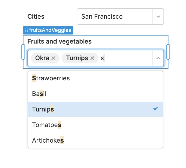
We’ve overhauled two of our most popular components: Select and Multiselect. Like our new Input components, they have powerful new functionality including:

  • Expanded style editor support
  • Control over label position, alignment, and wrapping
  • More robust validation (e.g. min/max items for Multiselect)
  • Support for adding text and icons in the prefix and suffix
  • An optional tooltip with GitHub flavored markdown

Both components support full keyboard accessibility. For example, you can now use arrow keys to move between individual selected items. These components also have tons of new configuration options including:

  • Overlay height: set the maximum height of the dropdown
  • Combobox mode: set whether or not the component has an input field to support searching by text
  • Selection indicator: control whether the dropdown should show a checkmark on the selected item(s)
  • Empty state: set a message to display when the component has no options provided or when no options match the search term
  • Disabled: provide an array of values that should be rendered disabled or disable the entire component

New components you’d like to see us add? Let us know in our community forum!

Fixes and improvements

  • Fixed label alignment on the Progress Bar component
  • Fixed component styles in ListViews
  • Added tooltip support to more components (Avatar, Avatar Group, Divider, IFrame, Image, Progress Bar/Circle)
  • Improved CSV parsing capabilities of the File Input components
  • Added a warning when trying to preview an app with an unsaved query
  • Updated Slider and Range Slider components to support editing the track color
  • Fixed the Table component “Row select” and “Row select changed” events to support arrow key selections
  • Added support for evaluating an app's UUID dynamically (e.g. {{ retoolContext.appUuid }})
  • Added support for reply-to email in SMTP resource
  • Fixed the JIRA resource so that it automatically refreshes its token

Check out this guide to see the on-prem versions and their release notes. These fixes and improvements will be rolling out to on-prem customers in the next few weeks.