Changelog

Updates, changes, and improvements at Retool.

Scrollable tables

The Table component is now scrollable! Scrollable tables are a great way to allow your users to quickly explore data.

To try it out, select the new “Scroll” option in the Table component inspector. "Scroll" supports all of the Table component’s “Pagination” options (e.g. server-side pagination) out of the box. To learn more about working with Tables in Retool, check out our documentation.

We’ll be shipping other highly requested Table features and bug fixes in the coming months. Visit our community forum to make a new request or add your support for existing ones.

Fixes and improvements

  • Improved ordering of code autocomplete suggestions
  • Added multiline text support for Button components
  • Fixed folder creation—now we route you to the newly created folder
  • Improved validation to skip any components set to disabled, read only, or hidden
  • Updated the PDF Viewer component to support scaling each page to the height of the component, and added an additional option to snap scroll to each page
  • Improved fuzzy search performance for the Listbox and Multiselect Listbox components when using the “search term” option
  • Updated the Preview button to prevent accidental clicks
  • Fixed a rendering bug with the Looker component
  • Fixed tree construction so that merge conflicts are properly detected in protected apps (Enterprise plan only)

Check out this guide to see the on-prem versions and their release notes. These fixes and improvements will be rolling out to on-prem customers in the next few weeks.

Avatar and Avatar Group

****

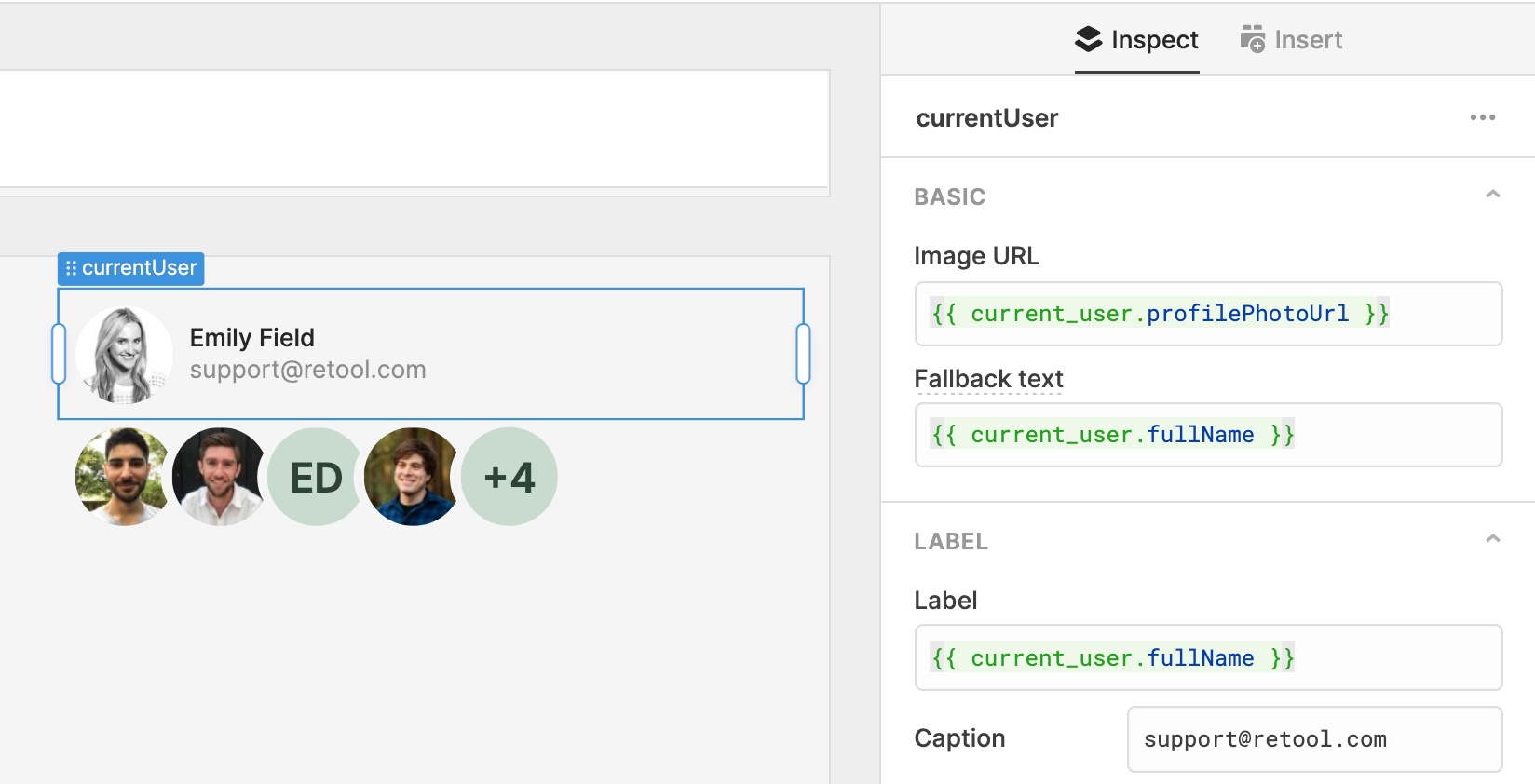
The new Avatar and Avatar Group components allow you to easily represent users in your app.

Avatar allows you to display an image with an optional label and caption. The image URL will default to the current user’s profile photo (a new property, {{ current_user.profilePhotoUrl }}) and you can optionally set fallback text for when there isn’t a url available — if that text looks like a user's full name, we’ll render just their initials. Choose from a selection of avatar size options, extra small (16px) to extra large (48px), and customize label, alignment, and more!

Avatar Group displays several avatars together. Configure the maximum number of avatars to display, and the last avatar will display “+N” when there are more. Like our new input components, these also offer expanded style editor support.

More components you’d like to see us build? Let us know in our community forum!

Fixes and improvements

  • Added a new option, "show top bar," to IFrame which allows you to optionally show a customizable title, and adds two actions: refresh and open in a new tab
  • Fixed Listbox and Multiselect Listbox rendering with duplicate values
  • Added autofill for app names when importing an app
  • Improved the component search experience by autofocusing the search field when opening the Insert pane
  • Improved the loading state for the Table component
  • Fixed an edge case where renaming a component didn't rename references to the component
  • Added workspaces, audit logs, and data editor to the "powered by Retool" menu
  • Updated AWS assume role help text to display the correct backend name
  • Added the POSTGRES_STATEMENT_TIMEOUT environment variable, which defaults to 10 seconds (on-prem only)

Check out this guide to see the on-prem versions and their release notes. These fixes and improvements will be rolling out to on-prem customers in the next few weeks.

Editable Text and Number

We’ve overhauled Editable Text and added a new Editable Number. Like all of our new inputs, these offer brand new configuration options, built-in and custom validation rules, and expanded style editor support. These components were also built with accessibility and data density in mind.

The Editable inputs display static text that can be edited on click. In edit mode, Editable Text has all the same powerful, new functionality of our Text Input component, including: configurable prefix/suffix text, a prefix/suffix icon, read only mode, and more. In addition, Editable Number supports the functionality of the Number Input component, including currency support, percentage formatting, and control over decimal places and padding zeros.

Helper text

All keyboard inputs–like Text Input, Number Input, Editable Text and Number, Currency, and more–can now optionally configure a tooltip that is visible below the input only on focus:

Like the regular tooltip, helper text supports GitHub flavored markdown.

We’re continuing to ship new components each week! Drop us a note at support@retool.com if you have any feedback. Editable Text and Number are rolled out to all plans on Retool cloud, and will be included in the next on-premise release.

Fixes and improvements

  • Fixed an edge case where Text components could be rendered at the wrong height
  • Added support for freezing action button columns to the left or right of the Table component
  • Added the ability to add the currently viewed folder to your favorites list
  • Fixed focus, hover, and disabled styles for the clear button on input components
  • Added support for null values for sliders in the JSON Schema Form component
  • Fixed rendering of short Listbox components with labels
  • Added lastReceivedFromResourceAt attribute to queries to track when the query response was last received from the resource
  • Added the current page index and total number of rows to the footer of the Table component
  • Fixed label width default to be 40% instead of 33%

Check out this guide to see the on-prem versions and their release notes. These fixes and improvements will be rolling out to on-prem customers in the next few weeks.

Input improvements

We've added 5 new and improved options for input components in the Inspector (right-hand panel), including:

  • Read only: read only inputs are focusable and selectable but cannot be modified. They look the same as normal inputs.
  • Label width: set the width of the label as a percentage of the component width (%), pixels (px), or grid columns (col).
  • **Decimal places: **set the maximum number of digits after the decimal, and optionally pad trailing zeros.
  • **Allow null value: **Number Input components can now have an empty state of null instead of 0.
  • **Show clear button: **Number Input components can now optionally show a clear button.

If you want further configuration options for any of our components, drop us a note at support@retool.com!

Fixes and improvements

  • Added a keyboard shortcut–⌘ + D (CTRL + D)–to duplicate a component on the canvas
  • Added a keyboard shortcut–?–to show a list of all of the other built-in editor shortcuts (like ⌘ + D!)
  • Added a "Hide submit button" option to the JSON Schema Form component
  • Fixed vertical alignment of multiline labels on the Checkbox and Switch components
  • Added a "Row Select Change" event handler for the Table component
  • Adjusted default hover and active colors for Button
  • Fixed automatic text color for components inside of the Header frame
  • Updated read only input components to hide the optional clear button
  • Simplified the empty state for Container components
  • Fixed a delay with updates to dynamic height components
  • Removed an incorrect error message when selecting components in the same container
  • Fixed migrations to respect DATABASE_URL (on-prem only)

Check out this guide to see the on-prem versions and their release notes. These fixes and improvements will be rolling out to on-prem customers in the next few weeks.

Retool for Startups

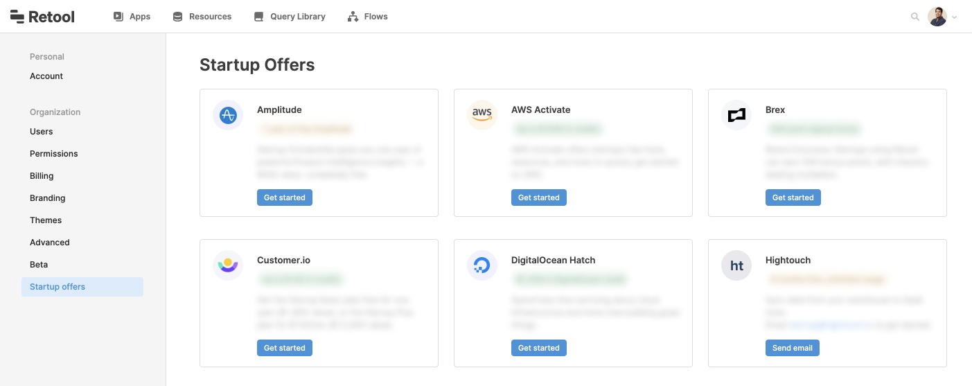
Eligible startups now get 12 months of free Retool credits (up to $1200 value), and we've partnered with companies like HubSpot, Segment, DigitalOcean, and Brex to offer many more startup discounts (apply here!).

If you applied and were accepted into the Retool for Startups program, you now have access to a new Startup Offers section in your Settings. To view more details and redemption instructions, go to Settings > Startup Offers:

Questions about the program? Enrolling in these offers? Drop us a note at support@retool.com (also, if you'd like to feature a startup deal for your company on the Startup Offers page, apply here).

Fixes and improvements

  • Added a new event handler action type to set and clear local storage key/value pairs
  • Added a toggle to the Number Input component to allow null values
  • Fixed a regression that would cause the editor to crash when deleting temporary state variables
  • Improved the app homepage search results to show what folders apps are in
  • Fixed the "hide reset button" switch on the Wizard component
  • Fixed default values and "Change" event types for the Range Slider component
  • Fixed app versioning such that the editor always shows the most up to date version, even if an earlier release is published
  • Added a tooltip to display the full app name on hover for the "Go to app" event handler
  • Fixed the Tags component so that it can reference other queries/components (e.g. {{ .. }}) when setting tag titles
  • Updated the labels for undo/redo shortcuts to be platform-specific

Check out this guide to see the on-prem versions and their release notes. These fixes and improvements will be rolling out to on-prem customers in the next few weeks.