Changelog

Updates, changes, and improvements at Retool.

203 posts tagged with "Retool Cloud"

View All Tags

Retool 2.85.12

Containers

This week we’re highlighting some major improvements to containers including support for multiple views, collapsible containers, and new presets for multistep flows and tabs.

Multiview

Multiview makes it easy to swap between different groups of components within a single Container. Add any number of views via the Inspector, each with a grid to drag components onto. The current view can be controlled with event handlers, the setView API, or conditional logic in the default view settings.

You can enable multiview on any Container, but we’re also launching presets for common multiview patterns:

Tabbed Container

The redesigned Tabbed Container comes pre-configured with a Tabs component linked to a multiview Container. Tabs can now be moved and customized independently, and individual tabs can be disabled or hidden.****

---Stepped Container

The brand new Stepped Container provides a quick and easy way to build beautiful multi-step flows. Like Tabbed, it comes pre-configured with the new Steps component linked to a multiview Container, along with next and previous Buttons.****

****

Collapsible Container

Container and Form now include a “Show body” setting, along with new APIs to show/hide the header, body, and footer. Get started quickly with the new Collapsible Container, which includes a Toggle Button wired up to expand and collapse the body of its Container.

To learn more about all of these new features, check out our Containers docs. And if you have any feedback, we’d love to hear from you in our community forum.

Fixes and improvements

  • Improved styling of disabled components to improve readability
  • Fixed keyboard navigation for disabled components
  • Added more information, like the type of the value, in the SQL editor when SQL is evaluated
  • Fixed File Dropzone, File Button, and File Input in List Views
  • Added an option to Table components to "Disable user selection." If enabled, selection can only happen via the editor inspector or JS APIs. Click and arrow keys are ignored.
  • Improved List View rendering performance
  • Fixed the columnMappers property on the Table component to update when data changes
  • Added the ability to hover over the extra indicator (e.g. "+10") for the Tags component to see the other tags
  • (enterprise only) Fixed the keyboard shortcut_ CMD+SHIFT+P_ (CTRL+ SHIFT + P) so that it doesn't drop you into a non-editable protected branch

Check out this guide to see the on-prem versions and their release notes. These fixes and improvements will be rolling out to on-prem customers in the next few weeks.

Retool 2.85.2

Options list editor

Many components present a list of options, like the dropdown in a Select or the radio buttons in a Radio Group; we’ve made it much easier to build this kind of UI with our new options list editor. We’ve also added new settings for those options, like captions and tooltips.

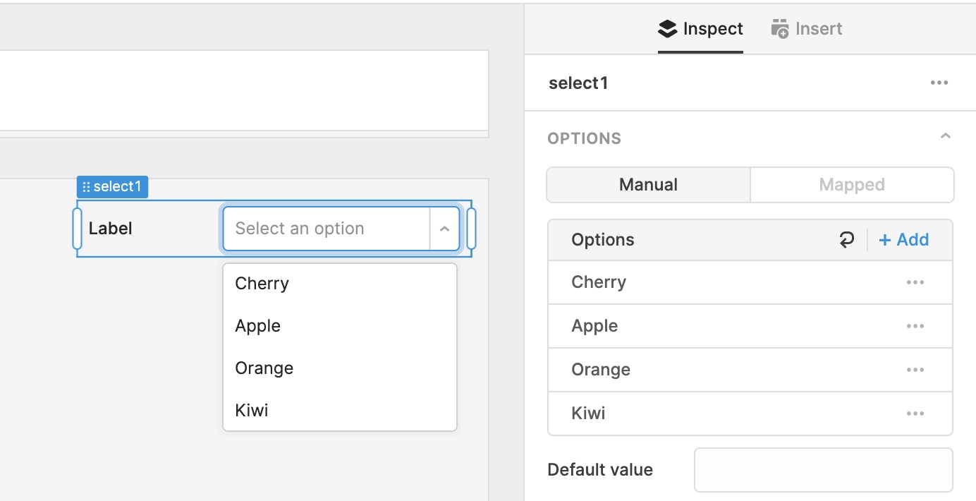
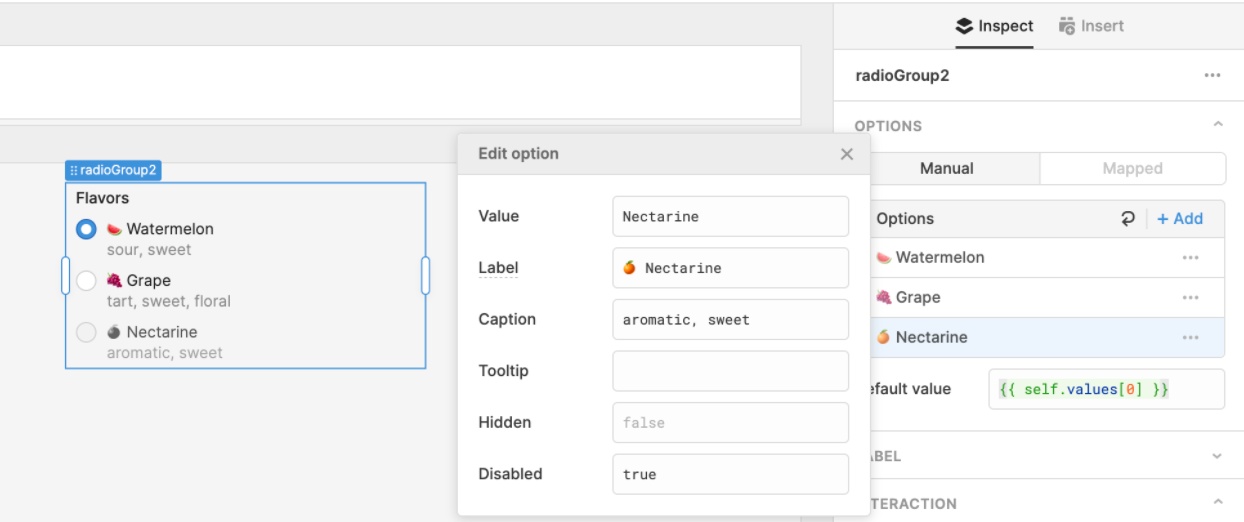
These types of components now have a new Options section, with two modes: Manual and Mapped. If you have a short list of options (e.g. Cherry, Apple, Orange, Kiwi), quickly configure your component in Manual mode by adding them to the reorderable list:

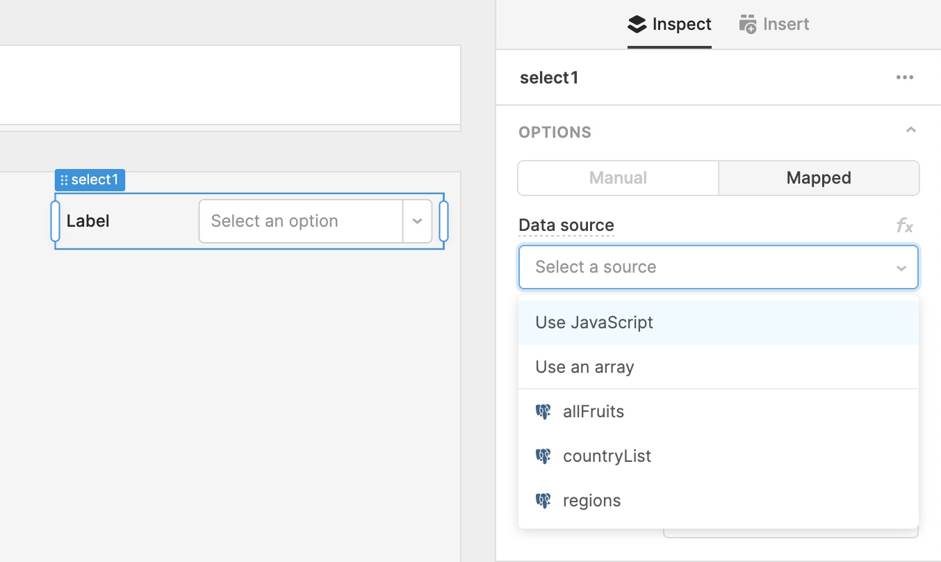
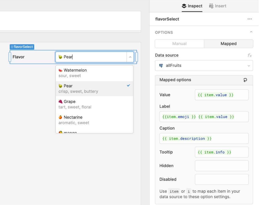
Sometimes you’ll need to generate a list of options from a dynamic data source like a query or transformer, or from a large array or JS expression. Switch into Mapped mode to quickly set up these dynamic options lists:

New settings

In both Manual and Mapped mode, you can configure settings (caption, tooltip, hidden, disabled) for each item in your list of options.

In Manual mode, just click on an option and enter values for each setting (e.g. “caption ABC”, {{ checkbox1.value }}):

Mapped mode works similar to the .map method on an array. You have access to a special keyword, item, which will allow you to map each item in your data source to these settings you’ve configured:

The new options list editor is much more powerful–dig into our docs to learn more. We’re also working on supporting more settings, like images and colors for options in a Select dropdown. Let us know in our community forum if you have any feedback or ideas for other settings!

Theme editor

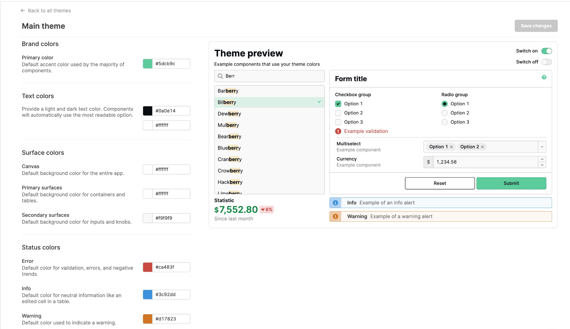
We rebuilt our theme editor, which allows you to create themes that control the look and feel of applications across your organization. Under your organization settings, you’ll find Themes, where you can create new themes and modify existing ones.

The new editor includes improved descriptions of all the style properties and a revamped, live-updating preview–so you can see how your color selections will impact your apps 🎨. We also introduced several new settings, like status colors. You can also now configure text colors: components will automatically use the most readable option of the light and dark colors you choose!

Themes are available on Business or Enterprise plans. We’ll soon be adding even more properties–so be sure to drop us any feedback in the community forum.

Fixes and improvements

  • Simplified the “query success” setting in the query editor
  • Improved autocomplete for Form and Text components

Check out this guide to see the on-prem versions and their release notes. These fixes and improvements will be rolling out to on-prem customers in the next few weeks.

Retool 2.84.4

New Component Directory

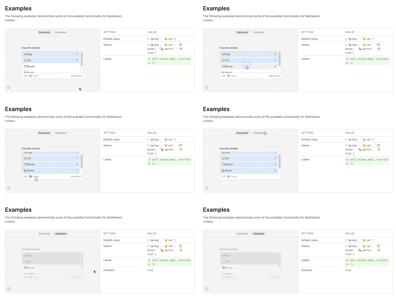
Our new component directory (retool.com/components) allows you to quickly browse or search through all of our components, see examples of different configurations in action, and dive into expanded API docs for component properties, methods, and events.

Each component has multiple real-world examples to explore different functionality, from labels and captions to validation and styles. Each example also includes the corresponding settings and values if you want to try them out in your own app:

As you check out the new component docs, we'd love to hear any feedback from you in our community forum.

Fixes and improvements

  • Added a default value option for the Toggle Link component
  • Improved the ordering of the Table component inspector fields
  • Improved the responsiveness of code editors
  • Fixed the grid visibility toggle–⌘+Shift+G (Ctrl +Shift+G)–so that it persists across sessions
  • Fixed a layout issue for containers in edit mode when using Safari
  • Improved the resources dropdown in the query editor so that you can now also search by resource type
  • Added the "not equal" and "not in" operators to the Firestore query editor
  • Added a new keyword currentColumn that editors can use when building with the Table component
  • Fixed the ability to reorder rows for the Key Value component
  • Added the ability to configure whether Markdown links open in a new tab via the app settings menu
  • Fixed Snowflake queries using OAuth so that they properly prompt for authentication

Check out this guide to see the on-prem versions and their release notes. These fixes and improvements will be rolling out to on-prem customers in the next few weeks.
Retool 2.83.15

Fixes and improvements

  • Fixed code evaluation to properly handle false values with newlines
  • Fixed the styling for empty Table components
  • Improved the dropdown for selecting column types in a Table component–popular types now appear first
  • Improved error messages when a resource type isn't supported in the form generator
  • Improved error messages for the Auth Login integration component
  • Fixed an issue where we were showing a hardcoded query timeout in edit mode, instead of DBCONNECTOR_QUERY_TIMEOUT_MS
  • [on-prem only] Fixed OAuth auto-refresh to work with fields using _RETOOL_EXPOSED__ variables

Check out this guide to see the on-prem versions and their release notes. These fixes and improvements will be rolling out to on-prem customers in the next few weeks.
Retool 2.83.5

New Table style options

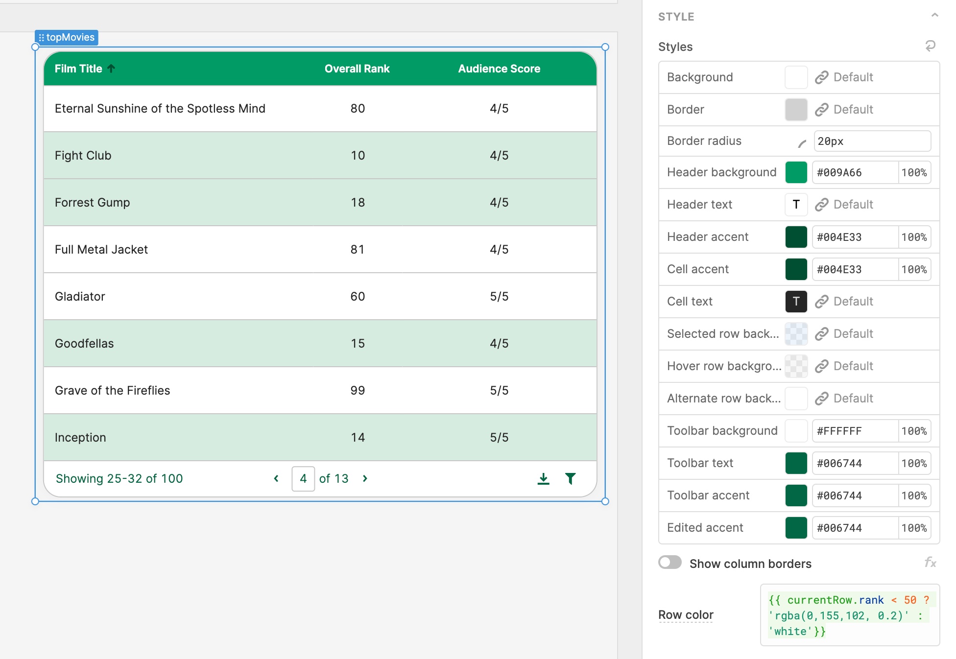
We now have 15 style options so that you can fully customize the look of your table, and we’ve also refreshed the default styles. In the “Style” section of the Table component inspector, there’s plenty more you can do now, like:

  • Configure row color dynamically with any JavaScript condition (e.g. {{ currentRow.sales > 100 ? ‘green’ : ‘red’ }}), rather than setting background colors on each column.
  • Control column border visibility–we’ve updated default styles to remove column borders and reduce visual noise, but their visibility is configurable. (For backwards compatibility, Table components created before this change will have borders on by default.)
  • Quickly set up zebra striping by choosing a color for the “Alternate row background” style.
  • Control header, toolbar, and cell styles with more fine-grained options for text, background, and accent colors. We’ve also revamped our** column sorting and edited cell indicators** and made their styling configurable.

As you style your tables, let us know if you have any feedback or feature requests in our community forum.

Fixes and improvements

  • Added support for upgrading deprecated Multiselect, Select, and Text components to their new version
  • Added support for label captions on all input components
  • Added autocomplete for user-defined properties with underscores (e.g. {{ currentRow._id }})
  • Fixed dragging and dropping components above Table components
  • Added support for specs served from http urls to the OpenAPI integration
  • Fixed the debounce/throttle dropdown in the event handler menu
  • Fixed the alignment of the Table component's column visibility icons in Safari

Check out this guide to see the on-prem versions and their release notes. These fixes and improvements will be rolling out to on-prem customers in the next few weeks.
Retool 2.82.32

New Table columns inspector

We’re making a ton of improvements to our Table component! First up, the recent changes to our columns inspector:

  • The column list is more compact than before, with better drag and drop so you can easily reorder your columns. Additionally, you can now see all of your column types at a glance.
  • To change whether or not a column is editable, you can now do so directly from the column list—instead of having to manually open each column one by one.
  • The settings for each individual column have also been reorganized, making it easier to find the settings you need and giving you more room to write code.

As we continue to make more changes to the Table component, let us know if you have any feedback or new feature requests in our community forum.

Fixes and improvements

  • Introduced accent color styling for Table component cells
  • Introduced vertical column borders as a setting in the Styles section for the Table component, and removed them by default on new Tables
  • Introduced new display behavior for tables with editable columns. If the majority of columns in a Table are view-only, we highlight editable columns with a pencil icon. If the majority of columns are editable, we highlight view-only columns with a lock icon.
  • Added new style editor options to the Button Group component
  • Improved performance of the editor when interacting with input components
  • Fixed autocomplete in event handler code editors
  • Fixed Select and Listbox component deselection when items are marked as required
  • Fixed the setValue API for Select components with the "Allow custom value" option enabled
  • Fixed the Date Time component to correctly display times that fall on DST boundaries
  • Fixed documentation in the model browser (left-hand panel)
  • Improved performance when deleting containers with many children

Check out this guide to see the on-prem versions and their release notes. These fixes and improvements will be rolling out to on-prem customers in the next few weeks.
Retool 2.81.5

Container and Form

Container and Form components have received major upgrades to layout, styling, data handling, and configuration options. In particular, these updates make working with forms much faster and easier than before!

Layout

Container and Form now support optional headers and footer slots, which are customizable via the inspector. The header and footer slots function as additional canvas areas, allowing you to drag and drop any component into either slot. For example, you can now build a Form with two buttons in the footer: reset and submit.

Styling

You can quickly style all components nested within a Container or Form via the Context section of the style editor, and separately style the Container or Form as well.

Data handling

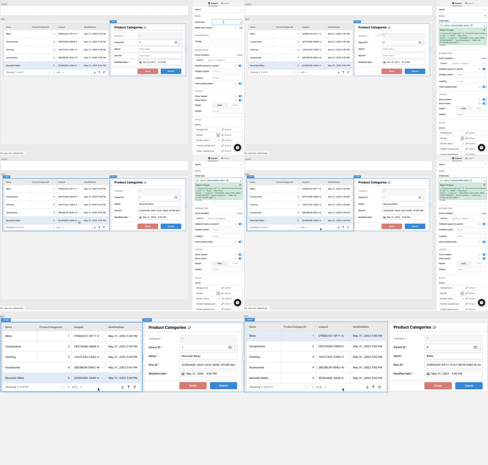
Forms now support a new property called Initial data. If you’re building a Form to edit existing data, you can quickly set the default values of all of your inputs by setting this property. For example, to map your Form’s input defaults to the selected row in a table, set the Form’s Initial data property to {{ table1.selectedRow.data }}. Form inputs also have a data key which you can use to match the keys in the Initial data object. If you use our Form generator, those inputs will be linked automatically (you can also use ctrl + click to generate/regenerate a Form).

Another critical part of form building is writing the underlying query that writes data back to your database or API. Previously, these queries required setting key-value pairs manually in Retool’s GUI mode query editor. Now, you can supply the object {{ form1.data }} to properly persist the changeset from your form!

Expanded API

Lastly, we expanded Form's API to give you more programmatic control over your forms! In addition to supporting submit and clear , we’ve added reset and setData.

If you have any questions or feedback on form building in Retool, head to our community forum. These new features are rolling out over the next week.

Fixes and improvements

  • Added a setValue API for Date Range components
  • Added selectedIndex and selectedIndexes properties to Select, Multiselect, Listbox, Multiselect Listbox, Radio Group, Segmented Control, and Switch Group components
  • Added case sensitive and fixed string searching to Select, Multiselect, Listbox, and Multiselect Listbox components
  • Fixed modal column types in Tables to scroll if their content overflows
  • Fixed an evaluation issue with self when controlling another component
  • Fixed the bounding box for Container components with children
  • Improved performance when editing a Table component
  • Fixed an evaluation issue with mapped columns in Table components
  • Fixed the context menu so it closes when you click outside of it

Check out this guide to see the on-prem versions and their release notes. These fixes and improvements will be rolling out to on-prem customers in the next few weeks.
Retool 2.80.14

Generating forms

Retool’s form generator now lets you automatically create forms with our new input components! Simply drag a Form onto the canvas, click “generate from a resource,” then select your SQL resource and table. In a few steps, you can build a fully functioning form—without writing an insert query or dragging-and-dropping individual components!****

The form generator flow also has a few new improvements, including:

  • Smarter component defaults: given your column type, we’ll select a default type from our new input components. For example, a_ varchar(n)_ column will default to a Text Input but can be changed to an Editable Text, Text Area, or Password. An integer column will default to a Number Input but can be changed to an Editable Number, Percent, Rating, Currency, or Slider.
  • Automatic labels: We automatically generate labels for you (e.g. a column named created_at will be given the label “Created at”). You can also quickly tab through the fields in each row to edit the labels directly before generating your form.

You can always modify or extend your form by dragging-and-dropping other components into the Form and modifying your insert query. Additionally, you can regenerate your form via the context menu (⌃ + click on the Form component). To learn more about building forms in Retool, including more details about form generation, check out the docs. Form generation only works with a subset of SQL resources (PostgreSQL, MySQL, and MS SQL) right now, but if you’d like to see us support other resource types, let us know in the community forum.

Fixes and improvements

  • Added the ability to upgrade deprecated Date Time components
  • Added a transition to the Date and Date Time calendar
  • Fixed DST handling for Date Time components with the time zone value set to "Local time"
  • Fixed formattedValue in Date Time when no timeFormat is specified
  • Improved placeholders for configuring URL parameters
  • Added support for arrays as parameters for Snowflake queries
  • Improved performance of Snowflake queries
  • Fixed query loading indicators in presentation mode
  • Added warning logging when expected SAML fields are unset (on-prem only)

Check out this guide to see the on-prem versions and their release notes. These fixes and improvements will be rolling out to on-prem customers in the next few weeks.

Retool 2.80.6

Date, Time, Date Time, and Date Range

Date Range component

We’ve added brand new Date, Time, Date Time, and Date Range components! They are fully keyboard accessible and provide tons of new functionality like automatic time zone handling, expanded formatting options, and more robust validation:

  • Automatic time zone handling: We have a new option called “manage time zone” that allows you to set both a display time zone and a** value time zone**. Display time zone controls how time is displayed to your users, while value time zone controls how it’s encoded. This separation allows you to do things like set your display time zone to follow your user’s local browser, while encoding your times in UTC!
  • Expanded formatting options: both dates and times now support all format strings and times default to a localized format. You can also control the step size of time increments that your users see in the dropdown selection (e.g. 15-minute or 30-minute steps).
  • Validation: You can also set a min/max time and/or a min/max date. The date and time selection UIs respect your component's configured validation, so invalid options are either disabled in the calendar or don’t appear in the dropdown. This even works with “manage time zone” enabled: you can set validation constraints in your value time zone, and the selection UI will correctly adjust, maintaining your display time zone!

Display and value time zone in PDT

These components also support the same options as all of our new input components, including: expanded label support to control position, alignment, and width (in percent, grid columns, or pixels), read only and disabled modes, prefix/suffix text, prefix/suffix icons, an optional tooltip with GitHub flavored markdown, expanded style editor support, and more!

Drop us a note in the community forum if you’d like to see us add more functionality to these components. Date, Time, and Date Time are available now for all users, and Date Range is rolling out over the next week. All of these components will be available in the next on-premise release!

Fixes and improvements

  • Fixed the Image component so it doesn't force authentication in public applications
  • Added query loading indicators in presentation mode
  • Added a transition to the Date and Date Time components’ calendars
  • Added support for a focus state for the Editable Text and Editable Number components

Check out this guide to see the on-prem versions and their release notes. These fixes and improvements will be rolling out to on-prem customers in the next few weeks.
Retool 2.80

{{ self }}

Components can now reference themselves in the inspector using the {{ self }} keyword! Access any component properties using {{ self }}, like the component’s value/values, label/labels, settings like disabled, hidden, readOnly, and validation properties such as maxCount.

For example, in a component like Select or Multiselect, you can set the labels to dynamically update to the capitalized values with {{ self.values.map(_.startCase) }} –this will actually be the new default going forward! It also makes dynamic styling much more powerful–for example, you can style the Statistic component’s trend green when {{ self.secondaryValue > 0 }} and red otherwise to indicate upward or downward trends.

{{ self }} is available for all components, and works in their event handlers, too! We’ve updated a bunch of our components to use {{ self }} for better defaults–but we’re excited to see what you configure with it. Drop us a note in the community forum with any examples, feature requests, or feedback! This feature is available to all cloud customers, and will be included in the next on-premise release.

Fixes and improvements

  • Fixed unexpected layout shifts in some apps while dragging/resizing
  • Fixed form generation to set labels correctly for checkboxes
  • Improved performance when querying the audit log
  • Added the ability to enable/disable release management across an organization from Advanced Settings

Check out this guide to see the on-prem versions and their release notes. These fixes and improvements will be rolling out to on-prem customers in the next few weeks.