Design
The following examples are used to compare design changes a Retool developer can make to improve usability, efficiency, utility and consistency.
Steps
The following steps focus on improving the first iteration of a design to a second iteration.
- Iteration 1 represents a starting point for a Retool App. This iteration has issues with usability, efficiency, utility and consistency.
- Iteration 2, improves that design with a focus on usability and consistency.
- Iteration 3, further improves the design with more usability/efficiency, utility and consistency.
| Iteration | App |
|---|---|
| One | 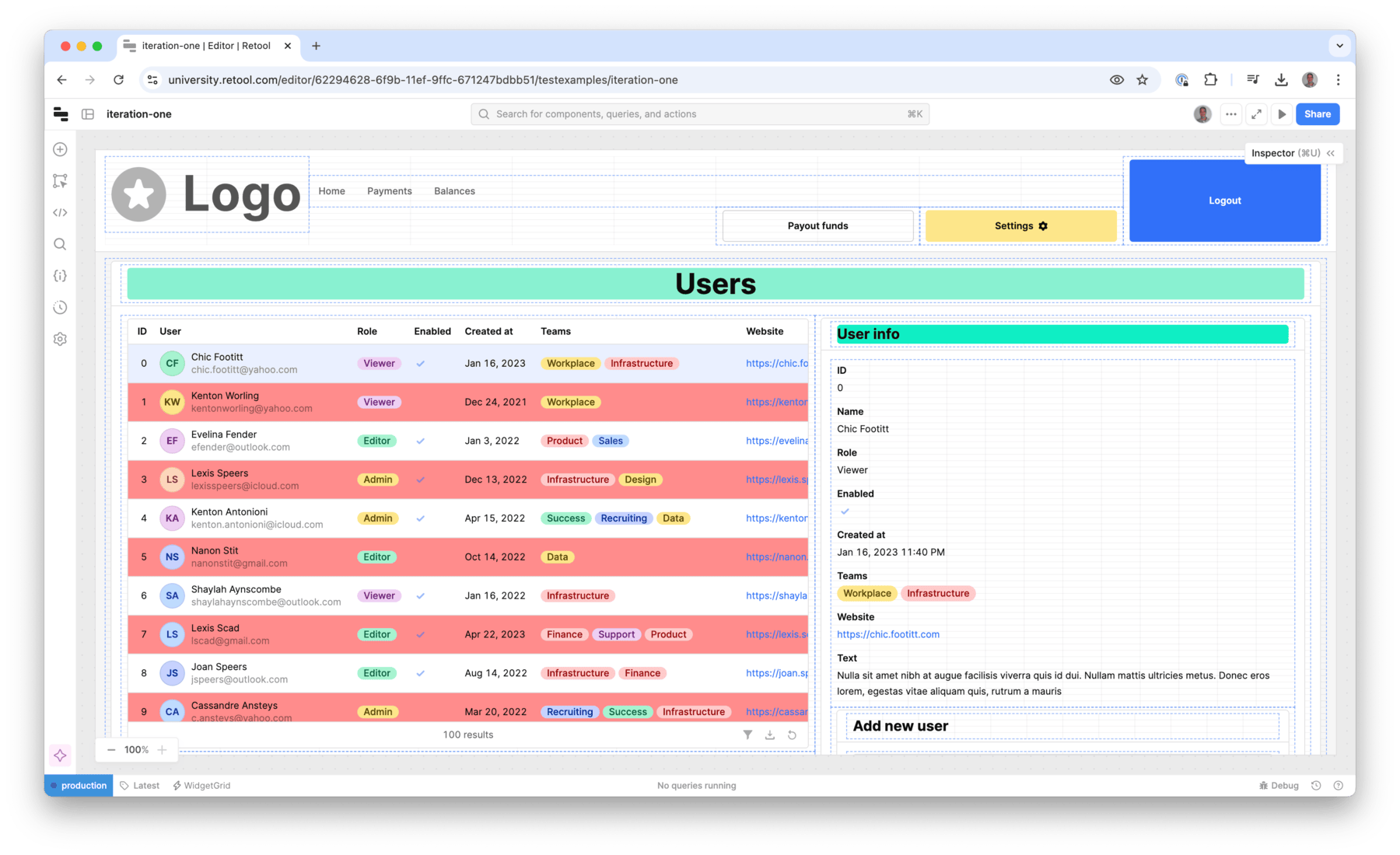 |
| Two | 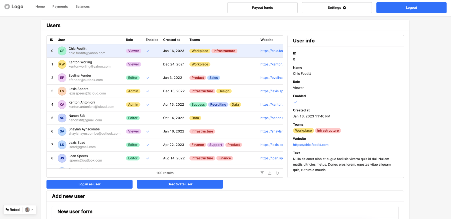 |
| Three | 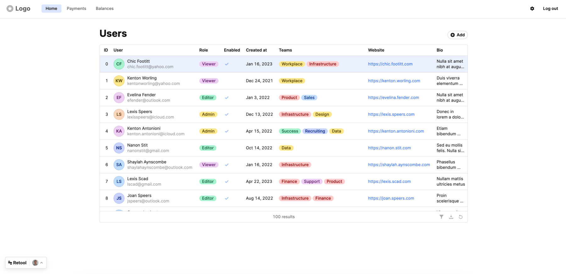 |
This example focuses on modifying the iteration one app to iteration two. Iteration three app is provided in its completed form.
Create a Retool account and login
Create a Retool account and login to your account as shown below.
Import iteration-one app into Retool
Next we will import the Retool iteration-one app into Retool. This application is meant to provide a working example with components, colors, alignment that is the starting point.

- Click the Iteration one Retool App link to download the JSON.
- Once the template has downloaded go to Retool Home Screen, select Apps > Create > From JSON/ZIP. This will display a dialog to provide the downloaded file, the name of the app and the folder.
- Select Upload a file and select the downloaded file
iteration-one.json. - Specify an App name,
iteration-one. - Leave Add to folder to
None(root).
Establish consistency for containers
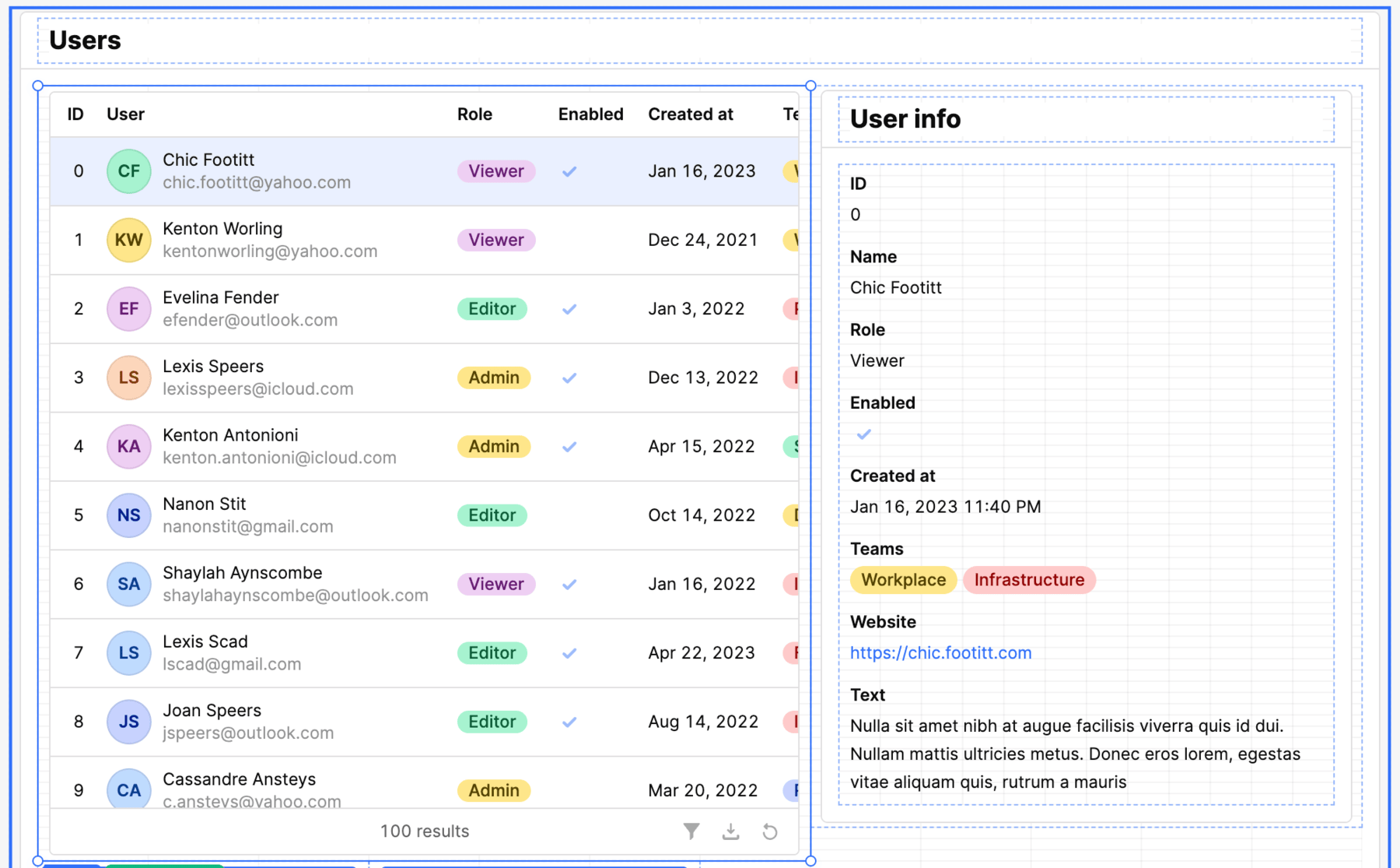
For the app, all functionality will have its own container, with container heading of H4 and left alignment.
- Select containerTitle2 via the Component Tree.
- In the inspector go to Appearance > Styles > Background and adjust the color from #89F1D1 to #FFFFFF (white).
- In the inspector go to Appearance > Alignment select the
Leftalignment - Change the font size from H1 to H4 by going to Content > Value and change
# Usersto#### Users. - Select containerTitle1 via the Component Tree.
- In the inspector go to Appearance > Styles > Background and adjust the color from #10EEC4 to #FFFFFF (white).
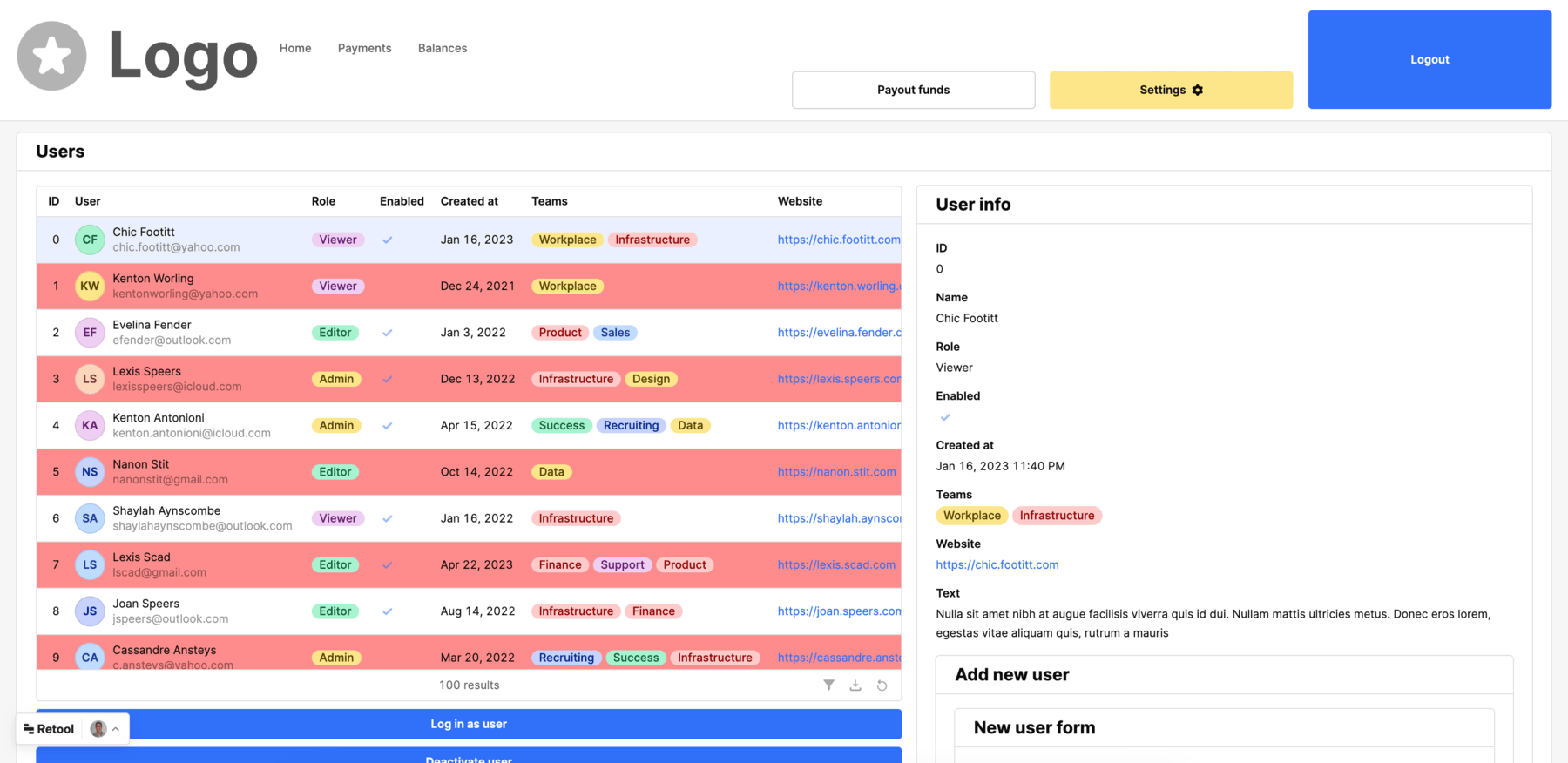
- The following image shows the impact of those changes in creating a consistent alignment, font size and a white background.
- Next we select container3 in the Component Tree. Drag and drop container3 and place under the buttons
Login as userandDeactive as user.
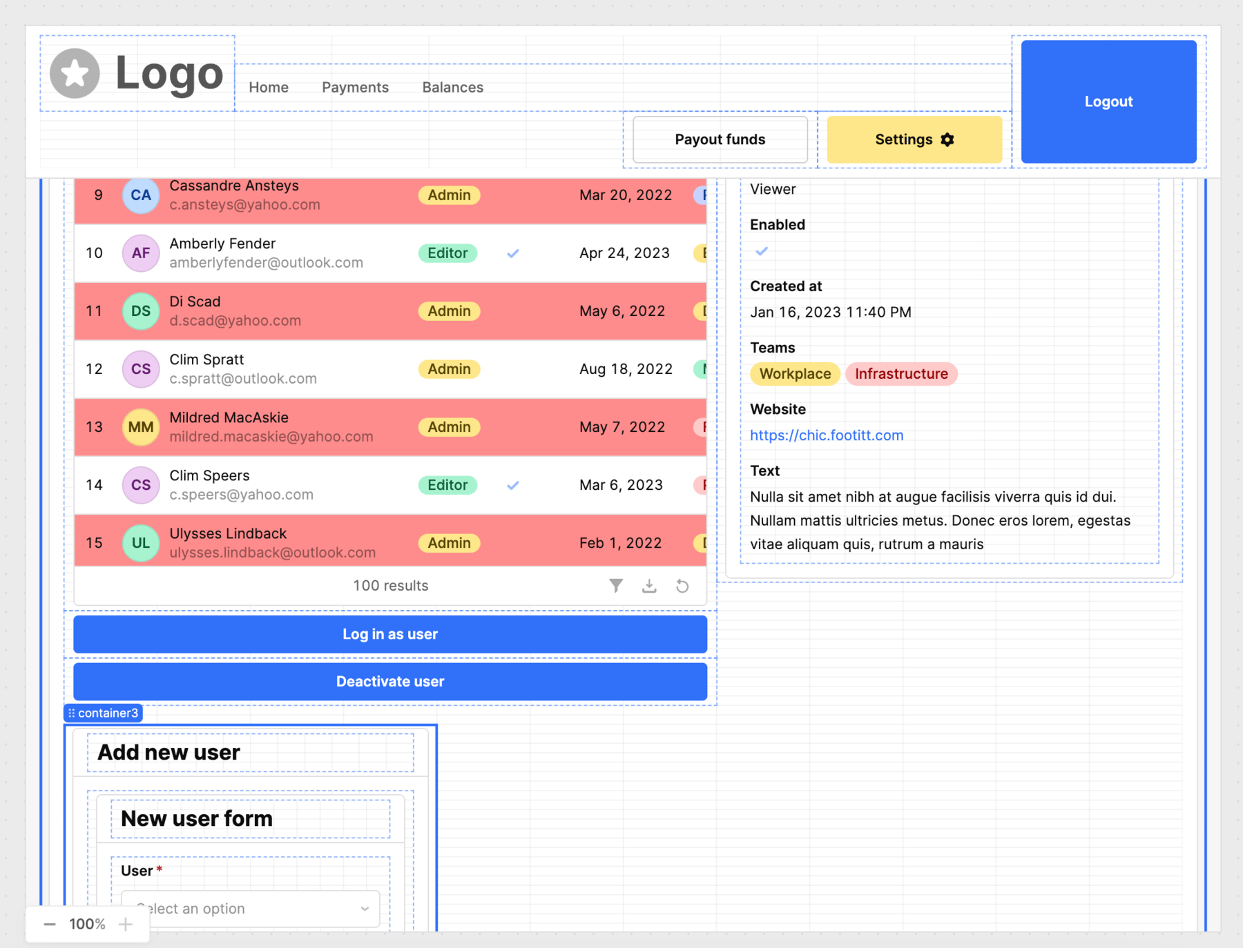
- Once container3 has been placed, resize to take the full width.
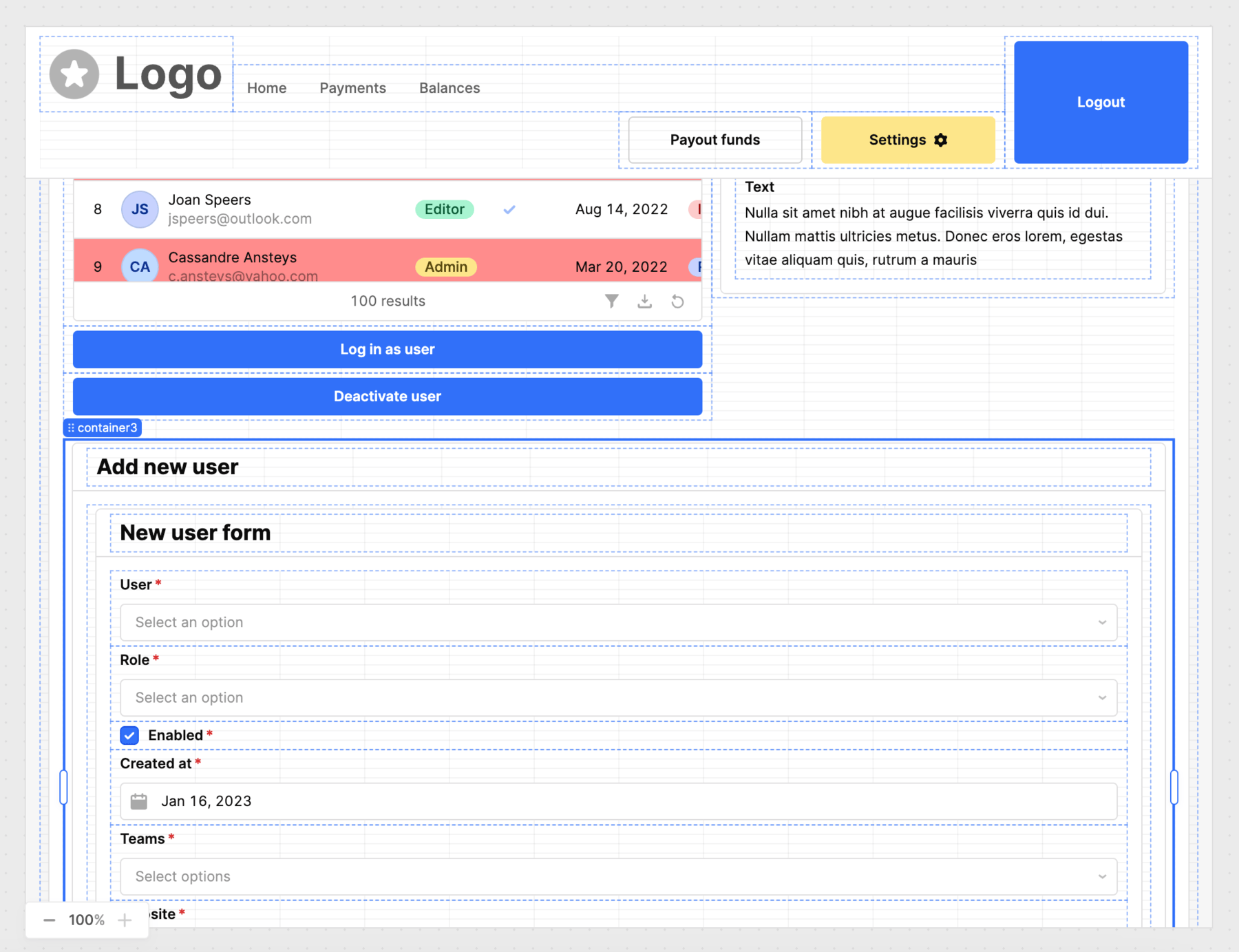
Establish consistency for buttons using alignment, sizing and colors
- Reduce the size of the Blue Logout button by dragging it to the same height as the Settings and Payout buttons.

- The Logout button should have the same size as Payout funds and Settings.

- Resize the logo by selecting it dragging it to make it smaller / occupy less columns.

- Let's group the image1 and navigation1 components by selecting them by dragging the mouse to highlight them both.
- Once we have selected them both, right-click and select Stack horizontally.
- The tag for the two components changes to the label
group1.
- Drag the
group1stack to the top of the header as shown in the following image.


- Select
button1,button2, andbutton3to the top of the header.

- Select
button2so that we can adjust the color.
- In the inspector, examine the Appearance > Styles notice that the Background is set to
Highlight.
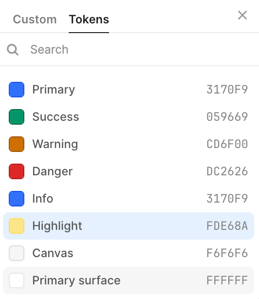
- Select Highlight and the following palette selector will appear. Change the setting to Primary surface #FFFFFF
- The button2 background is now set to white but it doesn't have a outline so it doesn't appear the same as Payout funds.
- Select Appearance > Variant > Outline.
- Select Styles > + and specify a Border color of
Generated.
- The button2 will now include an outline making it consistent with Payout funds.
- Now lets move to the two buttons below table1.
Log in as a userandDeactivate userare labelled as button4 and button5. Rather than having them stacked vertically, we will make them consistent with the previous buttons which are organized horizontally.
- Select
button4and reduce it size it size as shown in the following image. Selectbutton5and place it alongside/horizontal tobutton4, also reducing it size as shown below.

Simplify table by removing alternate row color
- The last change to the application is the removal of the alternate "red" row highlight. Select
table1and go to Appearance > Styles. Currently this is set to Alternate row value of FF00000 45%.
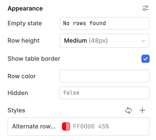
- Select Styles and delete the Alternate row styling. The table will no longer have the red highlight alternating as shown in the following image.
Summary
This lab briefly touches on design decisions and how to navigate the Retool interface to leverage grouping, alignment, colors, sizing, fonts and placement.
Usability Improvements
The overall net affect of moving the containers into their own designated space helps improve usabililty making it more clear / discernable for the user what a container does. Additional improvements are made in iteration three of the application as shown in the previous section. In addition the reduction of colors helps decrease the inputs a user experiences when using the application.
Consistency
The majority of this lab focuses on creating consistency in button sizing, coloring, and overall organization of where components are placed and aligned.
Completed Examples
You can import the following examples and compare with what you have built.
- Iteration one application: iteration-one app
- Iteration two application: iteration-two app
- Iteration three application: iteration-three app