Assemble mobile app UI components
Learn how to assemble Retool Mobile app interfaces.
Retool Mobile provides you with a library of mobile-specific components that work natively on iOS and Android. Mobile components function in the same way as Retool's web components for web apps.
Manage mobile components
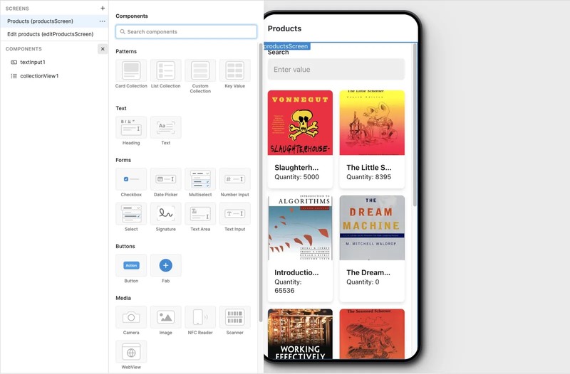
When editing a Retool Mobile app, the App IDE includes an additional mobile panel on the left. Use the Components section of the mobile panel to select, add, or delete mobile components from your mobile app.
Retool Mobile groups mobile components into separate screens that serve specific purposes. To add a mobile component to a screen:
- Select the desired screen from the Screens section of the mobile panel.
- Click + in the Components section.
- Select a mobile component to add.
Arrange mobile components
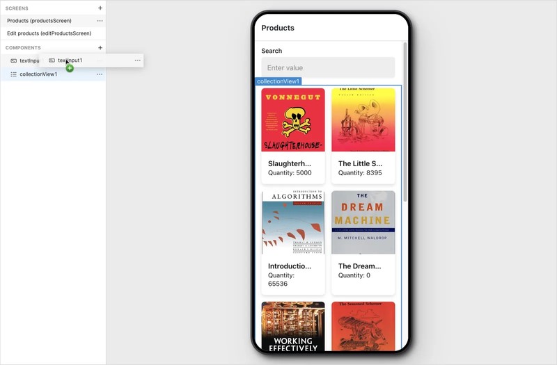
Retool Mobile organizes mobile components in a vertical (column) layout. Additional mobile components first appear at the bottom of the Component section. You can drag mobile components to change the order in which they appear.
You can customize the layout of mobile components to arrange them horizontally, adjust their width, and increase padding.
Configure mobile components
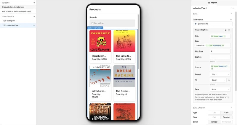
You configure mobile components in the same way as Retool's web components. You can write JavaScript almost anywhere, edit option lists, and more.
Use the Inspector in the right panel of the App IDE to configure the settings for a selected mobile component.
Trigger actions with event handlers
You can configure event handlers to open URLs with alternative URI schemes, such as tel:, sms:, and mailto:. These enable users to perform other actions like phone calls, text messages, and emails.
Retool uses event handlers to trigger queries or other actions in response to user events, such as pressing a button, navigating to another screen, or running a query. Use the Interaction settings in the Inspector to configure event handlers for the selected mobile component.
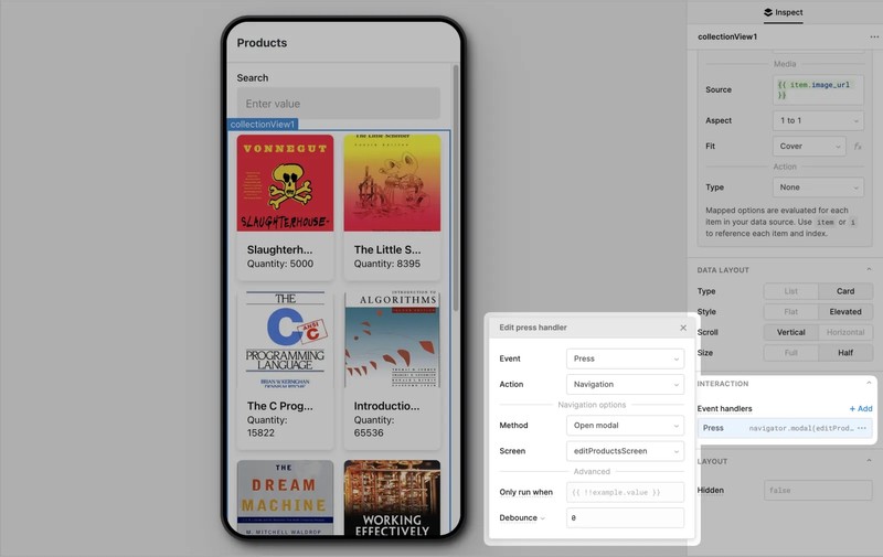
You can also configure event handlers to perform conditional actions only when a the condition results in a truthy value.
Multiple event handlers trigger actions simultaneously, not in a sequential order. If you need to trigger multiple actions in a specific order, consider writing a JavaScript query instead.
Upload files and images
Learn how to upload files and images in mobile apps.
Accept signatures
Learn how to accept and upload signatures in mobile apps.