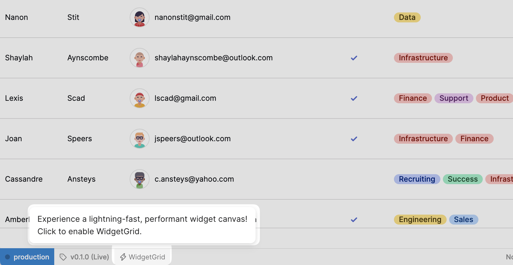
Button column type for the Table component
The new Button column type in the Table component is now available. When enabled, column values render as a button. This allows you to add buttons to trigger actions, queries, and open links using a button.
Updates, changes, and improvements at Retool.
The new Button column type in the Table component is now available. When enabled, column values render as a button. This allows you to add buttons to trigger actions, queries, and open links using a button.
The Phone Number Input component for web apps is now available. It automatically formats phone numbers, includes a country selector with international dialing code, and can perform validation based on the selected country. The default country is derived from the user's IP address.
A new version of the Key Value component is available on Retool Cloud and self-hosted deployments running Retool 3.22 or later. It contains a number of improvements over the previous component:
Retool organization users on the Business or Enterprise plan have the option to apply custom themes on a per-app basis. Previously, app themes were only available globally and required administrator access. App-level themes apply only to the current app. If your organization does not have access to org-level themes, you can still set a custom app theme.
We've also added some expanded typography settings. You can set custom typefaces and font sizes. Not all custom typefaces may work with the line heights used in Retool apps (generally 1em-1.5em).
You can now search for all code within a Retool app, from resource queries and component properties to preloaded JavaScript and CSS. Code search can instantly search for case or exact word matches, and supports regular expressions for fine-tuned searches.
A visually refreshed component library is currently available as an opt-in beta for cloud-hosted organizations. It contains minor style changes to many components, such as:
Any style overrides you've made will still be retained.
Click Get started and leave a comment to request access.
You can create custom URLs for web apps to make them more discoverable and easier to share with end users. With a custom URL set, end users can access apps at {domain}/app/{custom-url}
or {domain}/p/{custom-url}
if it's a public app.
We're expanding beyond internal tools so you can build nearly any software for your business with Retool.
With this launch, we're adding two new products to help you:
Both external apps and embedded apps are now available across Business and Enterprise plans.
To learn more about how embedded and external apps are changing the way you can build with Retool, watch the overview video.
You can read details in the docs to embed your first Retool app or build an end-to-end portal on Retool.
We rebuilt the Table component to improve customizability, and scalability for our customers. The new Table is capable of rendering, updating, and scrolling through hundreds of thousands of rows and hundreds of columns with diverse data types fast.
It also features deeper customization options:
The new Table component is available today and replaces the previous Table component. Existing customers can continue to use the previous version, which is available as the Table (legacy) component.
Check out our docs or the migration guide to get started. To learn more about building a data-driven dashboard with the new Table component, check out the following walkthrough.
You don't have to upgrade existing apps that use the legacy Table component. You can continue to configure the legacy Table in your existing apps, and then use the new Table component when you have an app to build.
If you want to migrate an existing app to use the new Table component, use this guide to learn more about the differences before migrating.
The new Table no longer supports the Auto column format. Each column must have an explicit format. Each column can contain an optional source key, which maps the column to a field in the data source. If the source key is omitted, the column is effectively a custom column.
Some commonly used Table properties have been renamed. Anywhere in your app where you reference these properties, you’ll want to update those references to the new property names.
selectedRow
The property to access the Table’s selected row changed from table1.selectedRow.data
to table1.selectedRow
.
currentRow
currentRow
in a column’s mapped values is now currentSourceRow
, to make it explicit that it references the underlying source row’s data.
recordUpdates
and changeSet
The legacy Table’s edited fields were exposed in recordUpdates
and changeSet
. These fields are now changesetArray
and changesetObject
, respectively. These properties no longer contain the entire row’s data, and instead only contain the modified fields.
Pagination controls are now nested under table1.pagination
. This means referencing a table’s pageSize
, for example, is done using table1.pagination.pageSize
. Pagination is now accessible in the Table’s Add-ons section in the Inspect tab.
The new Table exposes the built-in save and cancel buttons for bulk editing in the Add-ons section of the Inspect tab.
The legacy Table exposed several fields to represent the Table’s sorting state: defaultSortDescending
, defaultSortByColumn
, sortedColumn
, sortedDesc
. The new Table exposes the sortArray
property, which represents the entire sort state of the table.
The legacy Table did not support nested filtering. The new Table supports nested filters with the filterStack
property.
See below for a feature-by-feature comparison of the legacy Table and the new Table.
Category | Feature | Description |
---|---|---|
Column type | Auto column | The new Table forces explicit column types. |
Column type | Button column | The new Table has redesigned actions for triggering events. |
Column type | User Email column | The new Table has an Avatar column that serves the same purpose. |
Column type | Modal column | Modal columns are not supported natively in the new Table, but can be implemented by using a Column event handler to trigger a Modal component open. |
Actions | Action button columns | The new Table floats all action buttons to the right edge of the table when you hover over a row. |
Category | Feature | Description |
---|---|---|
Column type | Rating column | You can use a Tag column to represent a rating cell instead. |
Sorting | Sort columns by raw value | The new Table sorts columns by their mapped values. |
Styling | Row color | Row color is not supported in the new Table. |